
A fantastic new visualisation work has been released today titled ‘Kindred Britain‘. Created by Nicholas Jenkins and Elijah Meeks of Stanford University in partnership with Scott Murray (amongst others) the project offers a deep, exploratory interface into a network of nearly 30,000 key figures in British culture connected through ‘family relationships of blood, marriage, or affiliation’. As the designers describe, ‘it is a vision of the nation’s history as a giant family affair’.
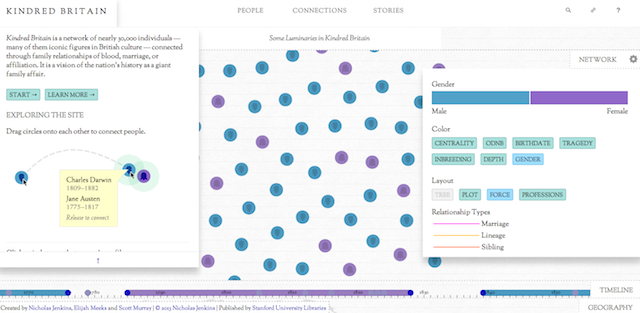
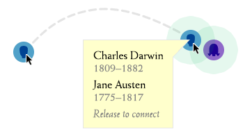
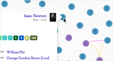
The site itself will do far more justice to the mechanics of the visualisation but the basic idea is that you can explore the relationships between key figures in British History. With 30,000 nodes there exists a potential 897 million different paths through the network. One way to interact with the contents is to search for and isolate a key figure then drag them over another one to establish their network of connections and relationships.
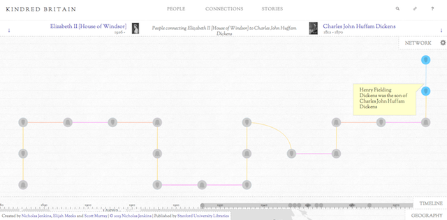
As well as the network view you also have a ‘Gantt chart’-type timeline view of the applicable individuals and a map view providing a geographical narrative.
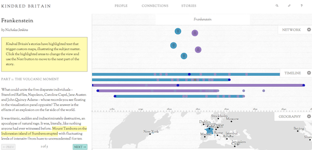
Aside from serendipitously finding interesting people, you can use the menus across the top to short-cut your selections based on curated views and popular selections: most viewed, professions, families, firsts and lasts, notable combinations and key stories.
This is one of the deepest visualisation undertakings I’ve seen for a long time and the creators have done an incredible job providing a route into this fascinating subject matter. There is an exquisite balance between the elegance and clarity of the design and the preservation of the weight and multi-faceted complexity of the content.
Amongst many great features, one of the most important and impressive is the care for the reader’s experience. Rather than over-simplify this project, diluting its essence, instead there is a respect for the reader demonstrated by a great level of annotated assistance and insight. Nowhere is this better shown than the welcome windows that introduce the project, describe the basic interactive functions used to explore the site and explain the colour palettes and important visual keys.
Beneath this you have so much more detail about the project, including extensive user guides, project FAQ’s, glossaries and a super account of the design challenge by Scott.
A wonderful project, congratulations to all involved and do spend some time exploring it.