
I was recently asked to contribute a selection of what I believe to be the five most iconic visualisations of the past 10 years for an article on FastCo Labs. The article has now been published and there are some really interesting other selections on there from Robert Kosara and Matt Stiles to make up a top 10 list.
I thought I’d share my personal choices and reasoning for their inclusion. Just to be clear, these are choices for iconic visualisations not necessarily the ones I think are the best of the last 10 years.
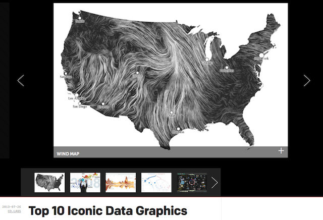
1) Hint FM: Wind Map – If it is not already iconic, it surely will be seen as being in due course. A wonderfully elegant and transfixing portrayal of wind, aside from being widely celebrated across the field it also became the go-to tool during the severe wind events that struck the US during 2012, elevating it beyond *just* being a beautiful design into an actual utility that people turned to, learned from and discussed.

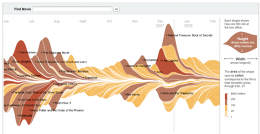
2) New York Times: Movie box office receipts – A genuinely divisive piece when published in 2008 and still being debated today, this movie box office takings ‘stream graph’ won the Peter Sullivan best graphic of 2008 at the prestigious Malofiej awards. It offers so much potential for analysis and discourse about the value and impact of visualisation, with its enigmatic and (certainly back then) novel form enchanting as many as it repelled.
3) Jess Bachman: Death and Taxes – One of the most famous infographics of recent years, the designer Jess Bachman takes time every year to research update this visual account of how US tax dollars are spent.

4) Hans Rosling: Gapminder – This multi-variable motion chart tool was demonstrated by Hans Rosling in his now-famous TEDTalk about debunking myths of the developing world. Whilst the talk was clearly enhanced by the humorous style of Rosling, this portrayal of data captivated the audience and viewer alike, presenting, what was to many, an exciting and new approach to visualising data. It has gained iconic status through its influence in the contemporary popularity and exposure of the subject.

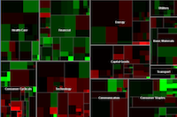
5) Martin Wattenberg: Map of the Market – A second mention for Martin, the map of the market was one of the first web-based visualisations. Launched in 1998 it is a ‘tree map’ view of the stock market and is one of the best examples of a visualisation application that has become entirely accepted and embedded into daily use by a large, general audience. It is now pretty much established as the iconic and standard single-view portrayal of market financial data.
On my subs bench were 512 Paths to the White House and the OECD Better Life Index.