With the ever increasing availability of, and access to open data about the world around us, there is a constant stream of fascinating developments to try bring new insight into the dynamics of how our cities function. Laurens Schuurkamp, a front-end developer from the Waag Society in Amsterdam, has sent me details of a new conceptual visualisation project built using WebGL called ‘OpenData Globe‘.
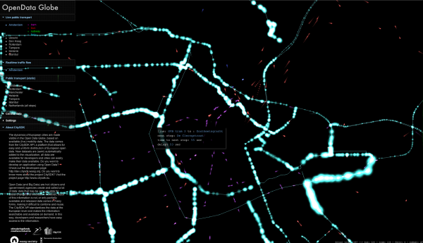
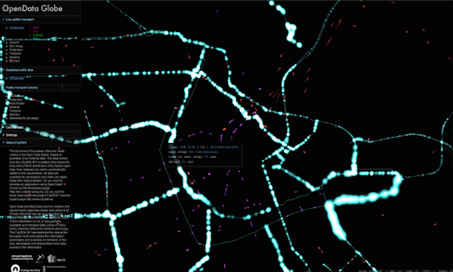
The data comes from the CitySDK API, a platform that allows for easy and uniform distribution of European open data, and through the visualisation it provides a realtime story about traffic flow and live public transport patterns for a range of European Cities, with particular focus on developments for the Netherlands and Amsterdam in particular. You can navigate through a range of quite abstract views of the data that throw away detailed mapping layers to just reveal the visual essence of the manoeuvrings of a city’s cars, trams, buses, ferries and subways.
In the public transport view you see the transport portrayed by meteor-esque animations that slowly slide across the screen for each form of travel. Clicking on each individual shape will then annotate the specific line/route and details of next stops, time until next stop etc.
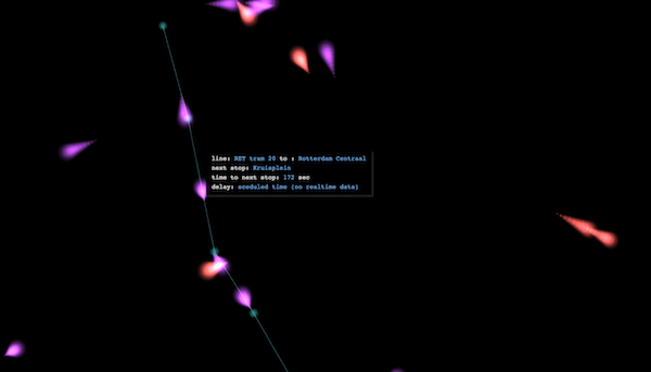
The static images here don’t do justice to the intriguing, pulsing and shifting live animations formed by the realtime data feed. Clearly there is a greater leaning towards this being more a conceptual development rather than a practical, sober tool, but it adds a new layer to the many different approaches that are being experimented with to bring alive this great well of data.