
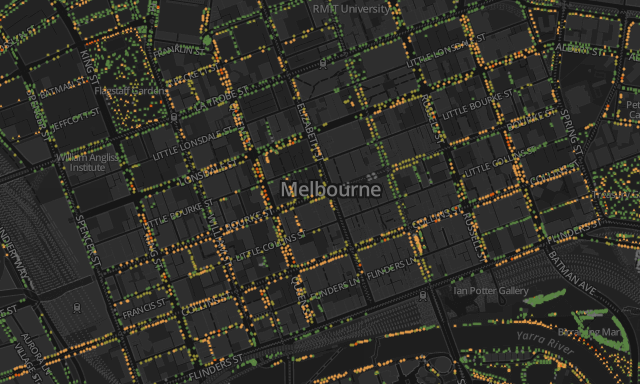
Came across some really nice work by Melbourne-based Greg More of OOM Creative. Titled ‘Urban Forest Visual‘, the CartoDB powered project allows users to explore a dataset of the City of Melbourne’s 70,000+ trees and appreciate some of the issues being faced to maintain their life span. You can navigate around and zoom into details of the city to see individual tree data, showing the diversity of tree types and their ‘Useful Life Expectancy’.
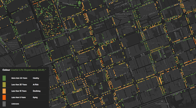
There is a whole lot more to the project than just this but it the colour scheme that I want to quickly draw particular attention to. Notice how the palette is derived from nature itself, with the concept of healthy leaves being green and decaying leaves tending towards orange and brown. I know this is not necessarily the case for all types of trees but its use in this project is metaphorically solid. It makes the process of interpretation so efficient, the user does need to learn how to read the scale or spend time visually searching back and forth to the legend, it is essentially automatic.