
A nice new project brought to my attention by Alexey Papulovskiy titled ‘Contrailz‘ provides an elegant visualisation of the world’s flight paths. Now, we’ve seen projects with a similar focus in the past (Bio.Diaspora and Arup, to name but a few) but here we have a fully interactive exploratory environment to zoom and pan around the global patterns.
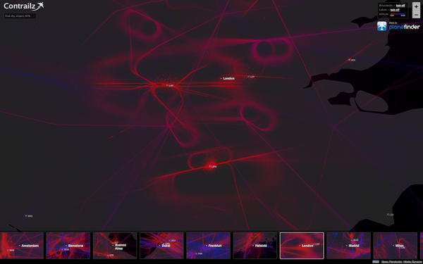
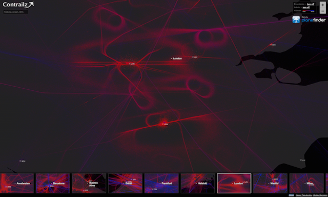
The project has been constructed using Leaflet and TileMill and data collected from Planefinder.net for the month of October 2012, which offers almost 1 billion datapoints or “dots”. As Alexey describes, the data is ‘somewhat discrete’ and doesn’t let you build continous routes for each plane, so the portrayal presented here is formed by the combined patterns of dots. As you can see, though, this still manages to do a very good job of capturing the specific flight routes and particularly the paths planes are forced to take in the lead up to landing in specific airports. You can see this illustrated in the image above showing London’s airports. For those who have ever been held up from landing in Heathrow, you’ll appreciate the tight, almost athletic-track holding pattern planes have to take up whilst waiting for clearance to land.
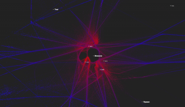
The tool enables you to move around the cities of the world that interest you, conducting comparisons between low-altitude (red) and high-altitude (blue) flight paths. One of the interesting discoveries is the sky above Moscow which is essentially a no-fly zone (“flights are allowed there only since March 2013 and only with an altitude of 27,000 ft or higher”).
Alexey provides more information about the curiosities that led to his project, some of the interesting observations as well as recognition of some of the interesting holes in the data.