

This is a guest post by Johanna Morariu (@j_morariu) and Ann Emery (@annkemery) who work for Innovation Network, a nonprofit evaluation, research, and consulting firm in Washington, DC.
You convened stakeholders from all aspects of the evaluation: grantees, their funders, community members, even service recipients. You designed a theory of change that demonstrates how a national initiative will achieve its goals over the duration of a grant. You collected data through interviews, surveys, and other assessments. You spent dozens (hundreds?) of hours analyzing the data. You summarized key findings through a 30-page evaluation report—and even included 30 more pages of appendices with details about the analyses. After 12 months of blood, sweat, and tears, you’re finally ready to share the evaluation findings with your client.
We’re battling that Dusty Shelf Report daily: by assessing evaluation capacity, by building that capacity, and through participatory data analysis.
Our strongest weapon against the Dusty Shelf Report is data visualization. These three tactics have proven most powerful:
Tactic #1: Captivate the readers with visuals. We’re also battling the Sea of Similar Reports. Our readers are not immune. Like us, they’re entrenched in a constant downpour of reports, memos, and emails. To make matters worse, the typical evaluation report is about 80% text and 20% visuals—paragraphs of text with one small chart per page. In our State of Evaluation 2012 research, we used the opposite tactic: 80% visuals and 20% text. As we suspected, the visualizations started conversations, made the information more accessible, and helped the (dry) research results stay afloat in the Sea of Similar Reports.
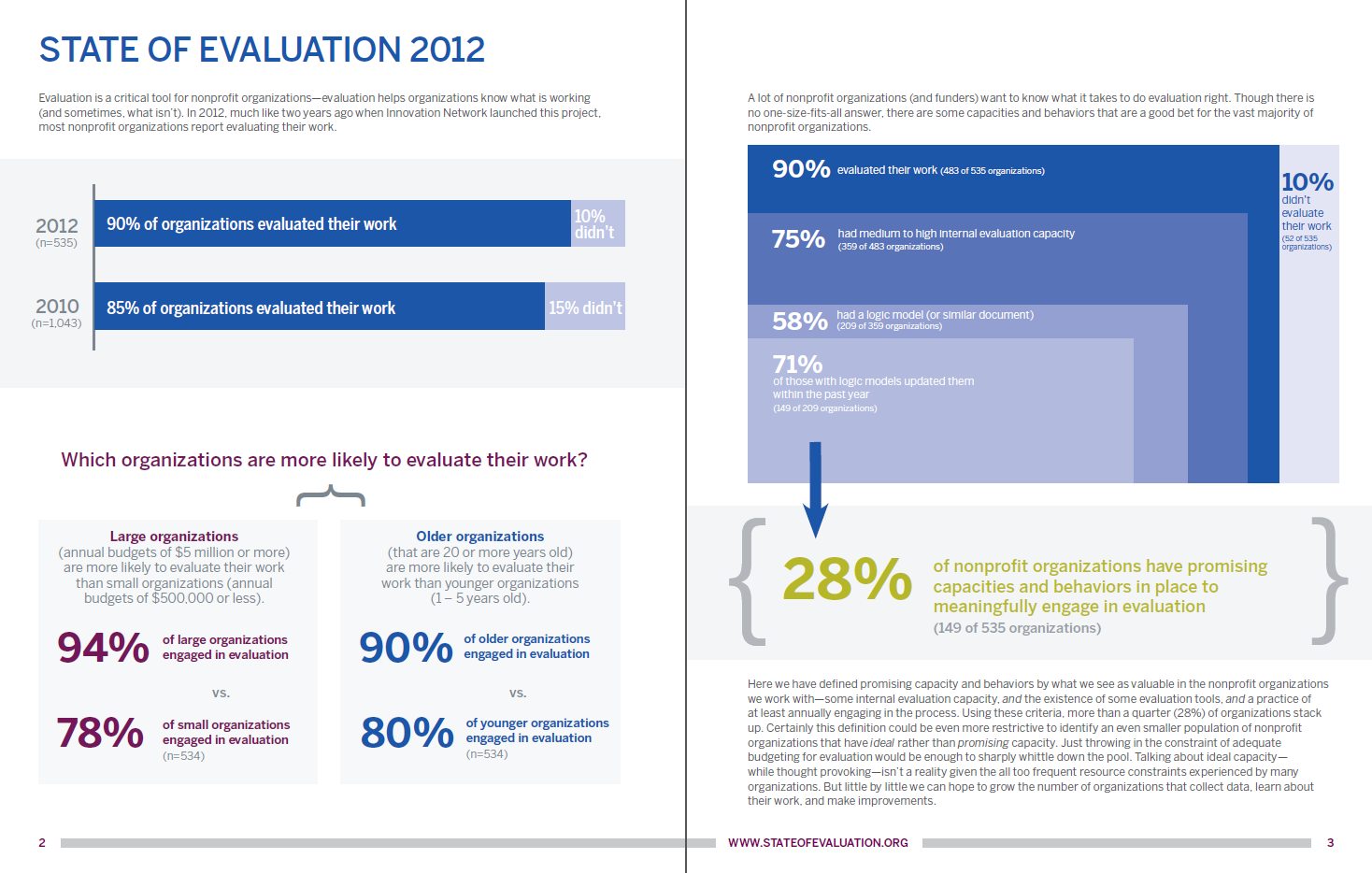
To grab the reader’s attention, we often deviate from the typical one-chart-per-page evaluation report format.
Tactic #2: Choose the design that’s right for the client–not the design that’s right for the data. Yep, we know. This is a major dataviz sin. We hear you. Last year, we developed a social network analysis (SNA) for a foundation. Our SNA had by-the-book design principles. But there was a major problem. It didn’t fit their dataviz literacy level. They were dataviz novices, and preferred to ‘visualize’ their data in a table. The SNA was completely unusable, thrown into the heap of Dusty Shelf Reports. Now, we’re strategically moving them forward, bit by bit, to get them to a point where they benefit from SNA. Until then, we’re using tables. Lesson learned: Have a contingency plan. What’s beautiful in theory doesn’t always apply to real-world situations.
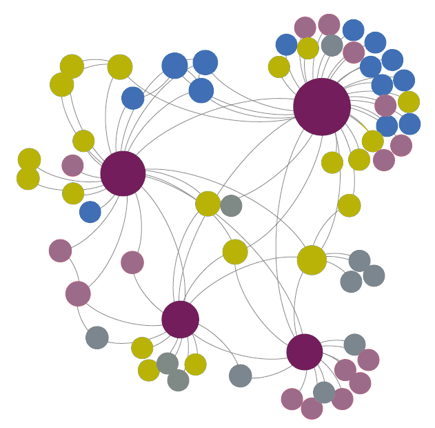
In evaluation, we use social network maps to visualize relationships between key players in a network.
Tactic #3: Strengthen the dataviz literacy of your troops. Even though we’re visual thinkers, our clients might not be. Lead with visuals that your readers are familiar with (like bar charts). Emphasize data they’re interested in (like contextual details). With a few adjustments, you can overcome even the most lackluster bar charts. In this example, we combined a closed-ended survey question (the stacked bar chart) and a corresponding open-ended survey question (the quotes). Uniting quantitative and qualitative data provides the context they’re craving. Once they’re engaged in the conversation and comfortable with the basics, you can move on to advanced visualizations.
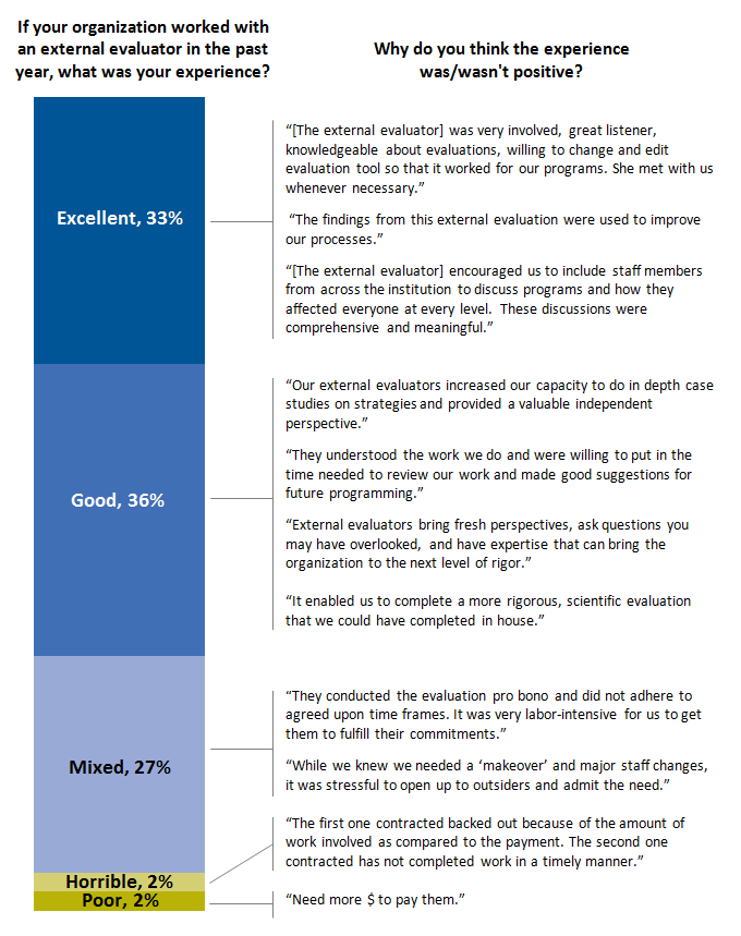
Throughout the evaluation field, surveys are one of the most common ways to collect data.
So, how do you combat the Dusty Shelf Report? Leave your comments below or get in touch via our twitter accounts: Johanna Morariu (@j_morariu) and Ann Emery (@annkemery). Thanks!
