

Just about this time last year I posted about Quadrigram, a visual programming environment ‘to gather, shape, and share living data’.
Having written this week about storytelling and successes of data visualisation, it was a coincidence that Alberto Gonzalez Paje, from the Quadrigram team, got in touch with me recently to invite people to contribute cases to a new initiative they are running called ‘data stories’ and a request for anybody interested to submit ideas, case studies, examples or applications. I’ll leave it to Alberto to articulate the background to this request:
As working with data becomes more integrated in classic professional practices, new disciplines such as data journalism, data consulting, and data research expand the realm of information visualization outside scientific and aesthetic concerns. The professionals or “map-makers” of these new disciplines are seeking to gain leverage over their data and augment their capacities to squeeze and mash it.
This cannot be effectively achieved by adopting frameworks for processing and visualizing data that are based on programming languages. These frameworks are incompatible with the non-technical backgrounds of these professionals. Other wizard-based approaches are too limited to leave room for creativity.
Therefore, there is an inherent need for new practices for working with data, based on a more ergonomic approach that recalls how an artisan manipulates clay to create custom and expressive sculptures. In essence, this is the philosophy behind Quadrigram, an online tool with a unique visual language.
Quadrigram tries to bridge the gap between information technologies and professionals looking to build new types of data experiences, such as storytelling with data.
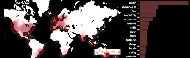
We just started an initiative called “data stories” that aims to tell stories where data visualisation plays a key role in decision making or problem solving. We want to publish on our website/blog specific cases where data visualisation has played a key role in solving a problem. An example case for this initiative was the data visualisation participant census data, a perfect example of data story. Here is an example of a “data movie” showing the patterns and dimensions of insight from this data gathering.
So if any of you out there have any case studies, requests or ideas for potential applications of using Quadrigram to tell stories, please contact Alberto via alberto@bestiario.org and see what data stories emerge.