
Simon Scarr is an extremely talented infographics designer and, until very recently, was the Graphics director at The South China Morning Post based in Hong Kong. He is about to take up a great new role as Deputy Head of Graphics for Thomson Reuters, based in Singapore.
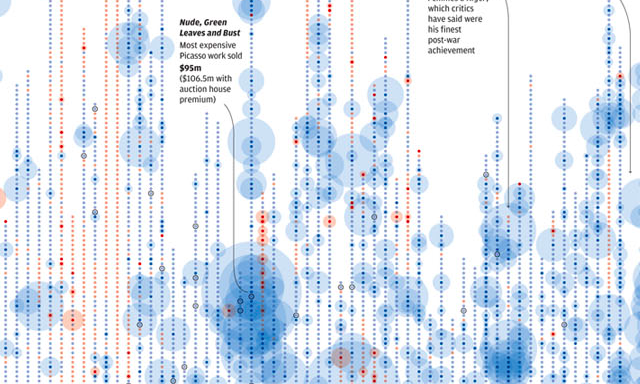
If you don’t recognise the name, you probably don’t pay enough attention to me! I first came across Simon’s (and his team’s) work at Malofiej 20, noticing a number of his pieces across a great portfolio. When he started blogging his work last year (GraphicsInfo) this gave a new audience access to the outstanding work emerging from the South China Morning Post and I included him/his work in my ‘10 most significant developments‘ collection at the end of 2012. I was thrilled to hear his team won a total of 5 awards at this year’s Malofiej event, including a presitgious Gold award for Simon’s own work on this infographic about Picasso’s Paintings.
I invited Simon to take part in an interview just as he was about to begin a new life! Here he talks about his career, his background as an infographic designer, the work of the SCMP and many other things about this fascinating world.
Can you tell me a bit about your career/education background – how did you become an infographic/visualisation designer?
After graduating from college, where I studied general Art & Design, I found myself looking at different degrees and Universities to further my studies. Most of the options involved the broader Graphic Design degree, but one of my tutors handed me a brochure for another course I’d never heard of, Information Graphics and Newspaper Design at Newcastle College (UK). There were a few examples of graphics in the brochure and a brief outline of what infographics are. I was intrigued and after an interview with the course leader, I left knowing this is definitely what I wanted to pursue. At the time I think this was the only diploma or degree focusing purely on information graphics and newspaper design in the UK.
My first ever infographic came on the opening day of the course when we were asked to do a hand sketched step-by-step process of how to peel a banana. Using no words, we had to explain everything visually. This was the first and most important lesson I learned – show it don’t tell it.
How did a Brit end up working as a Graphics Director in Hong Kong for the South China Morning Post?!
After graduating I worked for The Herald, a daily broadsheet in Glasgow. This was a great paper to learn at the time as the paper was full of good design and graphics, recently winning World’s Best Designed from SND. I would say this is where I did most of my real learning. I had a great Graphics Editor who helped me develop early in my career.
After five years it was time for a change and I accepted a job with Reuters News Graphics Service who had recently relocated their main global graphics desk from London to Singapore. A few months later I relocated to Asia.
I worked for Reuters for four years covering a range of breaking news, features and sports topics, including a month-long Winter Olympics posting in Canada. Then I was introduced to a role with the South China Morning Post which was very interesting to me as they were looking for someone to come in and help strengthen and build graphics through the paper. This was especially intriguing because it was my first opportunity to shape graphics my way.
For those not familiar with it, how would you describe the paper, its target demographic etc.?
The SCMP is a daily broadsheet first published in 1903 with a circulation of 100,000, mostly distributed in Hong Kong and surrounding areas. Close proximity to the mainland and sources throughout the country have helped the publication build a reputation for authoritative and influential reporting on China. The paper is the only English language broadsheet in Hong Kong and has a readership made up of affluent locals with a strong understanding of English, expatriates and visiting tourists.
With this unique positioning, the newspaper benefits from a healthy advertising climate, fueled mostly by luxury advertisers targeting mainland Chinese tourists and affluent locals. This has made it possible for the paper to maintain a strong position despite changes in the overall print landscape. That said, the importance of digital has also been recognized and a lot of resource and effort was put behind the recent re-design and re-launch of the website.
Can you tell me a bit about the context of working in the graphics department at the SCMP? How many staff do you have? What is the editorial culture and its relationship with the graphics team?
The department structure consists of an Art Director/Head of Department, Stephen Case who focused on the illustration and general artwork in the paper, as well as running the department, leaving myself, as Graphics Director, to take control of the information graphics. I also acted as his deputy in the running of the department. Then there is Senior Illustrator Henry Wong and Senior Infographic Artist and illustrator Adolfo Arranz, who we recruited from Spain. There are a further three full-time and three part-time artists/illustrators as well as some remote freelance contacts. In addition to the artists on the team, we created the role of a Graphics Coordinator, to facilitate our process and support the team. This role was extremely important and the Coordinator had to deal with a lot of the behind the scenes work such as collating requests, negotiating time and sizes of graphics, proofing and rewording some text, chasing up data sources and helping with some in-depth research. Having a Graphics Coordinator allowed me to spend more time directing the actual work and bigger projects, occasionally getting to do some projects myself too.
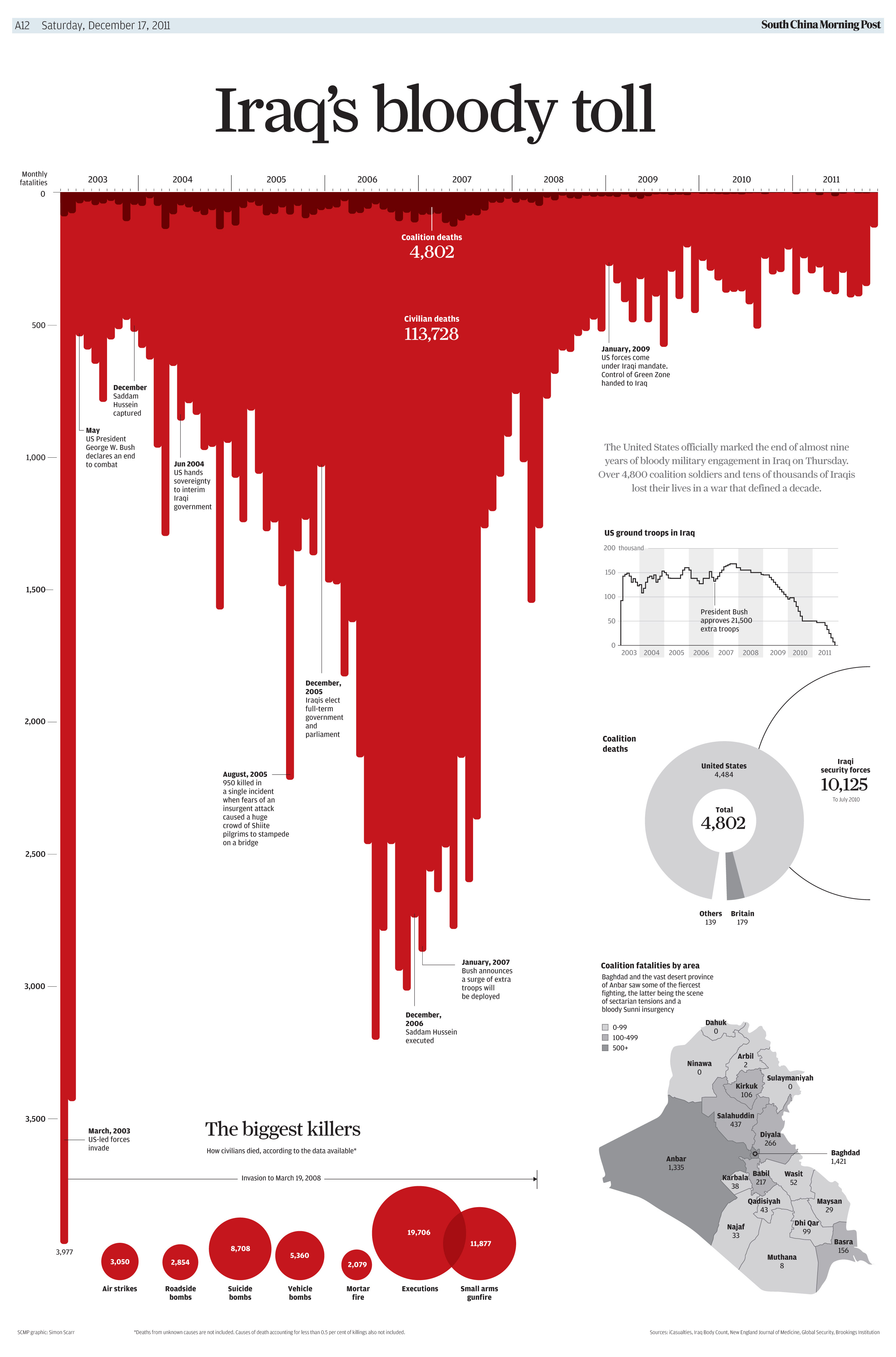
I think the editorial culture and attitude towards graphics has changed a lot in the last couple of years. Initially the appreciation for infographics was not as sophisticated and the primary role of graphics was to look good and substance and quality of information was secondary. Changing this perception, along with other bad graphic expectations was one of my priorities to address. I wanted to show that graphics can have just as much impact through the story they tell, by keeping them clear and easy to understand, rather than being embellished with unnecessary artwork. Not everyone was convinced by our cleaner approach to infographics and this proved a challenge. After time, and through a few examples, people started to understand. The most noticeable change was probably after the graphic I created illustrating Iraq’s death toll back in 2011. This was a very simple chart using only colour to suggest blood. As the graphic was in progress, a few people in the newsroom suggested splashing drops of blood on the page but we resisted all unnecessary artistic touches.
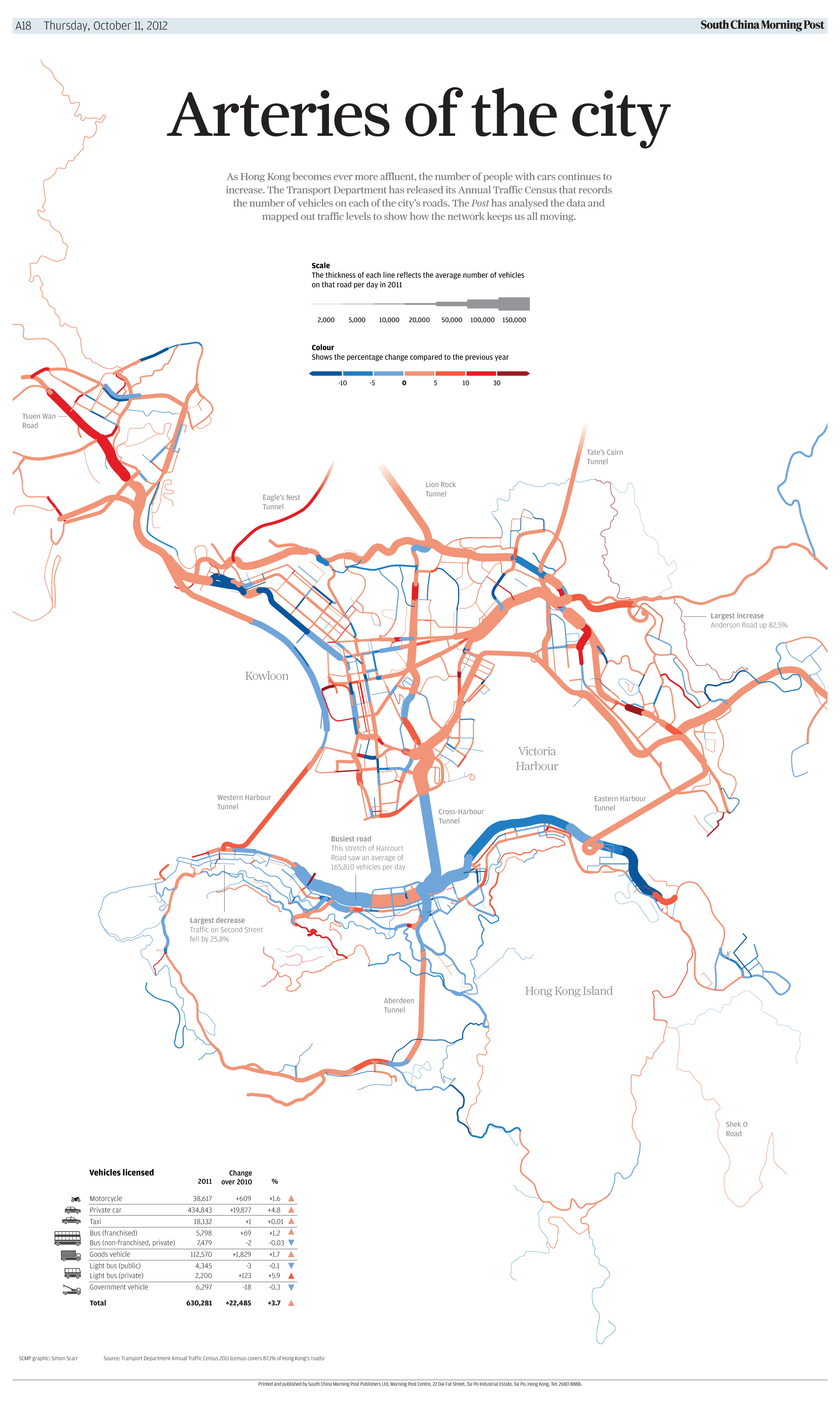
There has since been a shift from being more of a service department to a serious voice in the newsroom. As well as suggesting graphics to accompany stories often our graphic pitches would initiate (or inspire) stories such as the road traffic graphic below which ran with a feature on Hong Kong’s traffic problems.
Can you briefly describe the typical situation and process behind the development of a graphic? Typical timescales, design workflow?
There are three different ways graphics can come about. First there could be a request from a journalist or editor who has some data and would like a chart or map for example. Second, there is the morning and afternoon news conference and a weekly advance news/features meeting. Something can be raised in here or we can spot something on the news lists and suggest graphic options. And finally, we’d often pick up government data and keep an eye on major upcoming news events and pitch graphic ideas to the editors ourselves.
Graphics can take anywhere from an hour or two for simple charts and spot maps to a few weeks depending on the content. The full-page feature graphics we often create to go on the back page are usually planned a few weeks in advance and worked on in the background while dealing with daily work. This is a regular display page and we could make full use of the space. The only problem we had was keeping up with demand as they became very popular.
Can you pick the top three favourite pieces you have worked on/that have been published at SCMP?
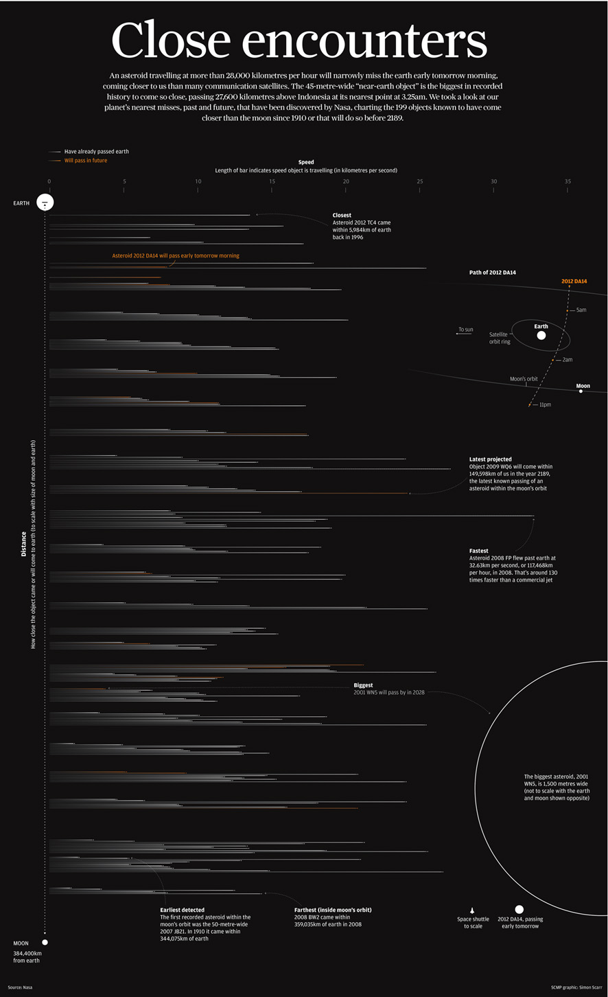
My favourite would be the Iraq graphic already mentioned above. For a graphic of this size it is one of the simplest pieces of work I’ve done but also has a very strong visual impact. The information is very clear and easy to understand.
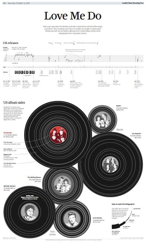
Another favourite would be the Beatles graphic. I chose this one because I had fun creating interesting and playful ways to show the data using records and music notation. Hopefully it put a smile on a few readers’ faces as well as ours.
Picasso’s Paintings was another one of my favorites and had to be the most labour intensive graphic we’ve ever done. The volume of research, editing and checking that went into this graphic was immense. For it to come off as a success was very satisfying. It’s also a subject I’ve not seen anyone visualise before. It was awarded our first gold medal at Malofiej so will always bring back fond memories.

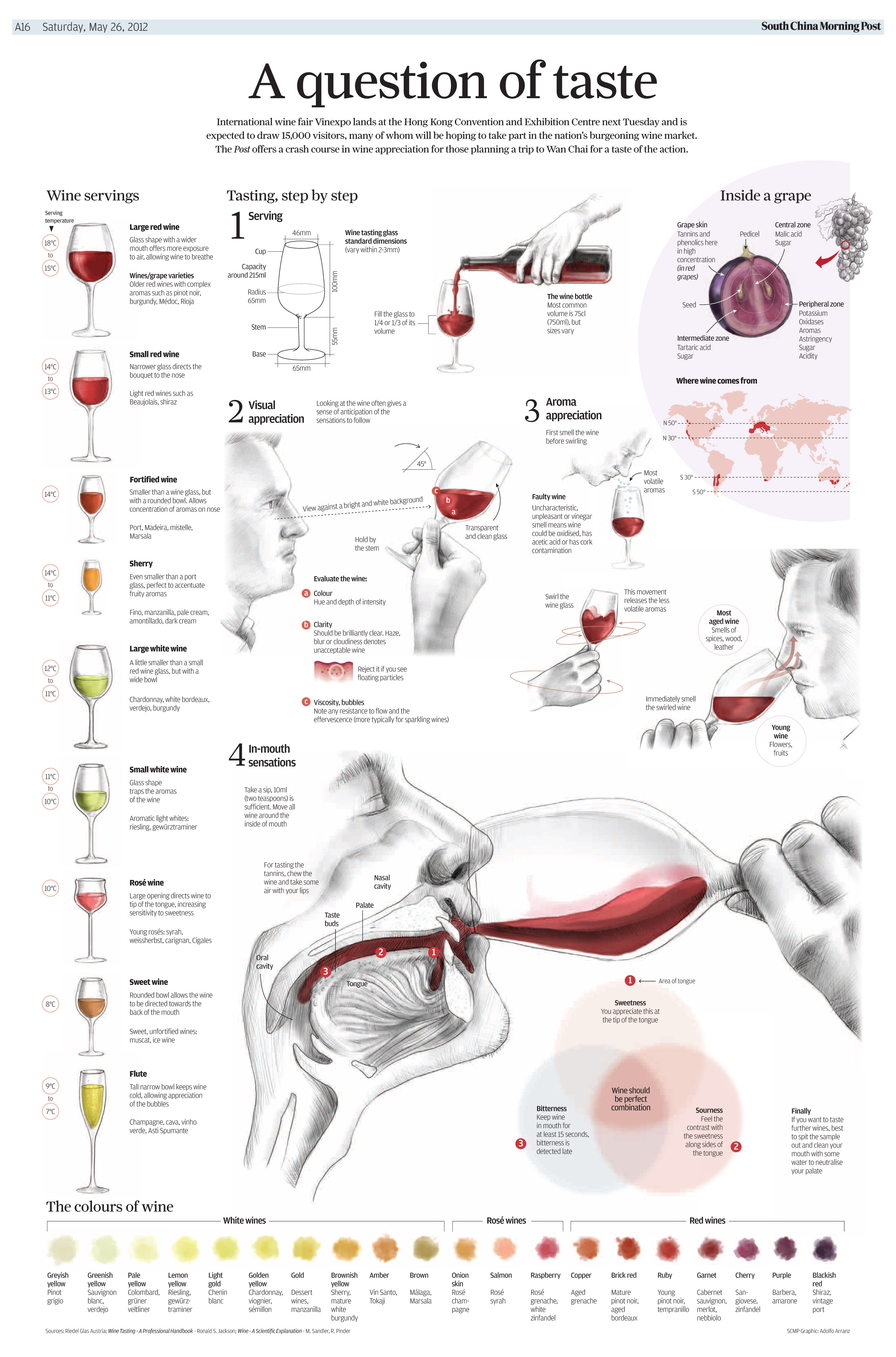
I’d also like to give special mention to another fantastic graphic from our Senior Infographic Artist Adolfo Arranz. This shows a different approach we sometimes take to our graphics that require a more human or natural touch. Not everything is data driven or involves technical vector drawing. This graphic on wine tasting was published last year to coincide with Hong kong’s annual wine fair. I didn’t have to do much with this one other than pose with the wine glass (that’s me in the graphic). This piece recently won a silver medal at SND’s Best of News Design competition in February.
What would you describe as being your favourite subject matter or a dream task?
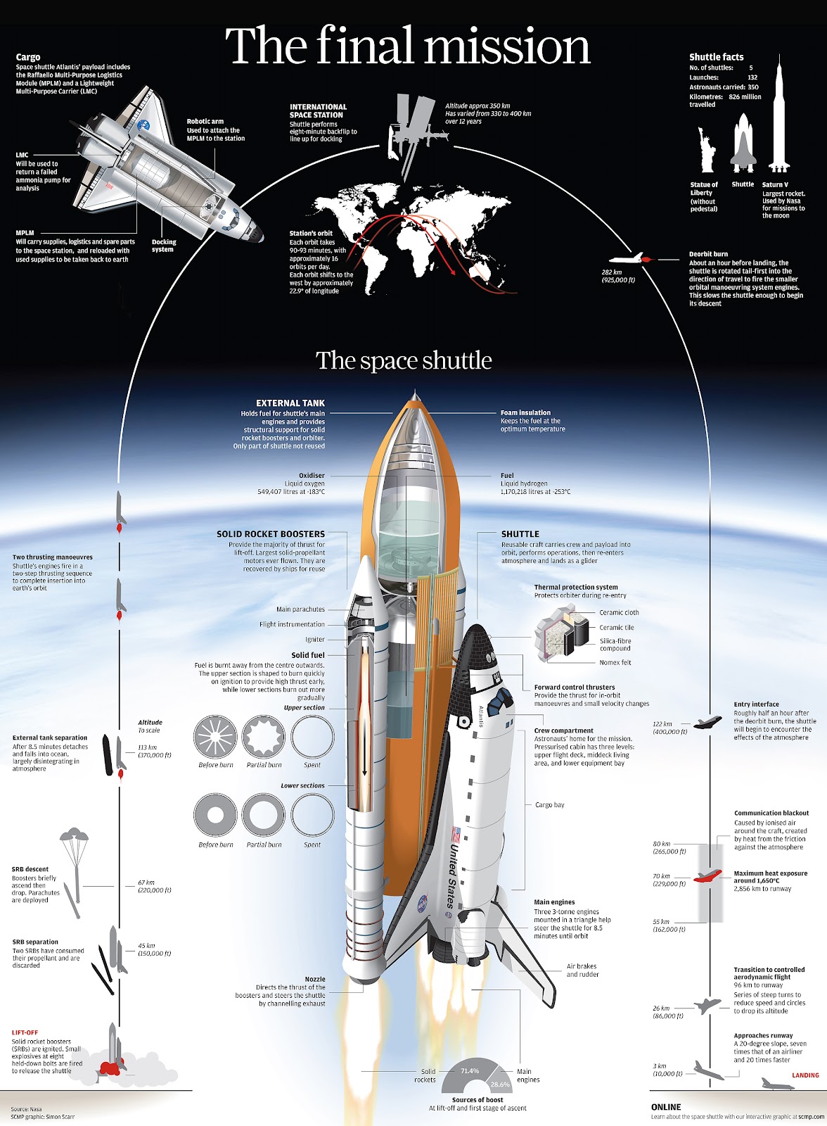
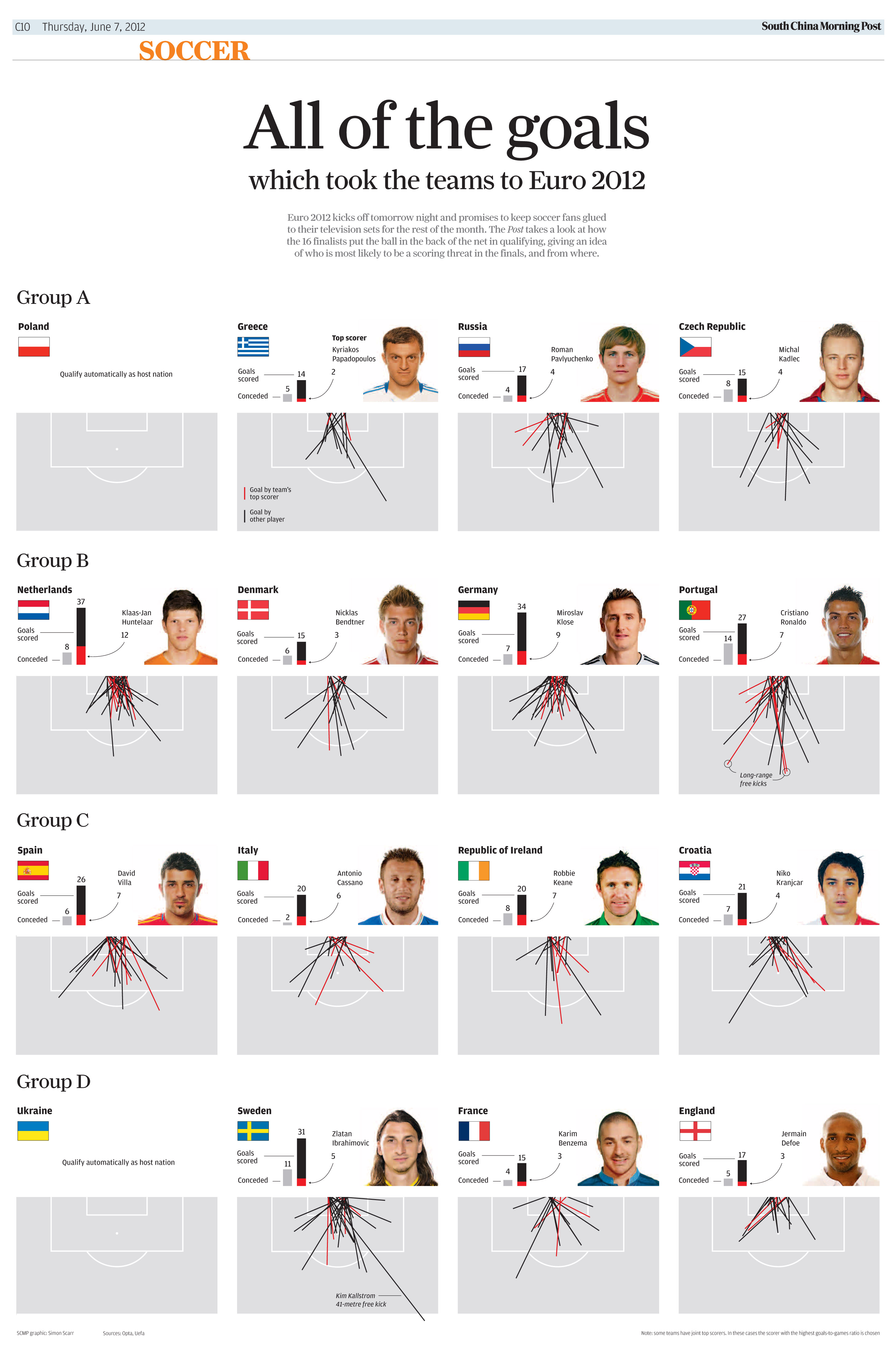
I’ve always enjoyed detailed vector drawings in Illustrator such as the Space Shuttle and Titanic but I would love to do more data-driven sports graphics. I had a few chances while at SCMP but would like to do more in the future. There are huge data resources for sports out there and I’m hoping this is something I can explore further in my new role.
What would you describe as your main sources of inspiration creatively?
I always keep an eye on the work others are doing and attend talks and conferences. Sometimes you can see work or hear someone’s thoughts on a subject or a particular type of chart and it will spark ideas. I believe the wider the range of work you look at and read up on, the more your own work will improve.
I also like to sketch ideas and illustrations out in the early stage, often experimenting with new ways of displaying the data. Sometimes scribbling ideas out on paper or playing around with data on the screen can suddenly spark a new idea.
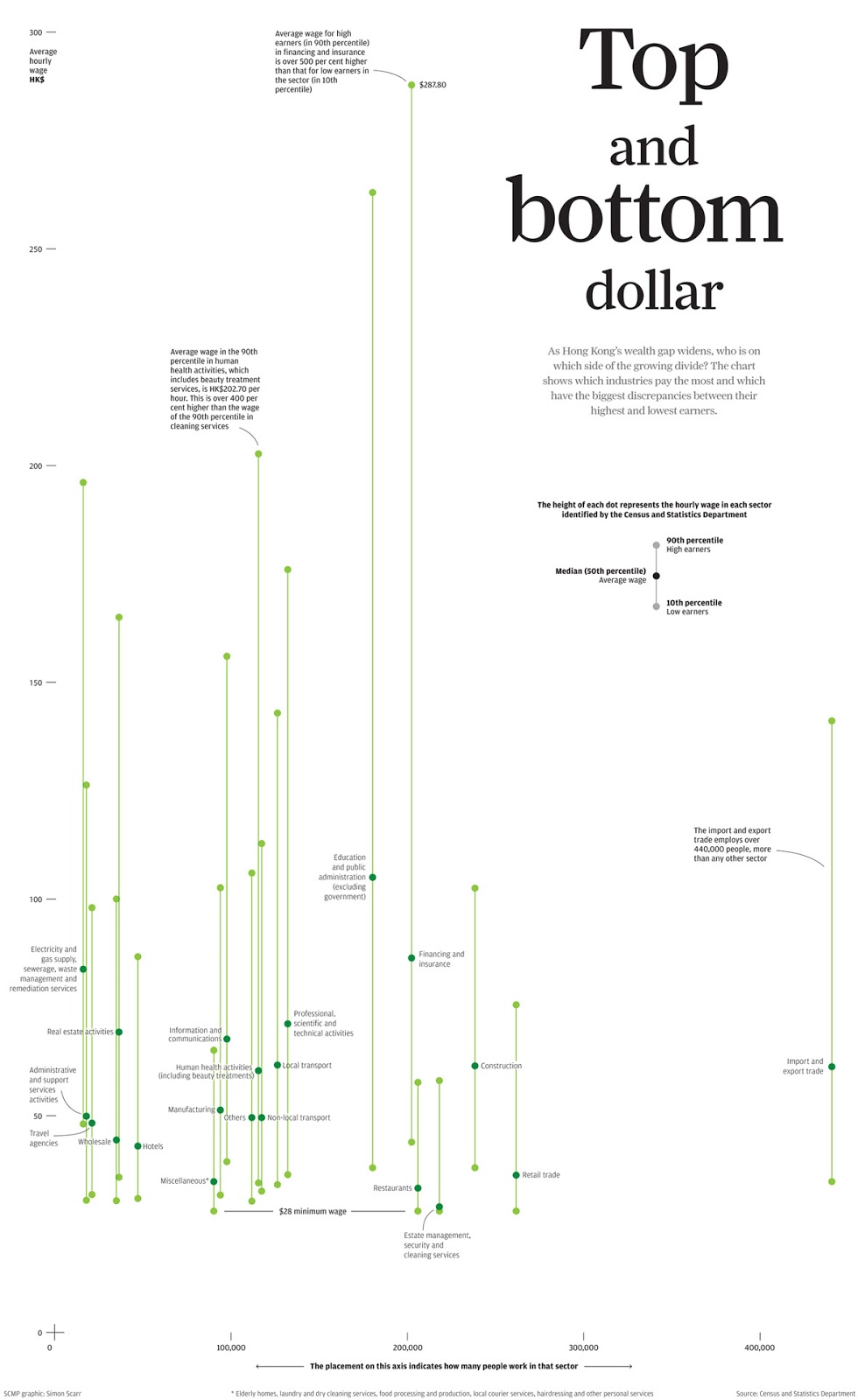
Sometimes I take a slightly unconventional approach to graphics with particularly dry data or subject matter. I would use design, use of headline and representations of familiar objects to draw the reader in without unnecessary artistic touches. Examples would be the retail sales and electricity graphics below and the traffic “arteries” already shown above.
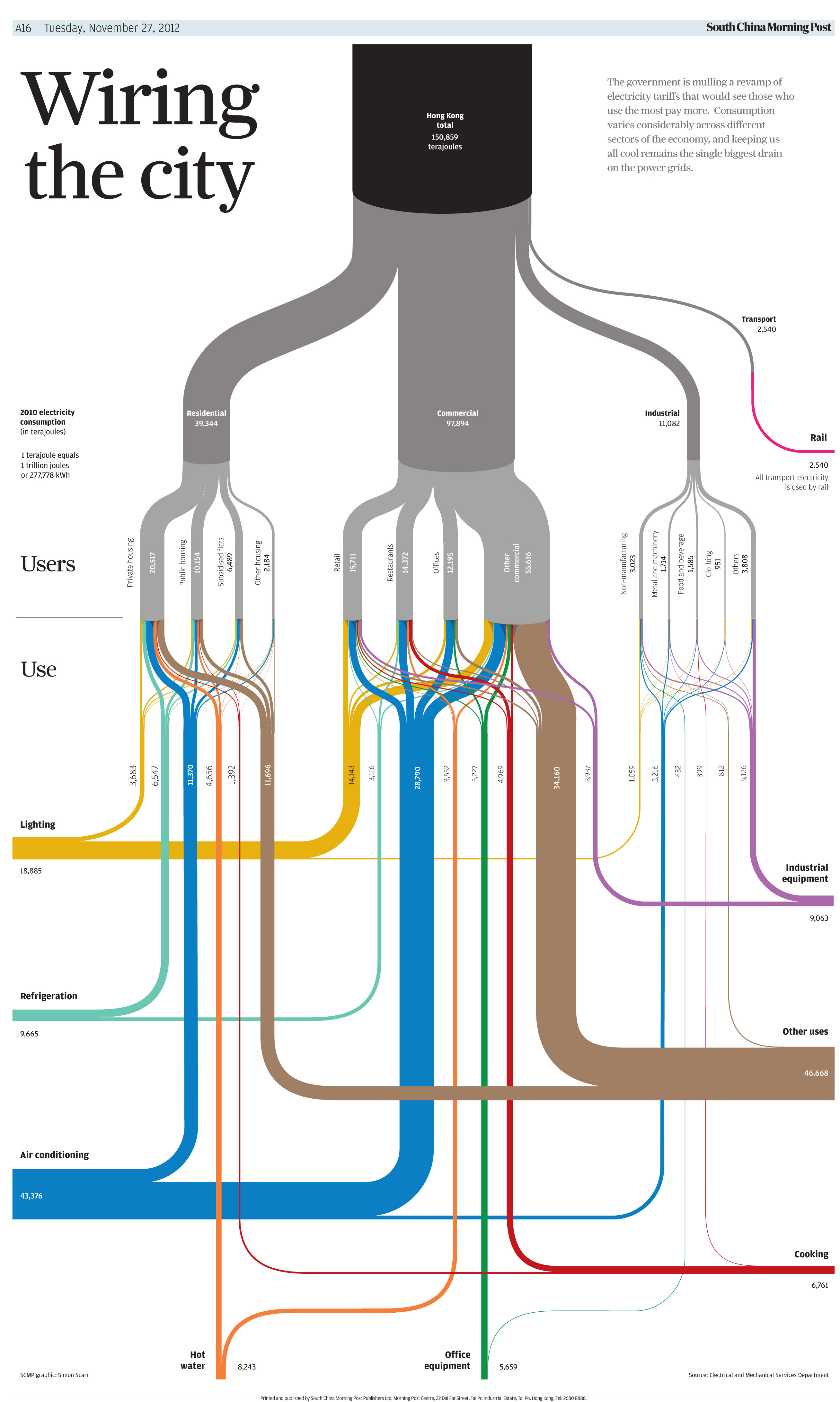

So in cases like these, I would read into and explore the general subject I’m covering and not just the data itself, looking through a lot of visual reference in case there is anything which could be reinterpreted in graphical form.
From a regional perspective, you will have a unique insight into the practice of information graphics in the East, how you would characterise the approach, appetite for and consumption of information graphics/visualisation?
In Hong Kong I think readers are starting to understand and appreciate the importance of infographics more. You see a lot more featured in the SCMP and some of the local papers also use graphics of some description.
While newspapers in mainland China have been using information graphics for a long time and more recently they are becoming more popular online and on social media sites, I do believe there is a way to go in terms of overall execution and level of sophistication.
As for the rest of the region I have seen more illustrated type of graphics and less data visualization represented in the newspapers.
I believe one common problem Asian publications share is the lack of quality graphics or the correct display of graphics online. I’m not just talking about big showcase feature graphics but more the correct use of regular maps, charts, and smaller graphics. I find when they are used they are often disjointed and not thought about properly – like an afterthought taken from the print edition and often hard to find.
We have started to see change in the region as interest grows and more information graphics resources become available. Workshops and awards competitions being held by the likes of WAN-IFRA and SOPA will fuel this evolution and I look forward to watching the change unfold.
So, what’s next?
It was very difficult to say goodbye to such a great team and a city that I love but it was time for another change. I have recently taken on the role of Deputy Head of Graphics with Thomson Reuters, based with the team in Singapore, but also working closely with graphics desks in New York and London. In this role, I will focus on strengthening and growing Reuters’ global graphics service to media and financial clients. While I’ll be responsible for managing and directing graphics, I hope to still have the opportunity to work on some projects myself.
