
The video below has been hitting the social media circles today – though curiously not much within/across the data visualisation field – and I thought I would share it as a really great example of using video and narration to explain an interesting data-driven subject.
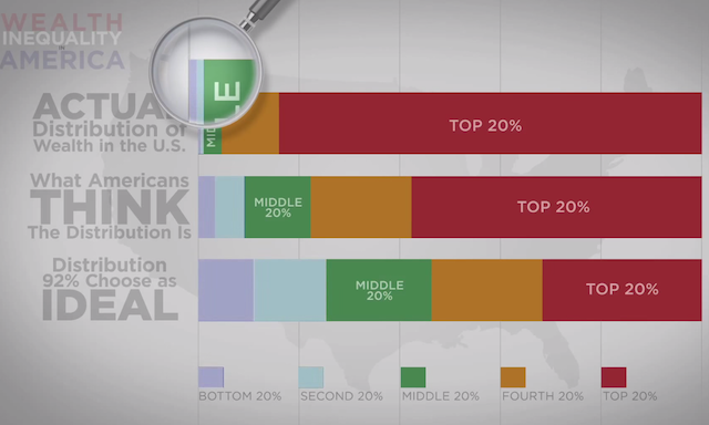
This video presents the fascinating misconceptions surrounding the perceived extent of wealth inequality in the US. The central theme is that there is such a disconnect between what is seemed to be the reality, what is seemed to be the ideal and what IS the actual.
It is no surprise to see that the video has been shared by so many (even though its place on Mashable gives it a good chance!) because it a nicely executed and well structured story that is enhanced by the animation – unlike many others that use this as a gimmick.
For other data visualisation designers out there who don’t have the luxury of working with video/animation, examples like this also offer an opportunity to dissect and learn about what features make this succeed and how we can attempt to translate this success to static work, for instance. I often talk about the different layers of visualisation design and this is a case when the importance of arrangement and annotation would come to the fore, in particular:
- How can you best architecturally structure a work so that it implies sequence, hierarchy and therefore story?
- How can you size and group elements so that they create a logical layout?
- How can we maximise the inclusion of explanatory/assisting annotations to explain and almost narrate the story?
I know it’s only Monday, but maybe set yourself the challenge of working out how you would recreate this piece in a static format, perhaps on a single screen or sheet of paper (not on an endless tower infographic).