
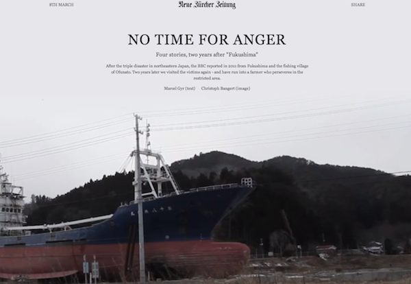
In the last hour or so, Benjamin Wiederkehr and his talented crew at Interactive Things have shared work they were involved in for Swiss German-language newspaper Neue Zürcher Zeitung. The project is titled ‘No time for anger‘ and looks at four stories two years on from the Fukushima disasters.
Just wanted to highlight two really nice visualisation features of this project.
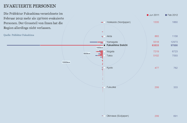
Firstly I really like this relatively simple approach to show magnitude of evacuees across Japan’s major cities. Rather than going for the obvious (or maybe more accurately ‘automatic’) approach of showing a map and dropping different sized circles over each location, I think this is a great alternative. It maintains a sense of Geography by displaying the relative distance from Fukushima and then delivers on the reading-accuracy front with the use of slim bar charts. Reminds me of the work done by Bill Rankin.
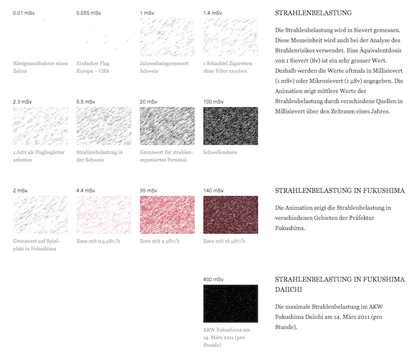
Secondly, this chart illustrates the different levels of risk from and strength of radiation, presenting a range of different contextual scenarios to then enable comparison with the reality of the situation in different parts of Fukushima. I love the animated particle legends, feels like a living texture and perfectly captures the essence of these shocking values, especially the levels at the plant itself.
Even though I can only read this through translation from ‘Google Translate’, it is clearly a very immersive and impressive project. You might sense the possible influence from the recent multimedia, multi-chapter story from the New York: ‘Snow Fall‘.
Well done to all involved!