
Your chance to shape my training schedule
Over the past 18 months it has been a great thrill to have the opportunity to travel the world and deliver training courses in data visualisation.
Your chance to shape my training schedule Read More »

Over the past 18 months it has been a great thrill to have the opportunity to travel the world and deliver training courses in data visualisation.
Your chance to shape my training schedule Read More »

Came across this online resource by chance but the BBC College of Journalism site looks an excellent repository for some handy tips about all sorts of communication-related disciplines that can be applied to the practice of effective data visualisation
BBC College of Journalism Read More »
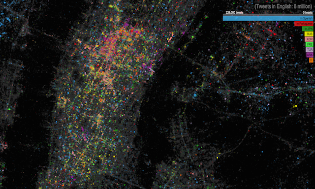
I’m not always positively struck by social-media related visualisations, however, I do like this Twitter languages map of New York project from James Cheshire, Ed Manley (of CASA) and John Barratt (of Trendsmap) – as well as several others.
Twitter languages map of NYC Read More »

At the end of each month I pull together a collection of links to some of the most relevant, interesting or thought-provoking web content I’ve come across during the previous month. Here’s the latest collection from January 2013.
Best of the visualisation web… January 2013 Read More »
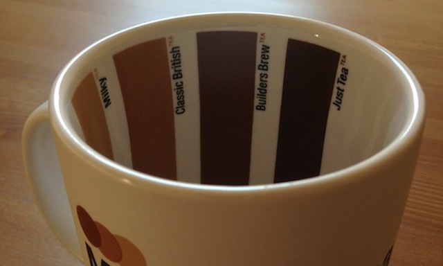
Sometimes I find myself lazily defaulting to posting things on twitter but forget that, on occasion, they are of such grand importance that, really, they should be shared with the wider world. Here is one such example.
Visualising the strength of tea Read More »
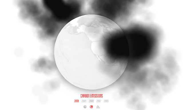
Thanks to FastCo Exist I’ve come across this interesting use of WebGL to create a 3D interactive visualisation of the world’s carbon emissions.
3D smoke visualisation of world’s carbon emissions Read More »
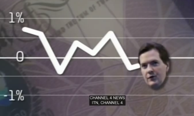
Thinking of re-profiling your work in to a more lucrative direction? Look no further than the latest boom industry – the ‘sad graph’ designer. Here’s a funny clip taken from Charlie Brooker’s BBC Weekly Wipe show.
The boom of the sad graph designer… Read More »
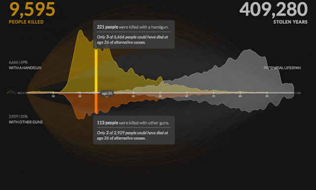
This week Periscopic released a striking new project titled ‘US Gun Murders in 2010’. It has already been showcased on all the major data visualisation and design sites, and rightly so. I love it.
Why I like really this visualisation: US Gun Murders 2010 Read More »

Every now and then I’m happy to justify to myself a rather indulgent post and today has a particularly warranted feel to it. Today marks the third anniversary since I launched visualisingdata.com and published my first post.
Celebrating three years of blogging! Read More »