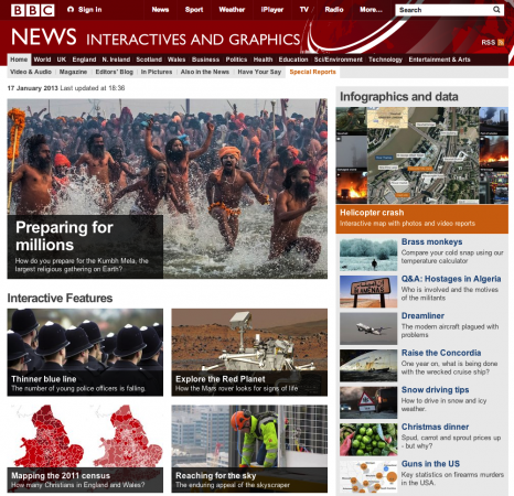
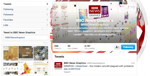
This is just a general observation that I shared on Twitter but wanted to capture it and share it on here. It has been noticeable over the past few days how much increased visibility/output there has been from the BBC with regards to its Interactive and Graphics work. This has been most prevalent on its Twitter feed @BBCNewsGraphics.
I’m not claiming to be some clairvoyant (though I will accept accusations of high-levels of wisdom and astuteness) but I did hope/forecast – in my 10 significant developments post of July – that the impact of the new Visual Journalism unit would help realise its incredible potential.
Whether or not this pattern of activity is linked to the creation of this unit is another matter but nevertheless it is good to see this great organisation start to leave a greater footprint on the data visualisation and infographics scene. Keep a watch on their dedicated collection site of graphic-related work as it hopefully continues to grow.