
Those of you with memories that stretch at least 362 days will recall my rather incendiary post (kind of) from December of last year that brought attention to the utter uselessness of Google’s 2011 Zeitgeist interactive report.
2011 Flashback…
Remember this beauty? The hovering-slidey-transparent-3D bar disaster?
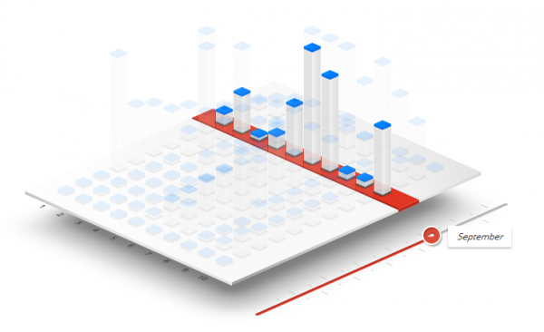
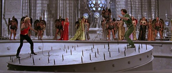
It always reminded me of the tilting spikey platform in Flash Gordon.
2012 zzzz
Anyway, Google have now launched the Zeitgeist 2012 report and its… well… just nothingness.
Aside from just publishing a load of lists and then compiling them in to a downloadable pdf file, they have rolled out one of the dullest and most pointless interactive mapping experiences you’ll find (watch it in highest quality to maximise the blandness and to particularly enjoy the hover events: insightful).
For a landmark report, for an organisation so intrinsically associated with data and technology, for all that technical and creative brain power, this is the best they can do?
Have they waved the preverbal white flag and declared they are out of ideas? Maybe the Zeitgeist report is now seen internally as being on a par with having to empty the dishwasher or vacuum the car.
Either way it is such a missed opportunity for such a prominent organisation to have wowed us with their latest developments.