
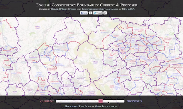
Just come across this great, simple and really effective project from Oliver O’Brien (@oobr) and James Cheshire (@spatialanalysis) of UCL CASA (Centre for Advanced Spatial Analysis). What may seem a particularly dry subject matter, the proposal for parliamentary constituency boundaries for England, is made extremely accessible by this tool which allows you to very elegantly compare and contrast the proposed boundary changes.
Above is a recording of me using the tool earlier. You can zoom in on a location of interest (or your home/current location) and then, using the slider, you can compare the proposed changes with the current boundaries. The subtle switching of focus between blue and red and, most prominently, the two overlayed at the same time is a great solution to this setting. If it was two displays side by side you aren’t able to easily compare, if it was the two states permanently overlayed on top of each other it would be too busy and hard to distinguish the fundamental shapes. The slider is the star so a hat tip to James and Oliver for deploying this device.