
This post is not really an article more of a pointer to go elsewhere. Unless you’ve been absent from the data visualisation and infographics scene over the past 10 days, you can’t have failed to have come across one of the many amazing graphics that have been produced by the New York Times during the course of the Olympics.
Every day they have been publishing insightful explanatory graphics and analysis on the most current events at the Games, whether it is a historical comparison of race results or a forensic breakdown of an athletic techniques the quality of the execution has been phenomenal.
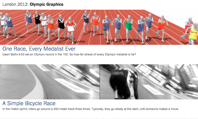
The image below is just a screen grab from the web page which holds the full collection published so far. Of course with a few days remaining there will still be plenty more added to this list and I would urge anyone interested in expert-level information graphics to take a look.

I imagine some people think I’m overly gushing about the NYT. Well I am gushing, but don’t think it is unjustified. This is simply incredible work in its own right but, as I keep banging on about, it is also thrown together in such a rapid timespan that you are just left scratching your head working out how they’ve managed it. I suspect the Malofiej 21 judges will be handing out plenty of these next March…

As many of the Twitter comments I’ve seen have expressed, this is simply face-melting stuff.