This is a guest post from Jon Schwabish, an economist and data visualization creator. You can reach him at jschwabi@yahoo.com or by following him on Twitter @jschwabish.
As an economist working for the federal government in the United States who also doubles as someone trying to use new data visualization techniques, I’m often struck by commentary that divides the data visualization community into two broad groups: academics and practitioners. Presumably, such commentators mean to group me and my fellow government analysts into that practitioner category. I think of people in my profession as more than just practitioners of data visualization, however; we use data visualizations to help us create, analyze, interpret, and even publish data and analytic results for a variety of audiences—the White House, Congress, regulators, press, the public, or any number of interested groups. Yet the graphical displays many government agencies publish are not employing best practices or new innovations in graphic presentations, such as stand-alone infographics or interactive investigative data tools.
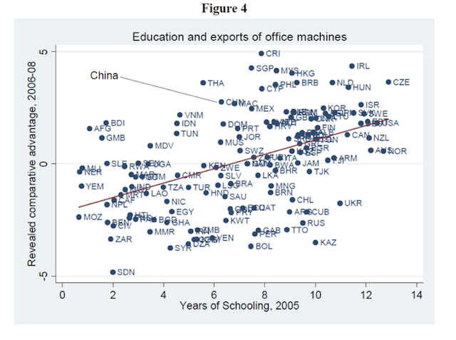
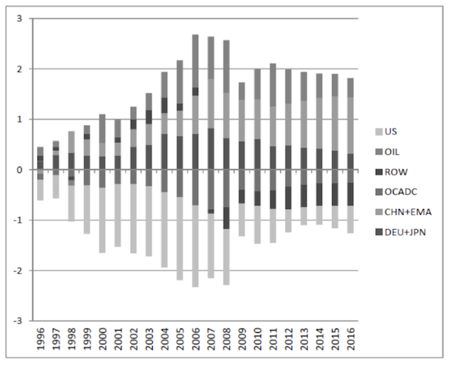
In my experience, the poor graphical presentation of government data and analysis stems from two factors: First, tight budgets that constrain the ability of government agencies to hire people with skills and backgrounds in graphic design and data visualization; and second, a large number of economists and other analysts who tend to not prioritize graphical displays as part of their analytic presentation. Take, for example, the two graphs below, both of which fail to employ best practices routinely discussed in the data visualization community, namely clear labels and clear presentation of the data. In the first—a scatterplot that shows the relationship between education and exports—try finding the 5 countries the author specifically discusses in the text (China, Costa Rica, Malaysia, Philippines, and Thailand). In the second—a bar chart of a region’s trade as a share of GDP—see if you can figure out which part of the bar belongs to which region.
Source: Gordon H. Hanson, The Rise of Middle Kingdoms: Emerging Economies in Global Trade, http://irps.ucsd.edu/assets/001/503233.pdf.
Source: Menzie D. Chinn, China, East Asia, and Global Rebalancing, http://www.lafollette.wisc.edu/publications/workingpapers/chinn2012-006.pdf.
Some government agencies are trying to improve their graphics and present their information and analysis in new ways, using techniques and strategies drawn from the data visualization field. For example, the Congressional Budget Office (CBO) has been releasing static infographics for about a year now. CBO recently released an infographic about the Social Security Disability Insurance program, which accompanied an in-depth report on the same topic. (Disclaimer: I am an economist at CBO and also serve as a data visualization specialist at the agency; the thoughts in this post are mine and not those of CBO). The Census Bureau has started its own data visualization efforts and has recently released two static infographics on Census data products. The White House employed the services of Edward Tufte as part of the Recovery Independent Advisory Panel to help create new visualizations to better inform the public about how the 2009 economic stimulus package was spent.
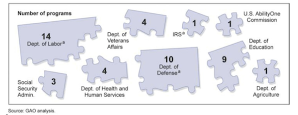
For every government agency that is creating better graphics, however, there are others creating poor visualizations. And I’m not just referring to poorly designed infographics or interactive websites; I’m referring to basic graphics in regular reports, studies, and testimonies. The Government Accountability Office, for example, released the following graph in the introduction of a report in June (my guess is that this graph would make Stephen Few ill).
Source: Government Accountability Office, Employment for People with Disabilities, http://www.gao.gov/assets/600/592074.pdf.
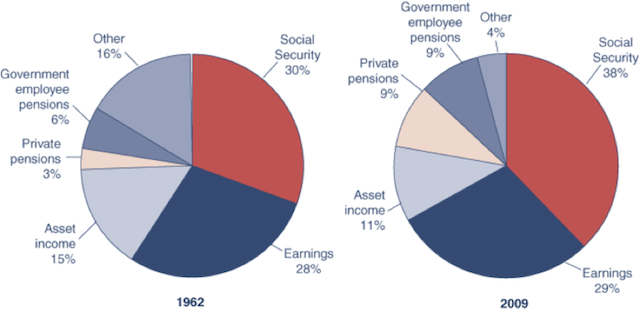
Or these pie charts from the Social Security Administration (I guess the small gap between the ‘Other’ and ‘Social Security’ sections in 1962 must be the missing 2%?):
Source: Social Security Administration, Fast Facts & Figures About Social Security, 2011, http://www.ssa.gov/policy/docs/chartbooks/fast_facts/2011/fast_facts11.html#chart6.
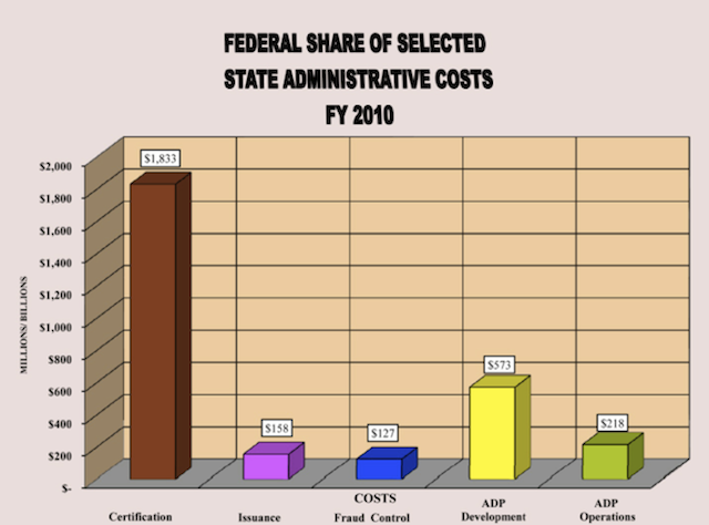
Or this 3D column chart on state administrative costs for the Supplemental Nutrition Assistance Program (SNAP, formerly food stamps). (Thanks to the 3D representation, the top of the first bar doesn’t exceed $1,800 even though it’s labeled $1,833; there’s also a bizarre y-axis label—“MILLIONS/BILLIONS”; and the bright yellow color unnecessarily draws the eye to the “ADP Category”—but I digress).
Source: U.S. Department of Agriculture, Supplemental Assistance Program (SNAP) State Activity Report, Federal Fiscal Year 2010, http://www.fns.usda.gov/snap/qc/pdfs/2010_state_activity.pdf.
Finally, every month, the Bureau of Labor Statistics (BLS) releases a report on the employment situation that starts with a line chart and a bar chart and is followed by nearly 40 pages of tables (for example, see http://bls.gov/ces/). Although the tabular data are available through different extraction tools on the BLS website, perhaps more could be done to present those results visually in order to better show the nation’s employment picture to the general public.
One impediment to better graphics may be that government agencies are—rightfully so—more focused on creating and analyzing data than on coming up with clear and innovative ways to show it to their constituents. But making better graphics does not require an extensive background in computer programming (though many government analysts are programmers) or graphic design; instead, it requires thinking more carefully and creatively about how to present data and analysis and a willingness to seek guidance from the data visualization community. At the very basic level, that simply means following Tufte: ‘reduce chartjunk’ and ‘show the data’.
Adhering to those guidelines and presenting their data and analysis to the public in clear, easy-to-understand graphics will enable federal agencies to better educate the public about the challenges facing the nation and engage them—and policymakers—in a meaningful dialogue to address those issues.
Postscript. For an introduction to best practices for data visualization, I recommend any of the books by Edward Tufte but especially The Visual Display of Quantitative Information. Stephen Few’s books are also excellent, especially Show Me the Numbers. Dona Wong’s The Wall Street Journal Guide to Information Graphics and Naomi Robbins’ Creating More Effective Graphs both have good lessons, tips, and strategies. If you’re interested in seeing examples of bad graphics and ways in which they can be improved, I recommend Junkcharts.com. For those who want to learn how to make better graphics using Excel (many people’s graphics workhorse), check out the tutorials at the Peltiertech.com or Chandoo.org websites. Finally, the Flowingdata website and associated book Visualize This have excellent examples and tutorials using the R language.

