
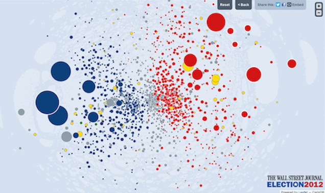
The Wall Street Journal have tonight released a massive, immersive and ambitious data visualisation project entitled ‘Political Moneyball‘, which visualises over a million records to reveal the networks and relationships that exist behind political contributions.

The interactive tool, developed by the always-brilliant duo of Sarah Slobin and Andrew Garcia Phillips, creates a powerful, flexible interface to explore the political donations as declared to the US Federal Election Commission.

By navigating around the many different political committees, parties and, of course, candidates, you can learn about the volume of donations made and received by all these political ‘actors’ as well as by those individual funders not part of this committee scene.
One word that best describes this piece is ‘heavy’, and that’s is in the best possible sense: it is heavy through the weight of data records and also heavy in the richness and variety of routes into the data, with so many dimensions and interactive features (such as filtering, view switching, following pre-discovered headline stories). There is simply so much going on with this work it is incredible and I urge you to have a go and spend some time interacting with it to truly appreciate its size and depth.
As befitting a visualisation and data framework of this vastness, this is not a project that you would or should expect to be instantly ‘graspable’. It requires the user to invest time in understanding how to use the features and how to read the findings. The entrance to the interactive is an explanatory screen which gives user an introduction in to what they are about to see, describing the basics of the interactive and offering a link to a video tutorial, shown below.
This level of care for the user’s experience is wonderful, it shows respect for the complexity of the visualisation’s context as well as the reader: the designers clearly care about us users being able to understanding how to navigate, explore and interpret the visualisation. This is supported, once you get through to the main screen, by a detailed methodology and a host of annotation elements which really equip us with all the information and guidance required.
All in all a hugely impressive piece and one that a 30 minute free wifi pass in Munich Airport won’t allow me to sufficiently explore right now!