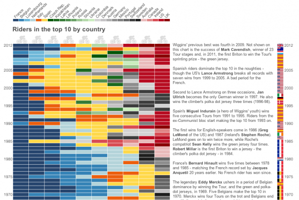
Just a quick post to respond to a piece I’ve just been sent because it reinforces one of the issues I point out in my training sessions. The graphic was produced by the BBC in reaction to Bradley Wiggins’ victory at the Tour de France, in an attempt to highlight the UK’s long wait for a winner. Well, that’s the title, but the graphic actually goes into a slightly different direction with an analysis of the prevalence of English speaking competitors in the top 10.
If you can’t be bothered to count, there are actually 27 different countries represented by the colour legend, but can you easily tell the difference between Russia and Slovenia in the chart? How about the US and Ireland or Germany and Mexico?
There is plenty of evidence in colour theory text (particularly see Colin Ware, ‘Visual Thinking for Design’, chapter 4) that any colour scheme representing categorical values (like countries in this case) that going beyond 12 classifications will make it difficult for the viewer to easily and reliably interpret the differences thereafter. Ideally you will stick to a maximum of about 8 but certainly the usage of 27 categories puts unnecessary extra cognitive burden on the viewer and increases the amount of visual searching, navigating between the legend and the cells to make out the meaning.
I can see what was trying to be shown here, clustering the regions and languages of countries to highlight the different eras of dominance, but it would have been better to reduce the colours and bulk some countries together into regional labels.


