
With the start of the 2012 London Olympics fast approaching, the quantity of infographics and visualisations about the games are naturally popping up everywhere. Of course the subject of these will tend to be about the sporting events themselves but one that has come to my attention today offers a beautifully simple approach to portray some alternative information.

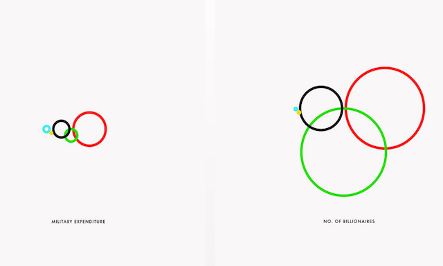
Entitled ‘oceaniaeuropeamericasafricaasia‘ this design produced by Gustavo Sousa uses the Olympic Rings, depicting the continents Oceania, Europe, Americas, Africa and Asia, to portray a range of fascinating global indicators with the size of the ring representing the size of that continent’s value. There are indicators such as homicides, prisoners, catholic and gun ownership.
There is something so engaging about this minimalist design and bravery too, in choosing not to show the legend, include no labels, no values, and no scale. All that remains is the title, presumably to act as the reminder for the intention of which rings represent which continents (given there is no official intended representation or association). It is reduced to its core purpose of creating a reaction to the different sized rings we see across the gallery.
However, having looked closely at the data portrayed in the ring sizes, my issue is do the rings themselves actually correspond to the sequence of continents in the title? If you look at Population, based on the title I presume the green circle is Africa but Asia’s population is about 4-times larger than Africa. Is Child Mortality really that bad in Europe? Instinctively (maybe I’m just way off) this feels like it could be the figure for Africa? Does Asia really have the largest Coca-Cola sales?
I suspect the colours are actually, from left to right – Oceania, Africa, Europe, Asia, Americas – and therefore the project title should be ‘oceaniaafricaeuropeasiaamericas’ instead!
I love the minimalist concept and the execution but sufficient doubt has been put in my mind. It could be that this is simply me having pre-conceived ideas about such global indicators but unfortunately I now want to see the labels, the values and the data sources.
You can see all the images on Gustavo’s dedicated Tumblr or by viewing the video below.