One of the matters that I cover at the start of my data visualisation training courses is a brief reflection on visualisation’s popularity in a mainstream sense and how it has now penetrated (and continues) parts of culture and society that it would never really have managed to do even 5 years ago.
I’ve just been reading my Twitter timeline and noticed a retweeted post from a writer, columnist etc. called Emma Kennedy.
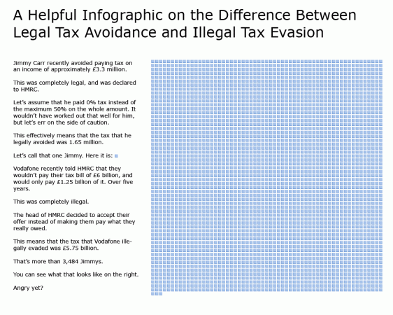
This tweet linked to an infographic (shown below) which tried to contextualise the recent troubles being experienced by UK comedian Jimmy Carr.
Now, I’m unsure whether Emma Kennedy actually designed this piece herself but, regardless, the original tweet has been immediately retweeted by many people including celebrities and comedians who have hundreds of thousands of followers.
It just shows you how deeply visualisation and infographics are embedded into the way we portray and digest information these days and how quickly these things can reach broad audiences. This graphic neatly captures much of the contextualising reaction that many have been tweeting about in their considered reaction to this story.
Click on the graphic above to see the full resolution version.


