
We’ve had a number of interesting new project releases of late (see this, this and that) and today continues that pattern with another super visualisation development produced for the International Energy Agency (IEA) on energy technologies. This work has been designed through a collaboration between Raureif (who recently worked with Moritz Stefaner on the OECD Better Life Index) and Christian Behrens.

This three parted interactive visualization is about projections for emission reductions, energy flows and transport indicators up to 2050 and it relies on the data and scenarios behind “Energy Technology Perspectives 2012” (ETP2012), IEA’s flagship publication on energy technologies.

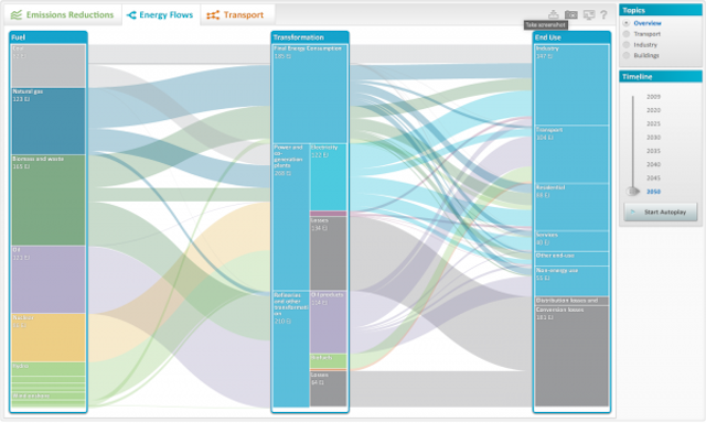
The centrepiece visualisation is that of the energy flows, as shown in the two images above, presented as interactive Sankey-style flow diagrams. These illustrate how the overall energy system and three of its sectors (transport, industry and buildings) will have to evolve from now to 2050 according to the scenarios outlined in the ETP 2012 publication in order to reduce emissions and limit average global temperature increase to 2°C. You can click on each part of the Sankey to see the individual ‘data pathways’ and also choose an autoplay function to animate the flow across 5-year periods towards 2050.

For the emission reductions and the transport indicators (shown above and below respectively) the user is able to explore different scenarios and regions to learn more about the data and find the stories that resonate with you.
![]()
Further features include an option to download the data and also take snapshot graphic images of your scenarios. You can explore the energy technologies visualisation here.