
Last week I posted a slideshare version of my slides from a recent pair of presentation events in Chicago. The title of this talk was “The 8 hats of data visualisation”. In this article I want to follow up these slides with a written accompaniment to contextualise and explain what I was presenting, as slides alone don’t really manage to achieve this effectively.

Background
Ever since I discovered data visualisation I have been intrigued by the many different subject areas and disciplines that contribute to its unique mix of art and science. This convergence of different ingredients introduces a wonderful richness and variety of concerns but can equally present quite a challenge for people looking to master the subject.
As the field continues to increase in popularity and exposure, penetrating more into the mainstream, and as data resources and technological capabilities continue to enhance at incredible rates, the opportunities and challenges similarly increase. For many, the prospect of trying to acquire and effectively demonstrate sufficient knowledge and skill across the board of requirements is something that can be either intimidating or at least exist as a perceptual barrier. There is a sense that to be successful you need to be a Superman or Wonder Woman?!

During my training courses I have met many people who have expressed a similar concern. More specifically, they don’t know where they fit in to the world of data visualisation. They aren’t trained designers, they aren’t skilled technologists, so how can they contribute to the design process?
Typically I find these people to be extremely bright, sharp individuals with a keen sense of the analytical dimensions that might be most interesting to surface in a visualisation. They might also be great organisers, leaders and be able to pull a team of people together to create a solution. The key point here is that everybody can find a role, even if they are not capable in certain areas because collaboration with others who can plug such gaps is so much more feasible these days. There are plenty of other duties required that don’t have such technical capabilities or experiences.
Furthermore, we should assess more closely the role of technology in data visualisation. I’ve somewhat paraphrased or maybe just echoed Aron Pilhofer (of the New York Times), but doing data visualisation well is ‘less a technology problem, more a people problem’. So, if you don’t have the tech skills but have the people skills – there is a role for you. Similarly, if you do have the tech skills, you need to ensure you also have the people skills.
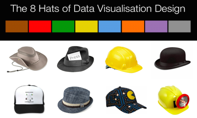
Why the 8 Hats?
Having spent a number of years assessing and learning about effective visualisation design I was interested to take a specific analytical look at the range of different capabilities required to ensure that any project is undertaken in the most rounded sense. These can be roles fulfilled by a number of people or they can be the different, deliberate mindsets of an individual to ensure that the problem is viewed and tackled from all necessary directions and not from a limited perspective. This is where I came up with the 8 hats of data visualisation design.

A couple of things that motivated the concept of the 8 hats.
Firstly, and obviously, was Edward de Bono’s 6 thinking hats, which essentially relates to the different thinking perspectives we should try to occupy when trying to reason and solve with complex problems.
Secondly, and far less obviously, I remebered a cartoon I used to watch as a kid (and probably only UK people will recognise) called Mr Benn.
The basic narrative of the story was that, in each episode, Mr Benn would go into a fancy-dress shop, try on a particular outfit and then would enter through a secret door in the dressing room into a magical world and live out an adventure appropriate to the costume.
So, this idea of taking on different characters or different characteristics resonated with my intentions for these 8 hats. It is not meant to be scientific, it is based on an instinctive sense of what is important. Furthermore, it is not presented in a way which gives any weight or hierarchy, rather a collection of the issues and duties that need covering off.
The 8 Hats


The Initiator is the leader, the person who is seeking a solution to a given problem, curiosity or opportunity. The hat is that of an explorer, they want to explore data and different design avenues to find answers to problems or evidence to their researcher mindset. They may have been commissioned with the project or might have conceived it themselves, fulfilling their nature as a thinker.The initiator will establish the analytical direction of the project, identifying the fundamental purpose and motive, which in itself will dictate the tone and style of the potential solution. Is it about explaining or exploring or expression? Is it something that is motivated by a need to facilitate maximum interpretation accuracy and efficiency or more about creating an emotional engagement with the subject matter?
The initiator will also identify and set out some of the key parameters surrounding the project such as the clarity and definition of the brief, the intended format/platform of the solution, the nature of the audience (size, type) and an initial view on the proposed resolution of the data solution (headlines, full details).


The Data Scientist is characterised as the data miner, wearing the miner’s hat. They are responsible for sourcing, acquiring, handling and preparing the data. This means demonstrating the technical skills to work with data sets large and small and of many different types. Some might come from corporate systems, others from web scrapes or via an API, some of it may also come from tricky pdfs.Once acquired the data scientist is responsible for examining and preparing the data. This means identifing and addressing data quality issues and generally preparing it for its analytical purpose (eg. parsing, merging, freetext > keyword converting). It will also be necessary to consider and source additional sets of data to mashup and enhance or consolidate the potential data stories.
The data scientist will also hold the key statistical knowledge to understand the most appropriate techniques and mathematical methods. They will apply this to undertake the initial descriptive analysis of the data, to commence the familiarisation process of this raw material. They will also begin to undertake exploratory visual analysis to learn about the patterns, relationships and physical properties of the data.


The Journalist is the storyteller, the person who establishes the narrative approach to the visualisation’s problem context. Working with the Data Scientist and the Initiator, they have the nose for the key stories and angles with which to slice the analysis and present the stories.They work on formulating the data questions that help keep the project’s focus on its intended editorial path. Building on the Initiator’s initial steer the Journalist will develop a deeper researcher mindset to really explore the analytical opportunities.
As with any research process, the approach may be inductive or deductive, but either way, the journalist is at the heart of the action, seeking to find the answers to move the project on from the preparatory/groundwork activity and on to its design stage.
As Edward Tufte says, ‘Good content reasoners and presenters are rare, designers are not’. That is the responsibility of the Journalist.


The Computer Scientist is the executor, but not in the sense of destruction, rather this is the person who brings the project alive. With their critical capability they are ultimately the ones who will construct the key solutions at the design stage and also bolster the Data Scientistwith technical know-how to most effectively and efficiently handle the data gathering, manipulation and pre-production visualisation activities.The breadth of software and programming literacy will have great bearing on the potential speed and sophistication of the data visualisation solution. It may be restricted to some basic Excel, Tableau and web publishing skills or may involve strong programming abilities with powerful environments such as Processing and D3.
Alternatively, the final technical solution may not be an innovative interactive online work but instead an infographic or static poster display, in which case technical skills with illustration packages like Adobe Illustrator will be all-important.


The designer is the creative, the one who, in harmony with the Computer Scientist, will deliver the solution. They have the eye for visual detail, a flair for innovation and style and are fully appreciative of the potential possibilities that exist.However, they have the necessary discipline too to follow the message established by the Initiator and taken on by the Journalist. They respect the capabilities of the Computer Scientist in terms of what solutions could be feasible but themselves have the helicopter-like vision to rationalise and reason what things will work and will not work, and why.
Their key responsibility is also to be capable of ensuring the harmony of the solution between its form and its function, ensuring it is aesthetically appealing to draw in the reader whilst fundamentally delivering the intended, communicated message.
Acting almost like a film director, they have many competing decisions to make, particularly around managing the five key layers of any visualisation’s anatomy: data representation, colour and background, layout and arrangement, animation or interaction options and the annotation layer.


The Cognitive Scientist is the thinker in terms of appreciating the science behind the effectiveness of the technical and designed solutions.They have the visual perception understanding to inform how the eye and the brain work most effectively and efficiently. They also have clear know-how about principles or theories like the ‘Gestalt Laws’, are familiar with colour theories, well versed in Human Computer Interaction issues etc.
They also can inform the design process in relation to the complexities of how the mind works in terms of memory, attention, decision-making and behavioural change.


The Communicator is the negotiator. With their hard hat they act as the client-customer-designer gateway informing all parties of the respective needs, feedback loops and progress updates.They need to be able to articulate and explain matters to different types of people, technical and non-technical, and be capable of managing expectations and relationships.
They need to be close to all stages of the process, understanding requirements, appreciating restrictions, recognising possibilities and then ultimately launching, publicising and showcasing the final work.


This role is simply the manager, the person who does much to pick up many of the unpopular duties to bring the whole project together. They manage the process and look after the project’s progress, ensuring it is cohesive, on time and on message.They understand the brief, recognise the parameters of the project as identified by the Initiator but also identify others of their own such as the inherent pressures (time, editorial), the rules surrounding the work (visual identity, layout restrictions), the capabilities of the available technical resources and, critically, the people management side.
Ultimately, this role or mindset is required to ensure things get finished, they need an eye for detail, the commitment and patience to check everything and should also be concerned with integrity matters like visualisation/statistical ethics.
Summary
If we take a look at how the relevance of these mindsets and duties surfaces at different points of a typical visualisation design process, we can see the importance of being able to manage your focus and perspective according to the stage of your progress.

Too often we see examples of work where there has been an immediate rush to produce a pre-conceived design or an excitable technical solution without all the preparatory work undertaken beforehand and the discipline to treat the project with the thoroughness of thought required.
Similarly, we see plenty of works that look like they could have been capable of providing really fascinating insights. They ask the right questions and seemingly tell the right stories but the technical execution, whether through an interactive design or illustration, is ultimately flawed and undermines the whole piece.
You could easily argue about some of the labels and descriptions of how the mindsets and duties have been carved up and allocated but hopefully you will be able to appreciate the many varied responsibilities that anyone delivering a data visualisation solution needs to demonstrate, regardless of whether this is an individual or collaborative design process.
Finally, it will help you recognise where you fit it in to the spectrum of duties and responsibilities, helping you identify your strengths and your weaknesses accordingly. You may then choose to address these weaknesses personally or plug the gaps with support from others.

