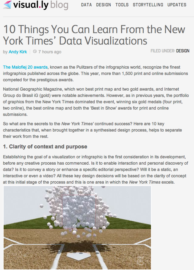
Really happy to have had the chance to publish a post on the impressive Visual.ly blog. In this article I have reflected on my experiences during the judging process at Malofiej and tried to isolate some of the most important characteristics of the all-conquering New York Times’ graphics department.
Click on the preview image below to read the full article.

