
Esquire magazine (or more accurately the web version) has published the results of an interesting project titled ‘The United States of 2012‘ where they commissioned five different mapping concepts from a range of artists and designers to “reflect the state of things this year”. For visualisation fans, three of the five submissions were produced by familiar names: MIT SENSEable City Lab, Eric Fischer and Stamen.
Red state, blue state, big state, small state, north and south and east and west: How we define our similarities and differences with each other often comes down to where we see ourselves on the map of America. But what if we threw out the standard-issue version and started over with something new?
MIT SENSEable City Lab: The United States of Cities

The SENSEable city lab designers used anonymous, aggregated cell phone data depicting commuting patterns in eight major US urban area to demonstrate how mobile the definition of the workplace has become and the changes this is making to people’s lifestyles.
The data was compiled during the month of July 2010 from several million commuters who communicated via cell phone; the colored dots represent the commuters’ home locations, while the rings and their intensity represent the number of commuters traveling. The resulting map shows a breaking down of the traditional idea of a nation of states, and, instead, an ever-expanding urban sprawl that pushes the limits of our respective cities. This is a version of America that’s not based upon politics, or history, but one that’s constantly moving.
You can read more about the project and see more photos on the United Cities page.
Eric Fischer: The Real-Time City

As we have seen with many of Eric Fischer’s work in the past, he is a master at taking photo data from sources such as Flickr to create new narratives about where “the action is: the places we photograph to preserve, the places we tweet about”. In this project he aims to transform the map of the US, removing the sense of real geographical size and shape through a cartogram approach to scale areas according to their density of geotags from 8.7 Million geotagged tweets (from 2011) and 9.4 Million photos tagged from Flickr (2004 – 2011). Eric’s United States is an “interconnected web, the lines of which consist of a series of dots that each represent one tweet or one photo”.
Eric adds his own reflective thoughts on this Flickr site:
I still think it might work at a poster size, but a computer screen is really too small. The colors for the different states are arbitrary, just to give you a little more to orient yourself with since the shapes are sometimes so distorted.
Stamen: Where Does the Money Go?

This piece from Stamen combines migration data from the Internal Revenue Service (IRS) with route information from MapQuest Open to show population movement alongside income flow building up an interactive image view of the 48 (contiguous) US States arranged by order of most county-level income lost through to the most gained.
Explore the loss and gain of income for counties using the slider above, type in a city or county you’re interested in into the county search box, or click anywhere on the map to view a county. When you see blue trails on the map (like this influx into Yuma County, Arizona), that means that people were moving to a particular county; red lines (like this exodus from Bristol County, Rhode Island to Florida) means they’re leaving that county.
You can read more about the design and the stories from this design on Stamen’s site.
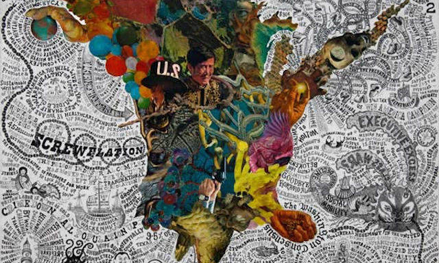
Just for completeness, the additional pieces that make up this series of five designs are more artistic in approach and come from Interboro Partners with their work “The Arsenal of Exclusion & Inclusion” and Dominic McGill with “We Are All Keynsians Now”.

