After the November release of ITO World’s road casualty mapping service for GB and the US (the launch being timed for the World Day of Remembrance for road traffic victims), the BBC website is also running a special feature this week around road traffic accidents and is showcasing a number of visualisation pieces, some more effective than others.
The centrepiece of the series is a live ‘#crash24’ blog occurring today (6th December) which logs and maps all the recorded call outs to collisions and road accidents across London.
There are a number of additional features which present a variety of information relating to road traffic accidents from 1999 to 2010. Rather confusingly, the repeated title at the top of the page implies that all the information, statistical and visualisation displays concern deaths on Britain’s roads but some elements, such as the animated time lapse maps (below) actually present the location of all the 2,396,750 road crashes during this period, not all of which resulted in death or indeed casualties.
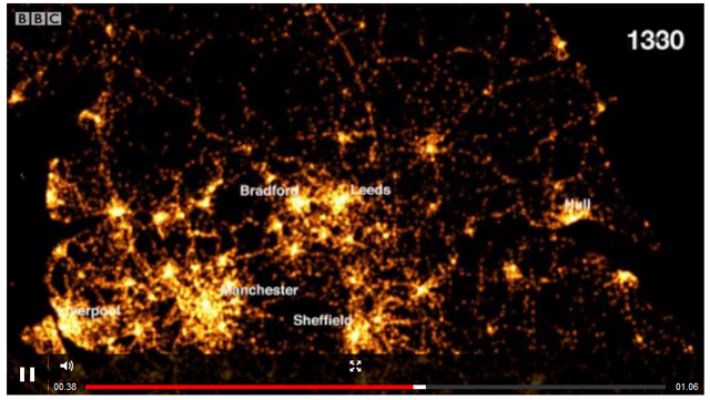
The time-lapse maps are elegant and entrancing displays of all the road crashes over the period showing a dot of light for each recorded incident across a 24 hour/7 day week time frame. There are different views available for different regions of Britain.
The presentation of aggregated data for 12 years provides a slightly un-graspable chunk of data, by which I mean we probably relate conceptually better to the idea of a single year of data. I’m also not sure why the animation goes through three cycles – the second cycle does include an annotated label for 6 major cities but not sure why there is a third?
That said, the visualisation does have an impact in conveying the horrific quantity of these incidents, the pulsing display seems to create streams of fire (which add to the fearsome impression) as incidents are plotted around the clock, particularly around the populated cities and prominent during the rush hour times. Maybe the display could be enhanced with some accompanying facts and figures to help viewers draw some analytical insights such as an ongoing breakdown of collisions, injuries and fatalities, and perhaps a dis-aggregation of the 12-years of data in to individual years and months?
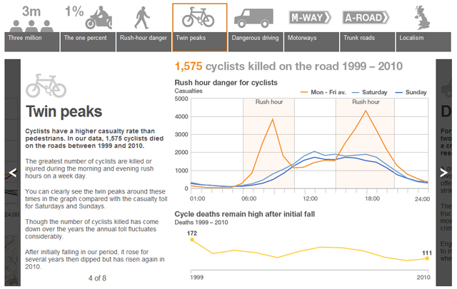
In addition to the time-lapse maps there is a ‘Did you know?‘ slide-show presentation of a variety of key stats and facts.
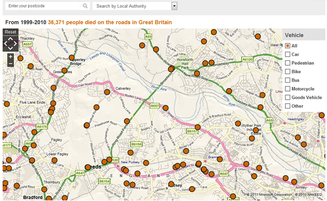
Finally, there is a facility which allows you to look up different regions or localities in Great Britain and see mapped data relating to the 36,371 road-related deaths. When you click on each point you can read a sobering, short summary of the incident and details of the poor people who died or were injured.
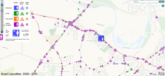
You can compare this with the one recently produced by ITO world which doesn’t include the textual summaries but provides effective visual representations to help distinguish between the nature and outcome of each incident.


