As you will have seen from previous posts, I was very grateful to be invited to contribute to the Visualizing.org data visualisation marathon in London. This was a 24 hour visualisation contest where students from across the UK (as well as a few teams from France and Belgium) competed to take a fresh and interesting dataset of certain relevance to London and produce compelling visualisations that tell a story.
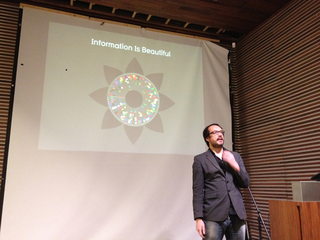
The event commenced with a brief session of opening talks from the organisers, sponsors and guest speakers (such as David McCandless below) to help launch the event, introduce the challenge and give the participating students some inspiration and guidance on how to go about the challenge.
The challenge involved a really interesting brief to explore and visualise a detailed dataset which revealed the attitudes and perceptions of UK residents towards the 2012 London Olympic Games. The student participants were asked to try to advance insights that could help London and future host cities get the most out of the Olympics.
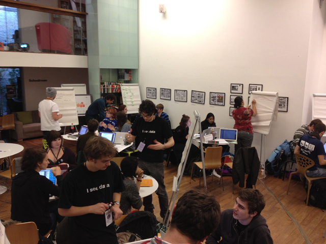
The students set about their task instantly and demonstrated really commendable energy, attitude and team working in the face of both an advanced visualisation challenge as well as the daunting context of a 24 hour, through-the-night working shift.
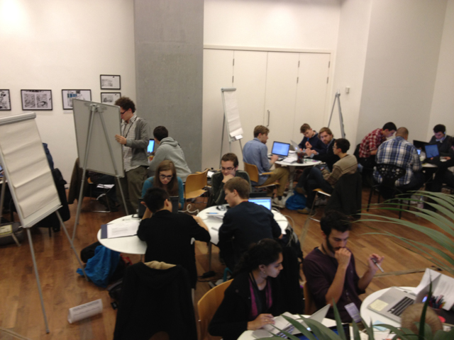
For a number of the teams who entered, this would have been their very first experience of taking on a data visualisation challenge, especially as they were representative of a wide variety of different degree subjects. Moreover, several teams were made up of first year undergraduates who will still be enjoying the first semester of their university careers. Some teams, it seemed, were also comprised of individuals who had not even met before to the event.
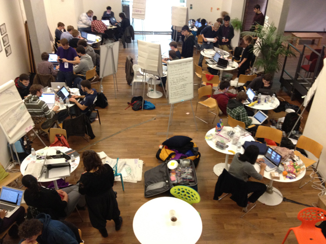
All this contextual information is extremely important to appreciate when making judgments about the quality and effectiveness of the resulting contest entries, a task I finally managed to complete last night.
Having been the final presenter before the launch of the challenge, and deliberately deciding to focus my talk on process and the importance of identifying the visualisation’s purpose, objectives and questions, I was a bit disappointed to see that only one or two teams subsequently (and visibly) took time to prepare and plan out their time, the task and the types of insights they were hoping to impart. I can completely understand the novelty of the situation and the excitement of just getting on with the task but there were several teams who almost immediately retreated to their laptops and launched various programming environments to begin coding.
The data contained over 100 fields (representing 4 demographic identifiers and 10 survey questions) and 2000 respondent records. With further, optional, contextual data available for the 2016 Brazil Olympic games, this provided an extremely rich resource from which a wide range of potential findings and stories could have and should have emerged.
I’m not going to go into detailed narrative about any individual submission, nor reveal my favourite submissions or otherwise. However, I would make the general comment that too few teams demonstrated an effective analytical response to what was the key line in the brief – “try to advance insights that could help London and future host cities get the most out of the Olympics“.
Overall, however, I would like to concentrate on the positives and really commend the students on their efforts. It is not by any means an easy discipline to undertake successfully without training and/or prior experience, and they will learn a great deal from the challenge. Incidentally, I would be more than happy to offer any help or advice to participants should they wish to contact me.
It was a great event, extremely well run and facilitated by the outstanding duo of Charlene and Alexandra and top marks to Visualizing.org/GE for running these events. Hopefully there will be more to look forward to like this in 2012.
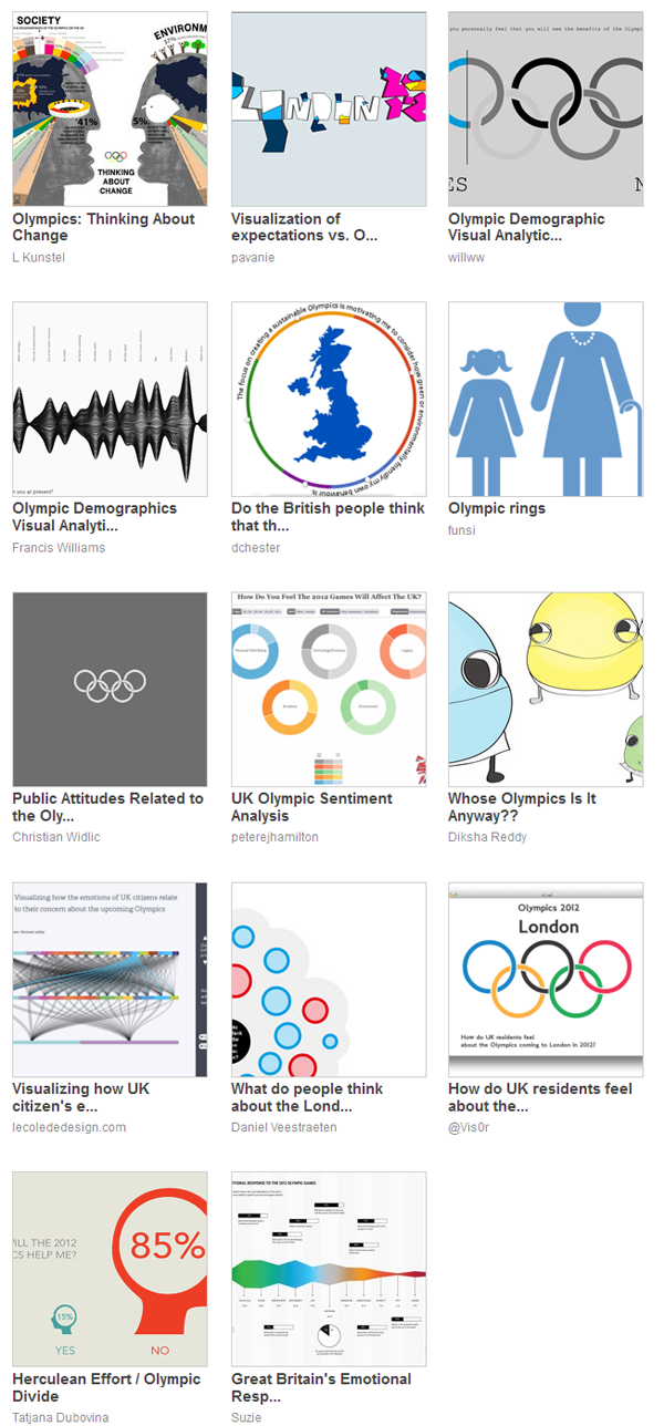
A gallery of thumbnail images can be seen below and you can visit the visualisations themselves to explore each one in detail (especially given a number of them are interactives).

