The excellent visualisation work of Eric Fischer will be familiar to many of you. During the summer he produced a stunning set of maps for 30 cities which displayed the locations of Twitter messages overlayed with the locations of uploaded Flickr photos. His latest project continues to explore Flickr data, this time visualising the seasonal and temporal variations in uploaded photos.
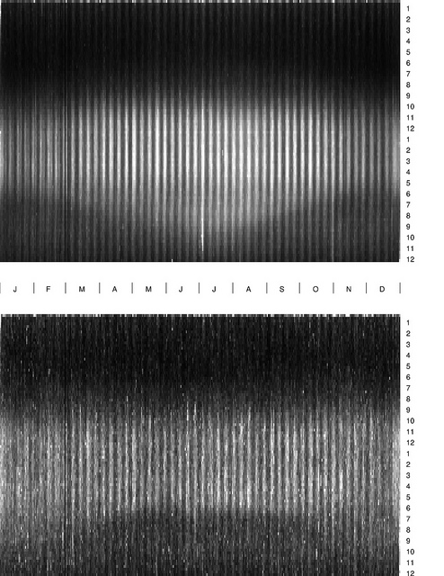
This visualisation presents the times of day when people are taking photos across the year, based on data from Flickr between January 2008 and December 2010. The top figure is for the northern hemisphere (summer solstice occurs in June) and the bottom figure is for the southern hemisphere (summer solstice in December). As he points out, the lack of clarity in pattern for the southern hemisphere is due to the significantly smaller data set, with only 8% as many pictures represented.
Don’t mistake the display being a representation periods of light and dark during each day – the white markings simply represent the tagged time of each photo analysed. As you would expect the summer month’s see people taking photos much later in to the evening, as you would expect with the longer hours of daylight. Interestingly, the effect of early summer sunrises does not seem to motivate people to get up and start taking photos any earlier than in the winter months. Notice the prominence of July 4 when people in the US, in particular, are up late taking pictures after dark.
Visit Eric’s Flickr Photostream to read more insights.

