
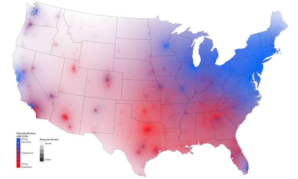
David B. Sparks, a fifth-year PhD candidate in the Department of Political Science at Duke University, has today published a fascinating set of experiments using ‘Isarithmic’ maps to visualise US party identification. Isarithmic maps are essentially topographic/contour maps and offer an alternative approach to plotting geo-spatial data using choropleth maps. This is a particularly interesting approach for the US with its extreme population patterns.
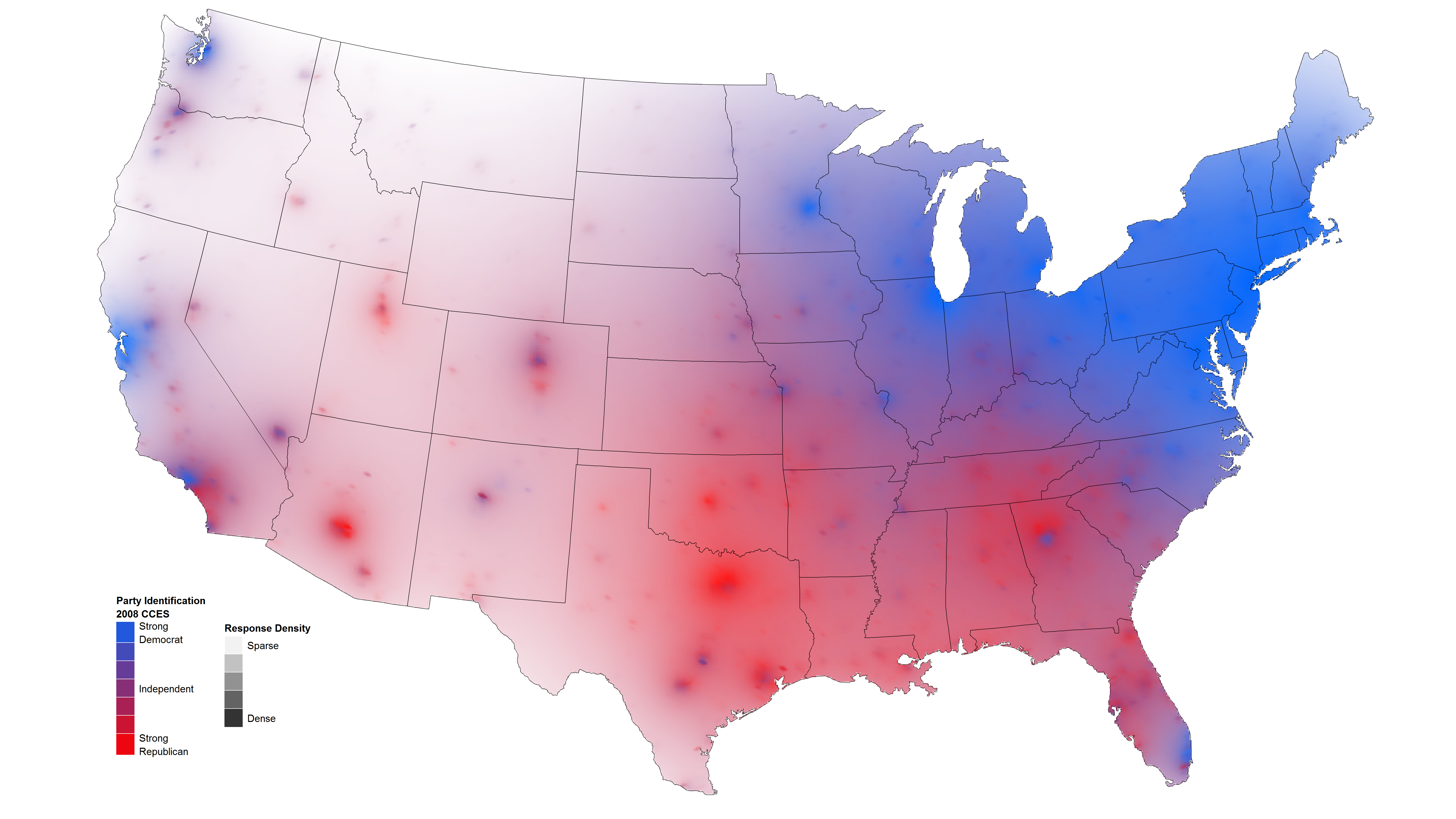
David uses hue to depict the strength of party identification using data from the 2008 Cooperative Congressional Election Study. Strong reds indicate a dominance of support for Republicans, strong blues indicate stronger support for Democrats, with purples reflecting an independence or general parity in opinion. Building on previous work experimenting with this mapping approach last year, he has now extended his visual encoding to include an extra layer of data presentation to depict density of respondents:
… since survey respondents are not distributed uniformly across the geographic area of the United States (tending to be concentrated in more populous states and around cities), I have attempted to convey a sense of uncertainty or data sparsity through transparency. Some early products of this experimentation can be seen below.
This layer is depicted by the ‘lightness’ of a region. In the image above he uses a white > dark scale, with the lighter regions representing the more sparse populations. He reverses this in the example below.

Interestingly, feedback suggests the use of black to depict the sparse regions is received better by people on an aesthetic level, but the use of white is believed to better facilitate interpretation. I agree with this – it is more intuitive to me to view sparse regions as white ’empty’ areas.
I think this is an excellent solution to overcome the challenge of effectively presenting a combined view of opinion data with the spread of respondents. Note, it is important not to confuse this approach with the problems demonstrated in this ‘Are the Richest Americans also the Best Educated‘ map which tried to encode three separate variables using hue alone.
You can see further isarithmic approaches to visualise attitudes towards abortion and family income levels on David’s published post.