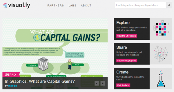
Today we welcome the latest notable development in the visualisation field. Just over three months after launching a teaser preview video of their offering, inspiring 60,000 people to sign up for invites, 8,500 Twitter followers and attracting an impressive list of partners, visual.ly, a platform for showcasing the diversity and beauty of visualisation, will launch into the public arena.

Promising to “connect public to publishers, designers and data“, Visual.ly will offer the largest web resource of indexed, searchable visualisations (over 2,000) and a powerful data warehouse pulling together a vast array of datasets.
The website will also eventually offer an intriguing, automated facility for registered users to create their own web-based infographics and visualisations, with a low-cost membership available for individuals and a more advanced version for larger companies. I understand the infographic creation feature will arrive later in 2011, signalling the transformation from beta to full-launch.
You can find out a bit more (but not much!) about visual.ly from this FastCoDesign article and here in the New Brunswick Business Journal. You can also watch the pre-launch video below:
One to watch…
I am really fascinated to see how the Visual.ly offering evolves and how well it takes off. I genuinely wish the team well and, given the impressive ‘interest’ statistics, they sound to be off to a great start.
Just to share a couple of observations that occurred to me when I first heard about this site.
I am particularly intrigued by the concept of automating infographics. Now this could be semantics, but my personal definition of infographics, and one shared and articulated far better by Robert Kosara, is that they are essentially produced manually, bringing together separate visualisation, imagery and textual elements to form a single, cohesive explanatory visual. To hear that a creation engine has been conceived that could help to automate this is a significant proposition and I look forward to giving it a go.
I will also be interested to see the design style and target of the visualisations and infographics. The issue of form vs function rumbles on, but this relationship (and lets see it as a relationship rather than a battle) was articulated better than most in a nailed-on article by Zach Gemignani of Juice Analytics. The talented designers on board at Visual.ly appear to be predominantly from a marketing background, so will this lead to a tendency towards designs that focus more on the emotional “wow”, serving the beauty-seeking user or will it also manage to feed those seeking more sober, but elegant, analytical communications.
Of course, these observations are made pre-launch and with all the ignorance of fact that goes with that status. As the site evolves towards full maturity I would love to explore theses further with the guys at Visual.ly.
Bottom line? Check it out for yourself.
Update #1: Fascinating to hear that Robert Kosara of EagerEyes has shared that he has been involved/is involved in an advisory capacity to support the development of Visual.ly which is great news. He will be posting a news item on his site giving more details about this in the next 24 hours.
Update #2: Here is Robert’s post revealing an encouraging post detailing more about what Visual.ly is and will be.
