I’m delighted to share with you details of my entry for the Visualizing.org UN Global Pulse visualisation challenge. The title of the work is “Giving Voices to the Vulnerable: The Economic Crisis” and explores survey data gathered by UN Global Pulse about perceptions of economic impact across five countries: India, Iraq, Mexico, Uganda and Ukraine.
If the Visualizing.org Player window doesn’t work, you can view the image via this closr.it upload
The aim of this post is to share with you the design process that was pursued, explaining some of the key decisions made and the design choices that formed the finished work. I am going to structure this around the three key themes that shape any visualisation project: message, data and design. A fourth theme, which relates to the constraints and restrictions around a project, runs throughout and so is incorporated within the others.
Message
The UN Global Pulse survey (conducted during May-August 2010) was undertaken using mobile phones/SMS and asked two multiple choice and three open-ended questions focusing on economic perceptions.
- In the past year, meeting your household needs has been: Easier, Same, More difficult, Very difficult
- In the past year, how has the (insert country) economic situation changed?: Better, Same, Worse, Much Worse
- What has been the greatest change you had to make to meet your household needs this past year?
- How has your quality of life changed over the past year?
- In one word, how do you feel about your future?
The purpose of this exercise was to discover perceptions about the impact of the ongoing global economic crisis:
Visualizing and UN Global Pulse challenge you to visualize the voices of vulnerable populations in times of global crisis. We’re looking for clear, informative, and creative visualizations that tackle one or more of the following: How do people in different nations describe their quality of life? What types of changes do people make in order to cope with economic uncertainty? How do individuals perceive their future outlook?
My intention was to absolutely maximise the benefit readers could derive from this work. It couldn’t be about a temptation towards generating data art or an emphasis on interactive novelty, just a clear and accessible piece of analysis that would help any reader feel smarter as a result of engagement with it.
Data
Clearly, by selecting participants using mobile phones, this would eliminate the involvement of those likely to be less privileged and so had to be considered very unscientific. However, the survey data did not, and was not intended to represent a statistically significant sample.
The data was presented in 5 separate tales (one for each country) showing the responses to each of the five questions.
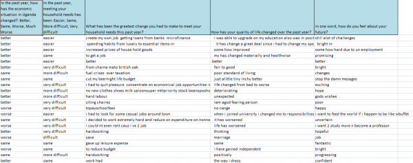
The first job was to become familiar with the data and to identify any data cleaning requirements. A combination of Excel filtering/sorting and Tableau managed to identify any data quality issues as well as the range and distribution of values. A number of illegible and erroneous values were removed or resolved but the biggest task was making sense of and dealing with the open-ended data captured in questions 3-5.
At an early stage I made the decision to focus only on working with just one of these fields, as there was simply so much variability in the content it would require a significant manual cleaning and classification process. For the purpose of focus, only the latter of these questions (Q5) was explored in order to identify the most important and valuable insights.
This fifth question, focusing on perceptions of future prospects and (supposedly) based on a single term appealed as the most interesting of the three free-text fields and also the least challenging classification task. I manually went through the 3794 records and formed a more concise and representative selection of single word terms and, whilst I was able to deploy a range of automated processes to assist with this, it was still a significant task. In addition to establishing a more manageable list of terms I also wanted to assess the polarity of these terms, were they a negative or positive sentiment, and so embarked on also scoring the terms with a positive (1,2) or negative (-1,-2) value depending on their nature and strength. I also noticed a number of terms that were of a neutral nature so assigned this a separate category so as not to lose or dilute their intent.
The analysis load was shared between Excel and Tableau. Initially, I was looking for patterns within each variable but then moved onto exploring combinations to identify potentially interesting or prominent relationships. Tableau, in particular, is such an outstanding tool for engaging with and exploring a dataset, so easily allowing you to flow from one analytical hypothesis to the next, opening up possibilities and quickly, efficiently closing off dead-ends.
Design
At an early stage I made the decision that I wanted to pursue my design as a static, print-compatible piece. There is something elegant and actually more challenging about seeking a solution that successfully communicates within a single view, without the need for animation or interactivity. Like the beauty of a photo in contrast to moving image. Furthermore, a static format would seem to connect with the nature of this global task and the need to make the solution accessible to all, regardless of format and technology platform. An interactive would have been very interesting to work on and to this extent I was interested in the potential development of a solution influenced by the inspirational work of the New York Times.
The early concept I was arriving at was a sequenced view that took the reader through some contextual information about the economic situations in each country (to help form judgments on subsequent perceptions) and then reveal the patterns of the survey responses. Each country’s analysis would then sit side-by-side to facilitate comparison across each subject area. I thought about the sequence of the countries and eventually settled on alphabetical order, just because I couldn’t decide on a meaningful ordering basis.
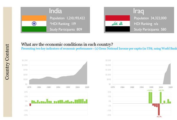
For the economic data I settled on a combination of an area chart showing the Gross National Income per Capita and a bar chart for the GDP % growth/decline. Two issues emerged here: firstly, the absolute GNI values being very different from country-to-country meant the use of small multiples would only be used to reveal patterns rather than aid direct comparison, secondly, the Iraqi GDP values had three outliers that I didn’t want to have to accommodate as they would skew the axis range and diminish the visibility of other values.
The next decision was to combine some values in both Q1 and Q2, merging the ‘Much Worse’ and ‘Worse’ perceptions for the former, and the ‘Very Difficult’ and ‘Difficult’ values for the latter. It made more sense to assess matters on a single, combined view both analytically and presentation wise.
The best display for the Q1 and Q2 analysis was a horizontal bar, based on standardised % values rather than absolute number of responses for each category. This would also allow comparison across each country.
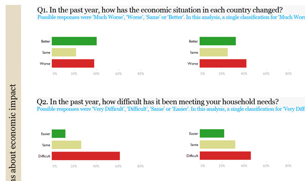
To aid intuition, red colours would be established to always represent a negative view (strong red = very negative), green to reflect a positive view (strong green = very positive) and dark yellow would be for a neutral or ‘same’ status view. All descriptive text would be Georgia font and numeric data in Gill Sans MT font.
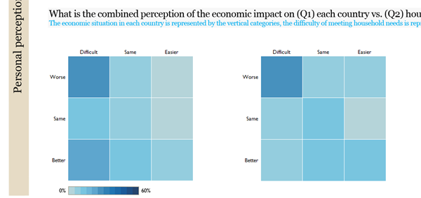
The next display was a combination of variables from Q1 and Q2 into a heat map in order to see how different cohorts of respondents were answering each question. The darker the section would reveal the dominance of perception pairings. This approach justified the decision to reduce the variable range down to three values rather than four.
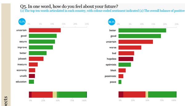
To communicate the analysis of terms used for Q5, initially, I tried some bubble charts based on the spread of polarity but they simply weren’t working in a way that aided comparison, rendering them pretty but fairly useless. Alternatively, a stacked horizontal bar showing the balance of positivity vs. negativity seemed to be working nicely. Presenting the frequency of usage for the various terms was problematic as I really wanted to avoid using something like a word cloud. This approach is a very obvious option for dealing with textual analysis but my view is that they offer limited functional and visualisation value – they are just for decoration. Eventually I arrived at a comparison of the 10 most prevalent terms, using a horizontal bar chart, using colours to indicate the polarity of each sentiment. This would show the general view point across each country. Finally, an aggregated % total formed by these ten terms would show how strongly they represented the consensus.
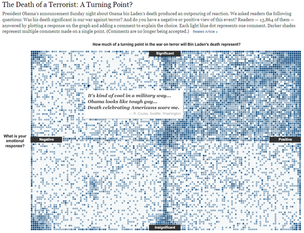
The final visualisation display was a pair of heatmaps for each country comparing the responses for views of the future with the Q1 and Q2 perceptions. I decided to use the same blue colour scheme on these heatmaps as the one above so that there were no visual clashes across the piece overall and to let the eye get used to interpreting the colour range values.
The last task was to incorporate some personal insights in a column of comments to aid understanding and add all the necessary annotation and explanatory text (intro, data treatment, how to read this visualisation, data sources) to help viewers understand every aspect of the project and the final piece.
You can see the final piece published on the Visualizing.org site.

