This is the ninth article in my Visualisation Insights series. The purpose of this series is to provide readers with unique insights into the field of visualisation from the different perspectives of those in the roles of designer, practitioner, academic, blogger, journalist and all sorts of other visual thinkers. My aim is to bring together these interviews to create a greater understanding and appreciation of the challenges, approaches and solutions emerging from these people – the visualisation world’s cast and crew.

Sarah Slobin is a Visual Journalist and Graphics Editor for the Wall Street Journal. With over 15 years experience as a graphics editor for some of the most prestigious American publications (New York Times, Fortune Magazine as well as the WSJ) Sarah occupies a seat at the ‘top table’ of contemporary visualisation and infographic practice.
I am really fortunate and grateful that Sarah agreed to take part in this article. As well as being an extremely entertaining writer, she has a wealth of experience and personal insights about her career from which any visualisation practitioner, new and established alike, can learn.
In this interview I wanted to find out more about Sarah’s rise to prominence in the newspaper graphics field, some background behind two recent WSJ visualisation projects and generally her thoughts on contemporary visualisation practices.
![]()
Can you give me a brief outline of your career and education/qualifications background leading up to your current role as a visual journalist for the WSJ?
I’ve learned on the job, but I grew up around art. My dad was a professor of graphic design. We had a stormy relationship so I tried to stay away from anything visual. Still, every job I had I ended up designing the poster, making the flier…
After college I was hired at the New York Times in news administration as an assistant. I kept organizing our processes; I set up a recruiting database, the first newsroom Facebook. They put me in charge of coordinating the Pulitzer Prize submissions – which is like making 33 magazines simultaneously. Ultimately, my mentor Soma Golden Behr noticed I was good with data and design asked me if I was interested in graphics. Of course, I said no. The following year she asked again and I change my mind and got a tryout at the graphics desk.
About a year late, the week I was promoted, my father fell ill. I flew home to Chicago and while he was in the intensive care I was able to tell him that I was going to be a graphics editor. He died soon after, so there was a passing of the torch.
Essentially I spent 15 years at the Times, working my way through the desks — covering Metro, National, Foreign and investigative projects and then running the Business Graphics Desk. Graphics editors at the Times are also reporters which suits my personality – a former executive editor once referred to me as ‘The Intrepid‘.
Then I got an offer from Fortune Magazine to be the Infographics Director. It was a chance to learn to make magazines, run my own shop and collaborate in a different setting. Fortune was an explosive space for me creatively. I was there about 3 years and then the economy crashed, I was laid off (I wrote about it for the Society of News Design).
So I partnered with Tommy McCall in his infographics studio, which was a crash course in client work – my favorite being Propublica – and then landed at the Journal where they were making a push to expand visual journalism.
Can you describe your role and the department you work in at the WSJ?
My job is to make graphics for print and web. My role is to introduce new graphic forms and ways of thinking about visual journalism into the newsroom.
When was the first time you recognised your passion for infographic/visualisation design? What was your Eureka moment?
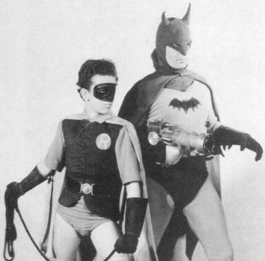
While I was still an assistant in the graphics desk I pitched a standalone infographic on the evolution of Batman’s costume (pegged to the opening of the movie.) I didn’t even know how to make graphics yet, or that we could have photo editors help with imagery so I did all the photo research myself. In the 1940s Batman was practically wearing underpants over longjohns, it was hysterical. By the time graphic published, I was hooked.
Who were/are the peers (authors/designers/practitioners/academics) in this field who have had most influence on your career, particularly your personal design style and principles?
Working under Charles Blow at the NYT I was like a little blossoming flower (he’s their Visual Op-Ed columnist now). Charles had the ability to find you work he knew would capture your imagination, then he’d gently encourage you to go off a cliff with the idea. At the 11th hour he’d swoop in and edit/art direct and fix it and make it so much better. It was infuriating. And I learned a ton.
My style is a combination of design I’m drawn to – Arne Jacobsen furniture, James Thurber cartoons, Robert Rauschenberg collages – and design I can make to compensate for my shortcomings, which are myriad. For instance, I’ve learned to make offbeat tension functional because I don’t have the patience for mathematical precision. I also like to make graphics out of things.
Principles? I try to answer ‘why do we care?’

From THE YEARS WITH ROSS by James Thurber (1894-1961)
What is the best piece of design advice you have received?
My first year at Fortune all the graphics I did were based on everything I already knew how to do. Then this art director, Alice Alves, who was in charge of the 500 issue gave me this collection of beautiful infographics to show me what she wanted for the issue. And it was like, ‘Really, I can do this?’. So from that point forward the graphics I made were limited by my imagination, not my past knowledge.
One of the highest profile visualisation projects emerging from WSJ last year was the ‘What they know’ project, can you give me some background behind this project? How did it come about? What was the motivation?
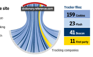
‘What They Know’ was the brainchild of a tremendous reporter, Julia Angwin. She runs the Digits blog and created the series around the software tracking industry, something most of us don’t know much about. Julia essentially went out and gathered a team of folks who knew how important the series would be. I signed on.
How did you identify the design approach for the visualisation? What other approaches did you consider (but ultimately reject)?
Julia sent me some the data and I began playing with ways to visualize it. Something that started working was this circle. Then my colleague Andrew Garcia Phillips was standing behind me and got interested in what I was doing, we started brainstorming. AGP and I have worked together for ages, we have this this flow where we can hand ideas back and forth and they get better.
The entire WTK series was built around this database, so Andrew and I knew the data (which is incredibly complex) would keep coming back at us. We wanted the visualization to work as a recurring signature for the series so he wrote a script to make the chart live as an interactive, output for print, and function as a tool for reporters and ultimately readers/users to explore the data.
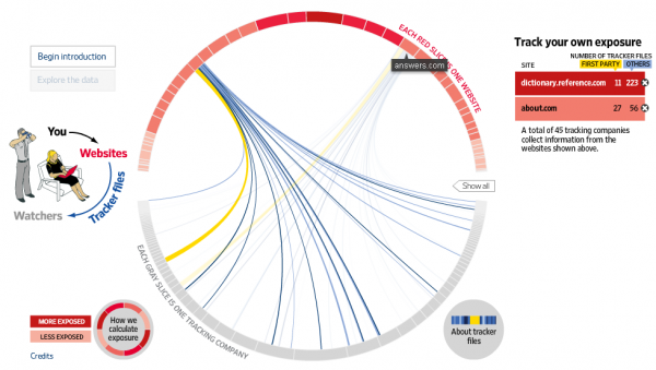
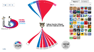
A big part of the process was consensus building among the editors because the form was new. In the end, Andrew added this linear narration with characters that sealed the deal. Then of course, the series started to grow and we did mobile trackers and the data changed, so we had to rethink the graphic and rebuild consensus which rough. Then we needed a visualization for the homepage…it was fluid, to say the least.
One of the key aspects of any creative process is knowing when to stop iterating a design: how did you/do you handle this issue with this project?
When the editors leave you alone?
No, just kidding. I tend to question my ideas and I depend heavily on editors to see what I don’t. I’d be terrified to make work in a vacuum. When someone suggests a change, I try it. If it makes the work better, great. If not, I go back to a previous version. In the end, a week later you come back to something and see how you could have done things differently anyway. Iteration is a spiral, ideas are for sharing.
![]()
A more recent project launched at WSJ has been the Jet Tracker. Can you give me some background behind this project? What was the motivation/objective?
![]()
Mark Maremont, who was part of the team that won the Pultizer at the WSJ for backdating, FOI’d the blocked flight records of private jets from the FAA. If you analyze these flight patterns they surface how this perk is misused, as well as travel routes around events like mergers and destinations like resorts. Again, I saw a huge opportunity to visualize flight data – we have 6.8 million records. Mark and Tom McGinty, who is a powerhouse database journalist, pulled data from other sources, cross-referencing the FAA data to build out their reporting.
How did you approach the design of the visualisation map and the interactive functionality? What software/technical resources did you use to develop it?
The answer to that comes from Jovi Juan, who runs the interactive team:
Basically we used coda and bbedit to write the code, a commandline interface to update the code base. We used Subversion and Versions to keep everyone’s code in line.
For tweaking the look in HTML, firebug and safari’s developer tools were essential.
For database work, we used PHPMyAdmin and Access and Excel. The whole thing was written in PHP and Javascript, using a MySQL database.
…initial comps and wireframes we did in Photoshop and Illustrator.
What insights are you hoping for people will pull out from this work? Any plans to take this project further? Any follow ups?
One thing that was important to us was that the jet tracker was shareable/social, so you can easily tweet or put what you’ve found on Facebook. We’re watching this as it builds. There’s tremendous conversation among readers about the utility of the data. So that alone is interesting. As for plans, the FAA is in the process of making a decision on whether or not this information should be made public. We’re following that.
How do you maintain the necessary innovative juices in what is such a pressurised but creative environment?
I thrive on adrenalin, so pressure is oddly comfortable for me. At the same time, I’m very good at disconnecting completely from my work for a couple of reasons; I know that I need time to recover and empty my head so I can start fresh. I know my brain is always processing my work in the background so walking away, or walking over the Brooklyn Bridge is purposeful for me. I also live on the internet and consume mass quantities of art and design and illustration in all it’s forms. Then I fall in love with an idea. It sticks with me. If I carry it in the back of my mind later on I’ll bump into a chance to use it. Plus, I love my life. I’m blessed in many many ways.
How would you compare the environment of a newspaper graphics today with that of when you first came into the field? What factors have changed the most (perhaps away from the obvious of technology)?
The journalism hasn’t changed. It’s still the story that drives everything, but now the visual story and the data story have risen. For a lot of old-school journalists this is an uncomfortable place to play, simply because they are left-brain thinkers. It’s short-sighted, though, to devalue any sort of thinking, it’s like discriminating against someone for having green eyes. I see it at as a good thing that delivering news across multiple platforms has opened us up to creative approaches. Design has a seat at the table alongside the written word. One doesn’t negate the other.
What are your general thoughts on contemporary visual journalism? What do you see as the main challenges, opportunities, concerns etc?
We’re just at the outset of working with this massive influx of data and building tools that people can use to visualize information. If you think about it, every user interface is an infographic. I have tons more to say on this topic in my post on Mixonline.

The ‘Dogerfly’ – Sarah’s vision of the infographics field circa 2060
Away from visual journalism, what things excite you about the way the visualisation in general is advancing? Are there any aspects that frustrate or disappoint you?
I really enjoy the intersection of data and… art, sculpture, science, the web. Currently I’m obsessed with social media and the implications it has as layer of sourcing and interaction on top of what we’re already building online.
What’s the most unusual infographic project request or subject you’ve been asked to design?
At Fortune we made a chart out of cheese.

Cheese. The next generation of essential dairy visualisation tools?
Finally, would you have any advice to students or emerging designers looking to move into a career in Visual Journalism?
To embellish Joseph Campbell a little… Follow your bliss. What else is there?
*************************
I’m extremely grateful to Sarah for taking part in this interview, offering some really interesting and fun insights into her world at the Wall Street Journal and her life as a visual journalist. I wish her and the team at WSJ all the best for the future. You can follow Sarah’s twitter updates via @sarahslo and keep up with her projects on her personal website.

