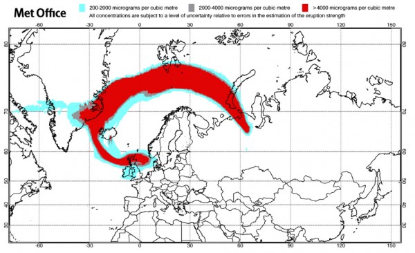
As somebody anxiously following the latest situation of the Iceland volcanic ash cloud, I find it fascinating just how much emphasis and influence the visualisation output from the UK Met Office is having on the response.
Whilst other information is of course being gathered and consulted, the overlayed ash cloud data on this map design is having a massive impact on the response from airlines, airports and aviation authorities. It is playing out like a form of sport for those of us with our finger’s crossed that the red zone moves on from our flight locations.
That’s not to say the graphic is perfect, far from it. A few features could be improved and made a little more elegant. Especially required is a thorough tidying up of the visual confusion caused by the clash of lat/long gridlines, airspace boundaries and the country borders.

