Pablo from Spanish developers Undefined has sent me details of a new project he and his colleagues created for the Radio Televisión Espanola website. This interactive creation visualises Twitter activity surrounding the Eurovision song contest, which took place last Saturday 14th, as well as the historic patterns of competition voting and final rankings.

Developed in Adobe Flex, the project is separated into three sections:
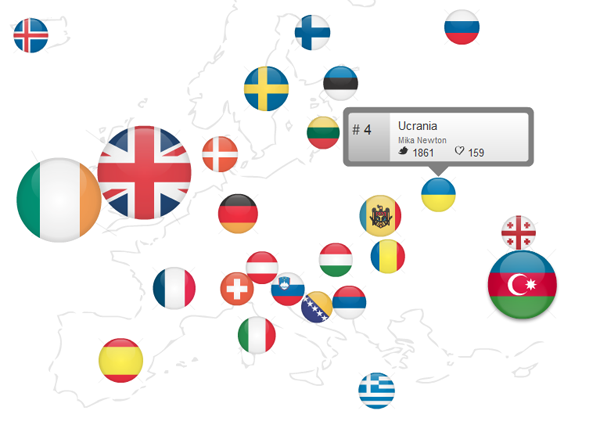
1) Map: As shown above, this feature plots the Eurovision finalist countries on to a map of Europe and represented by flags as circles sized according to the quantity of Twitter mentions.
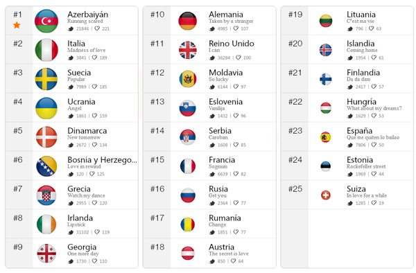
2) Ranking: This presents a simple ranking of the votes in the contest for each year, including a display the Twitter and Facebook popularity counts.

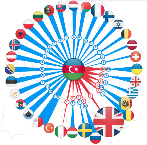
3) Who voted who: This layout displays which countries voted for which other countries. By clicking on a particular country’s flag, the dynamic display positions it in the centre of a network diagram surrounded by all the other voting countries. The thickness of the connecting lines/spokes between countries represents the size of each vote received in blue and issued in return in red. The main idea here is to see at-a-glance the predominant colour and determine if a particular country has voted higher or lower than other countries. You can navigate through the past 11 years of contests to discover the historic patterns.

