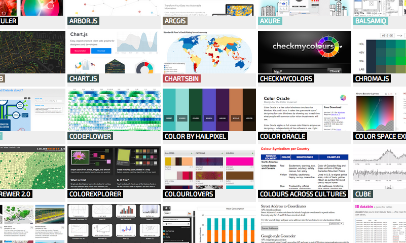
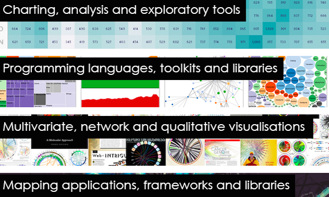
Part 2: The essential collection of visualisation resources
The contents of this post are now published on the interactive Resources page
Part 2: The essential collection of visualisation resources Read More »

The contents of this post are now published on the interactive Resources page
Part 2: The essential collection of visualisation resources Read More »
Google have launched an interesting new resource – an online quarterly book called Think Quarterly. In normal parlance you’d probably consider it on an online magazine or periodical but, semantics aside, the first issue is an excellent looking collection of articles themed around data. Google describe the purpose of Think Quarterly as offering some necessary
Google’s ‘Think Quarterly’ Read More »
I know there are many readers out there who love map design and the challenges of representing data against a geographical context, so I strongly recommend you take a look at a fascinating book titled The Exposed City: Mapping the Urban Invisibles (Routledge, 2010) and authored by Nadia Amoroso. The book offers a theoretical study
The Exposed City: Mapping the Urban Invisibles Read More »
At the end of each month I pull together a collection of links to some of the most relevant, interesting and useful articles I’ve come across during the previous month. Here’s the latest collection from February 2011
Best of the visualisation web… February 2011 Read More »
The contents of this post are now published on the interactive Resources page
Part 1: The essential collection of visualisation resources Read More »
Tomorrow will see the launch of a new series entitled “the essential collection of visualisation resources”. This will be a multi-post series designed to share with readers an inspiring collection of the most important, effective, useful, practical and affordable data visualisation resources.
Coming soon… The essential collection of visualisation resources Read More »
The Heritage Health Prize is a $3 million contest, sponsored by managed-care company Heritage Provide Network Inc, to use medical data to improve health care by designing a predictive algorithm that can best predict when people are likely to be sent to the hospital. Yesterday (March 15) the Network announced that the world’s largest predictive
Heritage Health Prize, $230,000 of progress prizes announced Read More »
If you’ve not heard there has been a massive earthquake off the North East coast of Japan this morning. This has caused devastation within the region, there are some staggering videos and images emerging. It has also triggered a pacific-wide Tsunami threat which may impact on many regions across that side of the globe. For
Japan earthquake real-time visualisation Read More »
Ben Saunders: North 3 is a great looking project designed by Applied Works in collaboration with Studio8 Design which will present live updates of intrepid explorer Ben’s record-attempting solo walk to the North Pole in just 36 days. Launching on Tuesday 18th March, the day Ben sets of on his trek, the site will present
Live infographic for Polar explorer Read More »