
Kristian Saliba, a digital art director for Three Drunk Monkeys creative agency (Sydney, Australia), has sent me details of an interesting project that has just been launched for YouTube titled ‘Map My Summer’.

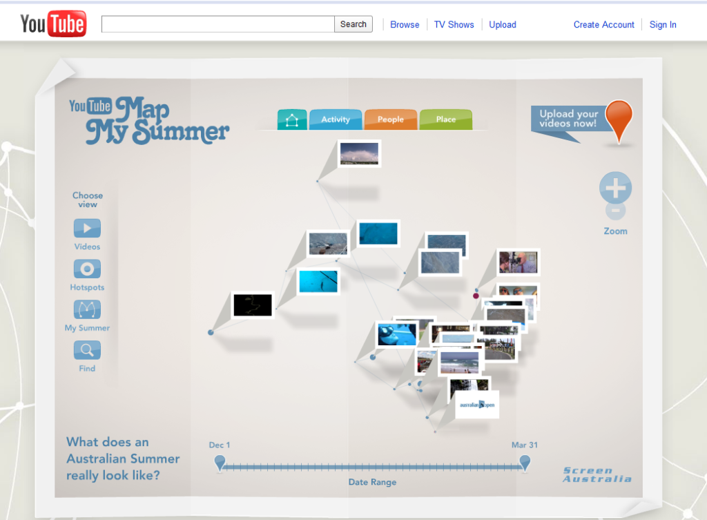
This is a YouTube experiment that asks “what does an Australian summer really look like?”. Users are encouraged to upload clips of their many and varied summer experiences. The clips are located on a (initially) blank map, building up an abstract representation of Australia’s geography based on an emerging canvas of summer experiences.

Users are able to browse the map and video content through an info-graphic styled user interface which segments the data into colour coded categories.
Take a look at the great activities people are up to during the Australian summer which is still going on now (December to March). Those of you based down under, or who have spent time down there (any English cricket fans?!), get your videos uploaded and help build up the map.