Back in May 2010 the World Bank announced that it was launching a portal to open up access to its vast datasets and creating a platform for developers to make this data more accessible and facilitate greater insights.
As part of the aim to bring greater access to this data, the Bank has been running an ‘Apps for Development‘ competition for “the public to create innovative software applications that move us a step closer toward solving some of the world’s most pressing problems“.

The submission period is now over and voting begins in a couple of weeks time. There are many wonderful entries but I wanted to briefly share a couple of specific developments that have been brought to my attention by Visualising Data readers.
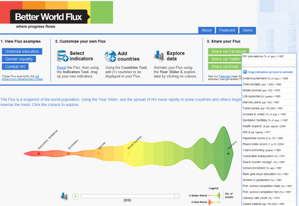
David Schönstein has developed a fascinating interactive visualization titled “Better World Flux” which presents of some of the most important indicators from the World Bank’s open data. The visualisation dynamically presents a fluid, almost organic looking shape which depicts the changing peaks and divergent patterns over time for selected countries against the specific indicators.

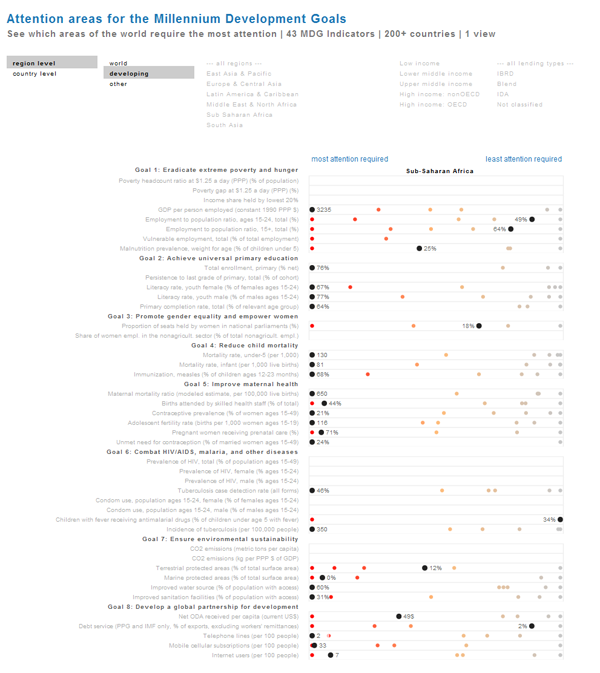
Jan Willem Tulp and Joshua de Haseth have used Protovis to create an impressive tool titled ‘Attention areas for the Millennium Development Goals’ (MDG) which presents an interactive, single view interpretation of which countries require the most or least attention across the 43 MDG Indicators.

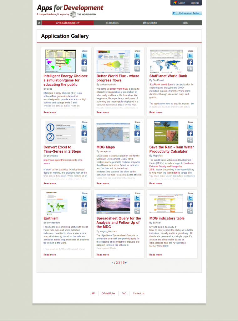
You can view the fantastic array of creativity, design and technical wizardry via the gallery of application submissions. Good luck to all entrants.


