
Through an article on Fastcodesign, I have come across BibliOdyssey, a wonderful blog dedicated to unearthing and sharing some of the finest and most unique illustrations to emerge from the 19th Century/Victorian period.
Given this was the age of industrial revolution and scientific curiosity, a significant number of these illustrations are vintage examples of visualisations and infographics.
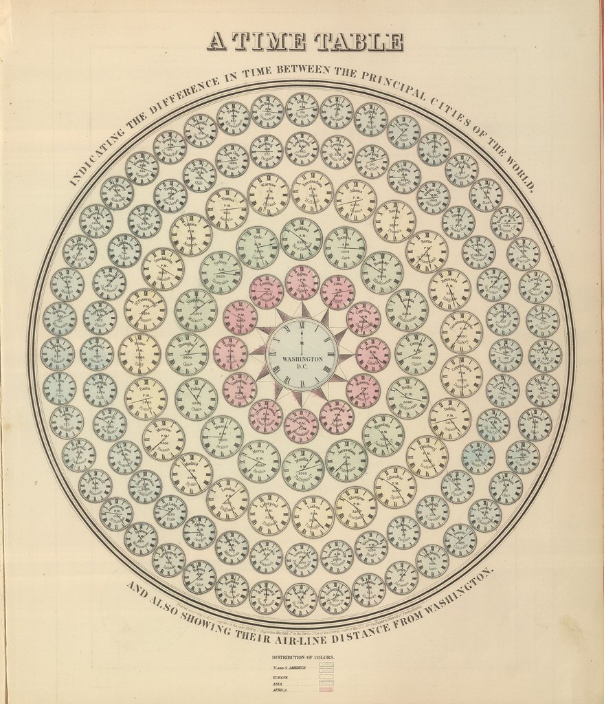
‘Timetable indicating the difference in time between the principal cities of the World’
Whilst we have seen several examples in Edward Tufte’s books, the BibliOdyssey site’s curator (enigmatically known as PK) has compiled an amazing array of maps, timetables, charts, graphics, and tables from this golden era of discovery.

‘Topographical Atlas of the City of New York Including yhe Annexed Territory’
The beauty of these pieces lies in their incredible technical execution (think of the creative tools we are able to call upon now), the care and attention to detail, the wonderfully subtle and elegant use of colour and the accompanying informative illustrations.
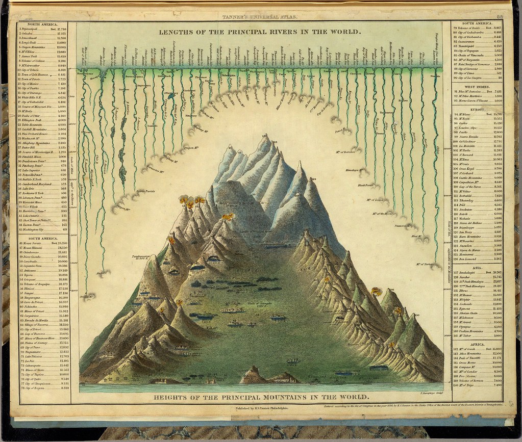
‘Lengths of the Principal Rivers in the World. Heights of the Principal Mountains in the World.’
You can see more examples on this post or this one and also through the 2007 book inspired by the site itself, titled ‘BibliOdyssey: Archival Images From The Internet’.