This is the fourth article in my Visualisation Insights series. The purpose of this series is to provide readers with unique insights into the field of visualisation from the different perspectives of those in the roles of designer, practitioner, academic, blogger, journalist and all sorts of other visual thinkers. My aim is to bring together these interviews to create a greater understanding and appreciation of the challenges, approaches and solutions emerging from these people – the visualisation world’s cast and crew.

Carlos Gamez Kindelan is a talented Visual Thinker based in Madrid. He is applying his skills as a highly experienced infographic and multimedia design artist across many different platforms, most notably through his work in the graphics department at lainformacion.com, an innovative online Spanish newspaper, and dMultimedia, his personal blog.
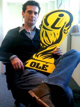

I approached Carlos to do an interview for this article for two main reasons. Firstly, I am fascinated by the challenges and pressures that come with producing graphics in the context of online journalism, especially for a newspaper that is entirely based on the web. My second reason was that I feel there is some superb visualisation design coming from Spain, typified by the portfolio of work Carlos has produced or been involved in.
![]()
Hi Carlos, can you start off by explaining what lainformacion.com is?
It is a new journalistic media that works exclusively in the digital environment. In addition, it is a hyperway and a semantic monitor of real time information produced by ‘Factoria Diximedia Digital’.
Can you describe the graphics department at lainformacion – where you are based, how many people work in your team, what are the different job roles etc.?
Our team works in a transversal way, without walls that separate us. Any colleague can share or form a part of a project relying on the experience of the people in charge of every department. At our business are professionals from design: Antonio Pasagali; dedicated to video and multimedia: David Tesouro, Michael Fernández and Adriano Morán; graphics: Sarah Potts, Chiqui Esteban and me; and html and css programmers: Alejandro Navarro and Alberto Aranguren. In addition, we have a network of collaborators, MOJO (Mobile Journalist).
How long have you worked there?
I’ve been working at lainformacion.com from its ‘Beta’ phase, concretely for one and a half years.
Can you briefly describe your current role at lainformacion?
I define my role as a ‘Visual Thinker’: I study and analyze the information, for both short and long term, and decide which is the better narrative approach from a visual and journalistic point of view.
Before lainformacion, can you give me a brief outline of your training and career history leading up to your current role?
I began as an intern for DIARIO MARCA and DIARIO MÉDICO, Recoletos Group at the beginning of the 90’s. Later I was working as an infographic artist at DIARIO DE SEVILLA, Group Joly; as Graphics Editor at the Spanish headquarters of 5Wgraphics, and as Graphics Editor at EL PAIS, Prisa Group.
What would you describe as being the key milestones of your career to date? You must have been involved in many fascinating news projects?
- Work at the sports diary MARCA during the Olympics of Barcelona 1992.
- To form a part of a first level team in a regional diary and what this supposes in the learning of any professional.
- Work in a graphics agency for a lot of clients from different countries, with very varied styles and with a very high level of quality.
- My entry in the digital environment almost 6 years ago and how I have been overcoming the fears before a way almost not known for me.
![]()
What was your “aha!” or “eureka!” moment?
When I was a teenager, I was fascinated by the work of Jose Juan Gámez, the current Art Director at MARCA, and other many graphics professionals like Juan and Samuel Velasco, Fernando Rubio, John Grimwade, Jaime Serra, Rafael Estrada and some others. I was concentrating on what was being done at ELMUNDO, ELPAÍS, The New York Times, USA Today snapshots and its weather map, etc. I collected hundreds of graphics (that still I preserve today) which I studied carefully and I tried to reproduce on my first Mac, a black and white Apple Classic. This way, it is not that I was deciding to be a graphic artist but graphics had chosen me.
Which software applications do you use for creating your work?
Flash, Freehand, Adobe CS4, Cinema 4d, Poser, Bryce 3D, Final Cut and other audio and video applications, and some development applications from Adobe and Apple (SDK).
Comparing these modern tools with 15 years ago, when you first became an infographic artist, what tools did you use for designing then?
The change and the development of applications has been amazing, 15 or 20 years ago I only knew Aldus Freehand, Adobe Photoshop and Adobe Illustrator.
How would you describe your design style?
I have been lucky to be able to learn off some of the biggest professionals of my country. My style is based on trying to purify the information in every way possible, to centre on the important aspects of news and to be clear, simple and direct. To facilitate to the reader the information they have in front of their eyes, trying to not frustrate with unnecessary useless devices or abstract visualizations. The journalistic information must be rigorous and clear.
Who would you say have been the most important authors and designers who have had most influence over your career?
Those which I have had the opportunity to work with: Jose Juan Gámez, Pablo Ramirez, Manuel Romero, Juan, Samuel, Pedro and Martin Velasco, Rafael Höhr and Mario Tascón.
Which books would you recommend as being the most important texts you have read about understanding the principles of communicating information through design?
Besides the classic ones like Tufte or Sullivan, I recommend also some in Spanish language such as Peltzer, Valero or De Pablos, as historical and introductory reference to the infographics. The three latest ones that have come to my hands are by William Cope (‘Graphics Methods for Presenting Facts’, from1919, and ‘Graphic Presentation’, from1939) and McCandless (‘Information is Beautiful’, 2009). Certainly, I recommend all the editions published of infographics and design international prizes both of the SND and of its Spanish chapter, Malofiej.
How has your design style changed over the years?
I think my incorporation to working on the Internet in 2005 and what comes with working for the screen and in a multimedia way. The design of online information, and for graphics especially, is less flexible, and remains limited in the majority of occasions for the screen and the structure of a site, the technology and the way of looking for the user. However, the Internet provides a deeper vision of the reality, problems of production do not exist in the use of the color and it combines elements such as video and audio, impossible to use in traditional media. All that pushes me towards a design of graphs where I use few colors but without fear, they help me to organize the information into a hierarchy and to present it in an attractive and clear way both for the information and for the final consumer, the user.
There are certainly strong visual themes that run through lainformacion’s visual designs, how would you describe this style or design brand? Is this something you have developed/evolved together as a team or is it a deliberate brand identity you are required to use?
The design and style of lainformacion.com is a responsibility of its Art Director, Antonio Pasagali. As for the style of the graphics that you have selected below, it has been a personal visual way based on the confidence and the freedom that Diximedia Digital offers me and for what I am very grateful.
![]()
I asked Carlos to recommend a few examples of his design work with brief descriptions and comments relating to their background, purpose, design solutions etc. Several of these are interactive so the snapshot image does not do full justice to their function, click on the title links to see the native work.
1. “Music and Economy – Different economic indicators (eg. The Retail Price Index) can be translated into musical language”
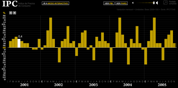
- I believe in the use of audio content to enhance informative graphics. This case demonstrates my desire and curiosity for experimenting with the senses. The three graphics that I produced using this approach was born from an instinct about the pulses that exist within the data. I was studying it while I was doing it, and it gave to me the sensation that it was something that could open a new door for infographics.
- I wanted to communicate sensations, that the user should measure the pulse of the Spanish economy without need to open the eyes.
- The information is strictly official and public, from the databases of the Spanish Government.
- I defined it in three levels: one, linear and for a passive user; two, 100% interactive; and three, more playful almost as a ‘gadget’ offering a musical keyboard.
- I only had five days to learn something that I had never done. To paint the information was the simplest thing. The complexity came at the moment of selecting the instruments, the sounds and the rhythm bases in the shape of loops – the work of audio edition in general. I used a free software called Audacity, ‘Garage Band’ that is included in Apple’s systems and to put the final scene together I used Adobe Flash.
- The principal problem was time. I finished the work in a few hours before it was published, so I had no time for the test phase. Anything that was not working right I had to solve it in four hours limit.
2. “How a Formula 1 engine sounds (Valencia street circuit GP)”
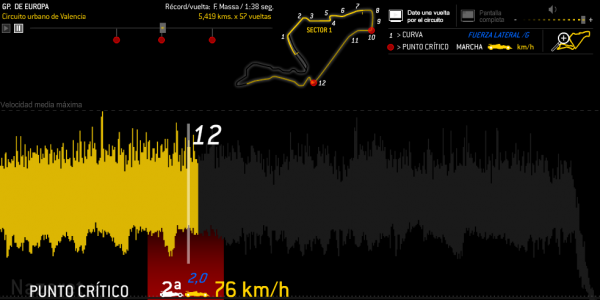
- This one was another case of my interest in experimenting with audio. It was not the first time that I was covering this topic in my work: I had solved it with the official information obtained about the drawing of the circuit and its analytics, a few times in the past I have using 3D programs, others vectorial and simple form. I thought that this occasion would be a wasted opportunity [to ignore potential of sound] so I centred on the sound of the engine of a F1 running on the circuit. Again, I chose three levels: linear, interactive and metainformative, with links and contents of interest like a 3D simulation video of the official circuit or a panoramic sight from Google Maps.
- I tried to ensure that the sound and its graphical presentation were guiding the user like a ‘safety car’
- I found a video of a real lap. I edited it, extracted the audio and then took the visual representation and I synchronized them. The natural analysis, number of laps, speeds, troubled points, etc, accompanies the story at all time. When one finishes, the user decides where to navigate in.
- I think that as a narrative structure it works well, similar to the previous graphics.
- I think that the principal challenge was basically the design. It is a working space in which I can only manipulate the height for technical questions, and this does not help when you have many informative elements to offer with an interactive navigation.
3. “Different visualizations can be help us attract new users and offer different and clear information – Facebook top ten games”
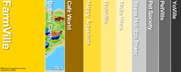
This work was so simple. I had the data from Facebook, and I was trying to offer a different visualization. This type of works had a very good reception from users who consumed the information in a fast way. Everything is done in Flash.
4. “Iberia´s merger with British Airways”
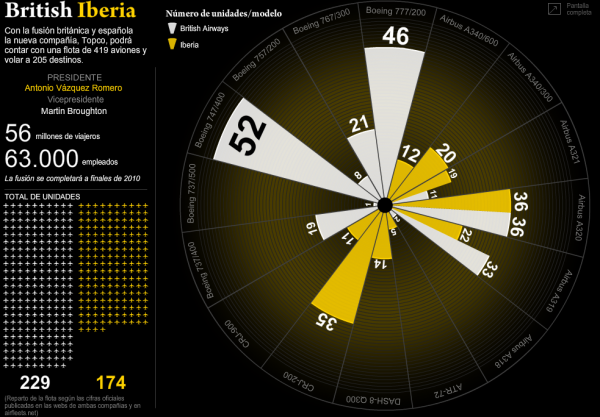
I am specially satisfied with this work because it shows once again the responsibility of a visual journalist to accompany latest news. Our web is characterized by the information always being alive, both in form and in the contents. One morning the front page changed its first item to the news of the merger of two of the most important airlines of the world. In less than two hours I located the information that was needed, the comparison of the numbers of the fleets of both companies by plane model. I rejected the total units because I thought that it was lacking informative value. It was not a case of comparing the different companies, but of seeing a merger, seeing the sum. The rest, the graphical part (Illustrator) and programming did not turn out to be especially complex. In less than three hours the link to this work was the hottest news on our home page for the rest of the day.
5. “Michael Jackson influences into Hip Hop music”
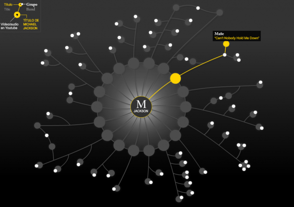
I love Michael Jackson’s music. It was about two o’clock in the morning. I was at home snooping around the Internet. Suddenly I noticed that something was moving in Twitter. Within minutes, the suspicion of Michael Jackson’s death turned into incredible news. TMZ, was confirming the death of the singer by Twitter. I had many doubts about the sources. I remember I was connected to Facebook and sent a very clear message: Vanessa, “Michael Jackson has died”; with a link to TMZ, which was showing different to the NYT one and to the LATimes.
On this night I discovered a blogger from New York, Ethan Heim. He was a music, technology and visualizations lover. I found something great for me, a very rough sketch with all the groups of hip-hop musicians and other modern styles influenced by Michael Jackson’s songs. So I said to myself: “I have it”. I sent an e-mail asking for permission to use his sketch and I went to bed. The following day, already we had published a chronology and a photogallery of Jackson’s life. I knew that the topic was going to be on the front pages long enough so I was kept waiting for Heim’s answer. The e-mail finally came and he said to me that he was delighted that I was interested in using it and there was no problems. I included it as an informative source. The design was based on a small drawing that I did in the margins of sheets of paper when I was a student and the class was boring. The only problem I had was technical. In these days our web was in ‘beta’ format and still we did not have possibility of embedding videos. But I thought that it was worth publishing it.
6. “Cronology of space shuttle missions”
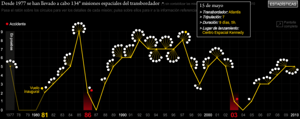
For this graphic the difference rests on the visualization. The information were the same for any person who was approaching the NASA website. What I did was customize a simple evolution of information and used a simple programme. I knew that the information was rigorous and I was trying to show it in a simple way: the evolution of space flights in yellow, every mission in white, and the eventful missions in red (Illustrator and Flash).
7. “A simple and linear animation – How a Temporary Nuclear Waste Repository works”
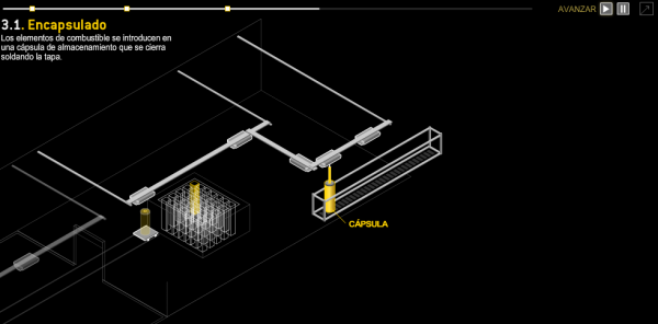
There are certain kinds of information that have to be explained in a linear way. However, how do explain a process? This type of work needs exhaustive analysis and compression of the information, and an animated sequence always, always works.
8. “11-Centelles: visual hunter of the Spanish Civil War”
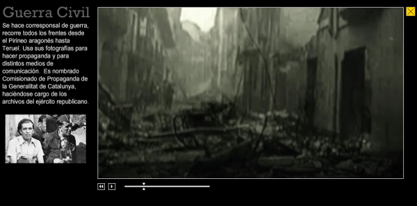
This graphic is based on the work of its author – Miguel Fernández – who works with us at the multimedia section. He traveled and worked over months to build this document. When he finished, he asked me to build him an interactive container for his piece. Time was very scarce. I tried to help him as much as possible, following his necessities and demands. I constructed a rather simple video player, making Miguel’s work the center of attention.
![]()
For those unfamiliar with your dMultimedia site, can you describe what it is and what your overall aims are? What motivated you to start the site?
dMultimedia is a personal and deliberately anarchic blogsite where I share a lot of things, from philosophies from academics and professionals, trying to centre on topics of informational visualization, infographics, journalism, resources, trends and software. I began two years ago motivated by the curiosity and the need to share those questions that are strange or exceptional for me.
Recently I have been becoming increasingly aware of how much amazing design work is emerging from different parts of the world and Spain stands out as a real centre of excellence – just looking at the number of references to Spain at the Malofiej awards supports this view. Can you give any reasons as to why Spain would be so successful? Does it reflect a strong design culture or perhaps something unique about your education system?
I think that it is a cultural question that is being more valued by the academic institutions. I think that the success of Spain in these contests is for the need that we have to communicate visually and for the capacity of many professionals to adapt to the changes and to the new trends. And, certainly, to the confidence of some other editors and journalistic businessmen who endorse our work. We must not forget that we are in a business.
How would you assess the rest of the world in terms of visualisation/inforgraphics, do you see any regional differences in techniques or design approach?
There is a very positive increase in the use of infographics as a way of transmitting information around the world. Especially in the digital area and in the experimentation, as well as new formats. The differences that I see more notable are especially in the use of and access to information and data sources. Nowadays we have such an abundance of information and in so many different hands that it becomes very complex to separate the wheat from the chaff.
What are the things that excite you/make you positive about the way the visualisation is advancing? Are there any aspects that particularly frustrate or disappoint you?
I’m very motivated about technology, graphics can open doors that we would have never thought before. But I also see that we have a wolf at the door. I am sure that it’s not positive to prefer the technology to the information. Infographics, and journalism must not be subordinated to the technology. The information always must be the first.
Finally, a chance for you to recommend or promote other designers. Apart from the obvious/popular visualisation and infographics sites, which other websites or designers would you like to recommend for readers to take a look at? Are there any designers, particularly around Spain, who you would identify as producing particularly innovative work right now?
Particularly, and for professionals of Spain, I recommend people follow the initiatives of ‘Medialab Prado-Madrid’ and the ‘Camon Visualization Workshop‘ in Madrid. Places to continue the study and development of new trends and visualizations. Also I love the work of the German agency ‘Golden Section Graphics‘, USA agency ‘5Wgraphics’ and the Spanish agency ‘Servicio Telegráfico‘.
*************************
I’m really grateful to Carlos for the time and effort he has gone to in offering a wonderfully detailed and fascinating perspective on his life as a visual thinker and relentless producer of interactive graphics. I wish him all the very best in the future wherever his career takes him. As well as his dMultimedia website, you can follow Carlos’s updates on Twitter @dMultimedia.
