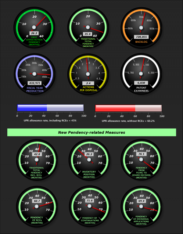
Over the several years I have been immersed in data visualisation there have been many occasions when I’ve come across a graphic that is largely well intended but basically ineffective, yet it actually proves to be quite a challenge to help justify (based on evidence) and articulate the specific reasons for its shortcomings to others.
At the other end of the spectrum, every now and then there are graphic demonstrations that are so ill-conceived that it is almost impossible to know where to start. You are left static, afflicted by some kind of verbal inertia. An example of this type of situation landed on my RSS reader today courtesy of the US Patent & Trademark Office and their new data visualisation centre.

Don’t be confused, you’re not trying to pilot a Boeing 747, this is the headline dashboard page of the USPTO’s key metrics, with each gauge representing the current performance. On the site itself you will see further details behind each metric.
You can just imagine how many times the phrase “cool gauges” was used within the team responsible for this.

