
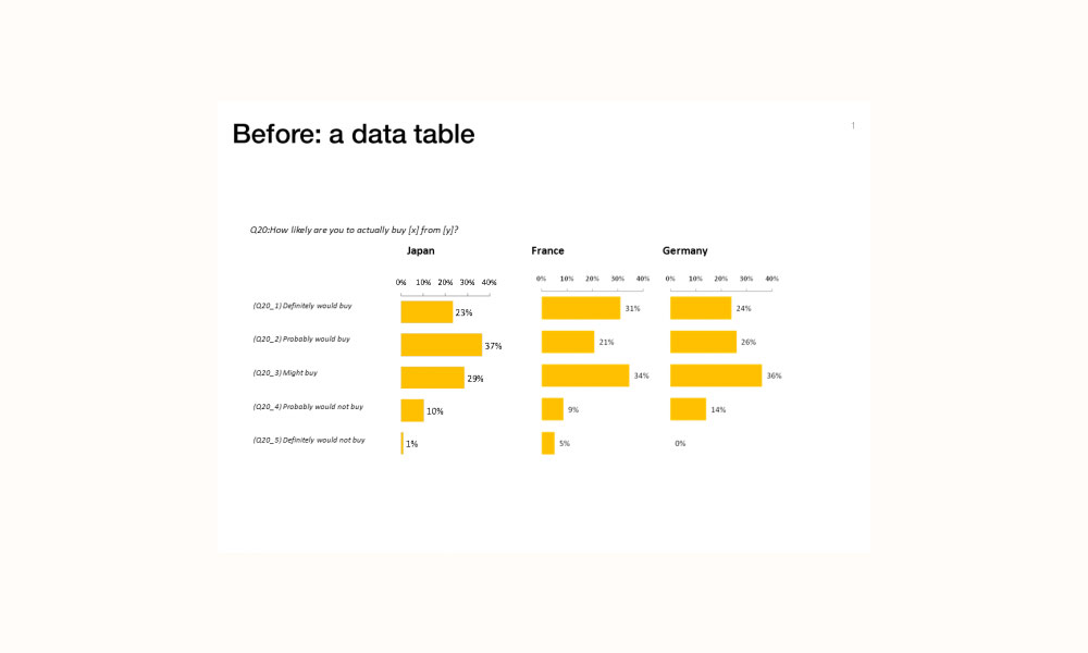
One of the many RSS subscriptions that keep my Google Reader working overtime is Jan Schultink’s Sticky Slides blog, which provides a lot of useful advice around presentation design. Today Jan has published a post comparing two alternative chart designs that present the same data from a survey question.


Jan’s view is that the second graphic is the more effective:
Both of these charts contain the exact same data. The second is a lot easier to read, the spectrum of customer choices is neatly laid out, and the colors are picked in sequential order.
My view is that the first graphic is, overall, the more effective. It does contain unnecessary value labels, I’d also remove the question reference codes and there is an execution blemish on the Japan chart compared to the others (presumably caused by an inconsistent paste special selection), but I think it is a much more elegant and principles-compliant approach that allows readers to draw insight from the distribution of buying attitudes in each country.
What do you think?