
This is a follow-up post to my first article in the Visualisation Insights series which I published last week. The purpose of this companion series is to optimise the learning opportunities from each insights article, reflecting on the ideas, issues and observations to emerge.
Visualisation Reflections
#1 Visualisation Designer | Michael Deal
Why did I choose this subject?
As an avid football fan I’m afflicted with an addiction that compels me to digest the sport in as many different ways as possible. So when I came across Michael Deal’s wonderfully simple but innovative Umbro design I was instantly drawn to its potential as a great way of communicating the key incidents and the general ‘ebb and flow’ of the World Cup matches.
With my visualisation head on, I was intrigued to learn more about the background behind this design. I’m no different to a large majority of typical readers who are eager to learn how designers like Michael move from conception to execution, so I was delighted to receive such a generously thorough and interesting account of the process he went through in producing this work.
Impressions prior to the interview?
The factors that impressed me most about this design solution were the density of the data and the clarity of the resulting game patterns. Visualising football is no easy task, indeed visualising any sport in ways that bring new insight and understanding is hugely challenging, but I felt this was a really effective solution that demonstrated a similarity in approach to the spacial efficiency of Tufte’s small multiples and sparklines as well as Few’s bullet graph.
A measure of effectiveness of any infographic or visualisation is does it make the viewer feel smarter? – a random selection of some of the match graphics below highlights how it achieves this:
Spain vs. Switzerland

This was Spain’s first game and ended up being the first shock of the tournament as a constant barrage of Spanish passing and efforts on the Swiss defence was defeated by a single breakaway goal, one of the few efforts the Swiss had in a game during which they rarely strung two passes together but held on doggedly all the same.
Italy vs. New Zealand

This game represented the second major shock of the tournament and perfectly reveals the story of the game which saw New Zealand get an early goal and then spend the rest of the game defending for their lives with only two further attempts during the entire game. As evidenced by the prevalence of white space, there was little or no emphasis on accurate passing to achieve this draw, with the Italians pressurising the New Zealand goal throughout the game.
Argentina vs. Germany

As you can see from the graphic above, Germany’s early goal catches Argentina by such surprise that it takes them until about 30 minutes to register their first shot. After this they have a fairly sustained period of pressure with many efforts on goal until Germany knock the stuffing out of them with three late goals.
Germany vs. Spain

This semi-final match shows how Spain’s intense passing accuracy seemed to paralyse the hitherto highly-effective German side. Eventually, after much patient play, this resulted in a goal midway through the second half. Thereafter, as the patterns reveal, the Spanish take on a more defensive approach with less emphasis on their normal impeccable inter-passing.
Netherlands vs. Spain

The World Cup Final was viewed as something of an anti-climax and a far worse spectacle than anticipated. The passing consistency, particularly of the Spanish, was largely lacking in a very disrupted and bitty encounter which became more about perspiration than inspiration until Iniesta’s late, great winner.
Impressions after the interview?
As with any visualisation challenge the effectiveness of the solution will be determined by how successfully the designer nails down the message, the data and the display within the given constraints of the project. I was very impressed by how Michael managed each one of these principal factors.
The great open brief from Umbro left the responsibility of the message to Michael and it is impressive how instinctively he arrived at the choice of the key variables and also the potential design format. The data was provided by Opta, which is a huge bonus, but this brought its own challenges through its sheer volume and complexity – Michael did well not to be tempted by all this data and be diverted from his objectives.
What I particularly liked about his approach was the way every visual attribute in the design was selected with deliberate intention. Producing any creative design like this is akin to arranging music – you need rhythm (in this case the consistency of each design layout, you only need to learn it once), you need some emphasis (such as the ‘fiery triumph’ of the buoyant red for goals scored) but not too much, and it needs offsetting with subtlety (the texture of the passing marks).
As Michael emphasised in his interview the time pressures he was facing during the production of this infographic restricted the amount of experimentation and iteration of design. The production process had to be practical and prompt in order to ensure the release was timely. It is with this context in mind that any recommendations for improvements have to be considered.
There are only two features I felt would have further improved the effectiveness of the designs without unnecessarily creating a great deal of extra process duration. To his credit, Michael identified both of these suggestions and explained their omission in his own reflections.
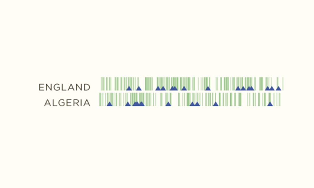
Firstly, I think the distinction between shots on target and off target is an important one, revealing a bit more detail about how close (or not) each team was to scoring with each attempt. To explain this take the England vs. Algeria game:

This was widely viewed as one of the worst games of the tournament yet you could draw from the frequent incidence of attempts that there was a reasonable amount of action, when in fact these efforts caused more trouble for supporters sat in the upper rows of the stands than it did the keepers. You could achieve distinction in detail by using two shades of blue or having filled and un-filled triangles.
The second enhancement would be to display a limited time-axis next to each graphic just to make it a bit easier to judge at what point in the game the different patterns or incidents occurred. At the moment there is only one time axis positioned above the first graphic. The axis would possibly only need to highlight the half-time mark as it is such an important junction within the game – you might expect to see tactical influences changing the pattern of the game thereafter. I can appreciate, however, from a production point of view that it would be complicated by the injury time played at the end of the first half, requiring the axis label to be shifted accordingly with each game.
Acknowledgement
Many thanks, once again, to Michael for his time and effort participating in this article. It has already been a massively popular post and I’m glad so many have been able to read these insights.
This was the first of many fascinating interviews I will be publishing in this insights series over the coming weeks and months. I will be covering the perspectives of more designers, practitioners, academics, bloggers, journalists and other visual thinkers to create a greater understanding and appreciation of the challenges, approaches and solutions that exist amongst the visualisation field’s ‘cast and crew’.
Finally, for those interested in learning more about the technical and design tactics behind producing visualisation work, there is another useful article here about the New York Times’ methodology for producing match analysis graphics like the one below. You’ll notice the timeline approach Michael took to display his data was also a small feature of this analysis, in this case just showing shots and goals.