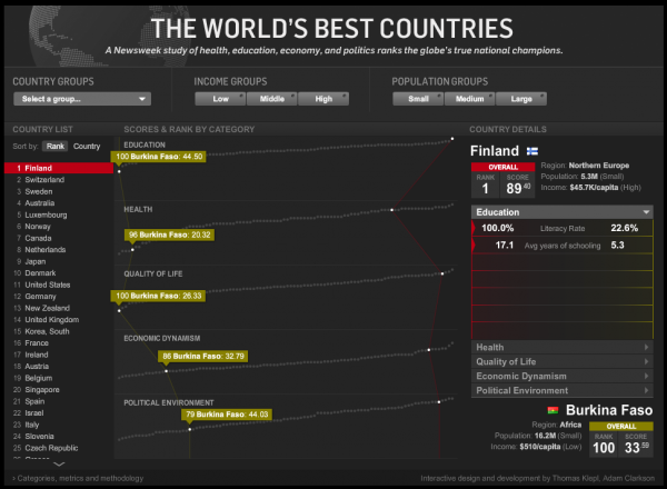
Just come across a very slick interactive published on Newsweek, designed by Thomas Klepl and Adam Clarkson. The graphic presents information around Newsweek’s study of health, education, economy and politics to rank the world’s top nations.

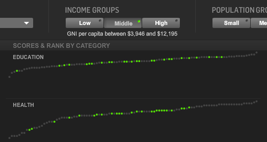
The interactive allows you to explore all the data for each country, based around a dynamic parallel coordinates type graphic in the middle. You can select two countries to compare from the list or from the graphic and then view the data in a comparison chart to the right. I like the effects when you hover over each country and it subtly highlights that country’s parallel data. I also like the option to filter the country lists by Country, Income or Population Groupings which emphasises the relevant countries in the graph.

The only minor complaint from a usability perspective is the auto-navigation through the list of countries depending on the position of your mouse pointer – its a bit hard to tame, I’d prefer to just click on the up or down arrows to move through the countries. That aside the rest of the interface works very smoothly and very intuitively.
Congratulations to readers from Finland which emerged as the top country, tough luck to those of you in Burkina Faso, there is always next year…
You can find out more about the methodology Newsweek used to calculate the rankings here.
