
Further to yesterday’s post about the Wikileaks Afghanistan War Logs, the Guardian datablog has published a post today describing how their data journalism operation worked. This reveals some interesting insights into the way the investigation team went about handling, analysing and interpreting all this data in order to unearth and present the key stories.
They have also made available a series of spreadsheets containing the data they have used for their various visualisations: summary of casualty data, full list of IED explosions and detailed data behind 300 of the key incidents (needs accompanying glossary of military terms).
I’ve played about with some of this data in Tableau Public to see if I can unearth some interesting visualisations and also to test out the data/software in this environment. I’ve embedded a sample of them below for sharing (please note they do take a while to load up):

This first graph simply plots all types of casualty on a common scale across the 6 year period so that you get a feel for the relative levels for each category as well as any particular patterns within each year. As with all these graphs, the context of the timeline of military strategy, troop numbers and other milestone information would help explain or inform some of these patterns.

In contrast to the first graph, this second one plots all casualties on a single line graph. The approach here is to accept the noise created by the largely overlapping lines towards the bottom of the graph because you can then easily identify unusual peaks such as the huge increase in Taliban casualties particularly during Aug/Sep 2006 and Aug/Sep 2007. It is also clear to see the overall increasing bloodiness of the war over time.

This third graph plots a cumulative picture of casualty numbers by type, clearly revealing the far greater numbers of Taliban casualties. It is really interesting to see the close proximity of Civilian and Afghan forces casualties throughout the course of the war – this graph shows this far better than the individual monthly patterns of the second graph.

This final graph is a heat map used to try and draw out seasonal patterns behind casualty numbers. I decided to use dual encoding for casualty levels with the size of the square and its colour both representing the data count. I felt this helped emphasise patterns more clearly than having just one. Note that the colour and size scales representing different values/maximums in each graph – these ranges are normalised to help comparison of the intensity levels rather than the absolute counts of casualty under each category. As shown in the second graph, you can clearly see an upsurge in activity around the late summer/early autumn periods, particularly in recent years. Casualty levels seem strangely low for the winter and spring months?
IED Explosions


These initial graphs above (the map boundaries haven’t come out particularly well compared to how they looked when created) show firstly the total deaths and secondly the total woundings by location during the 6 year period. Its particularly interesting to see the prominence of locations of deaths or woundings around the highways of Afghanistan, as you would expect given the roadside IED tactics.


The second lot of graphs are small multiples of the death and wounding incidents plots (1) across the 6 year period and (2) by the nature of the event.

This final graphs presents a monthly and yearly plot of deaths and woundings by category of victim and I think it does offer some interesting patterns. Overall these visualisations probably don’t bring a great deal of added insight compared to the original Guardian visualisations, although I think the exercise has served as a good test of the tool as a means for exploring such data.
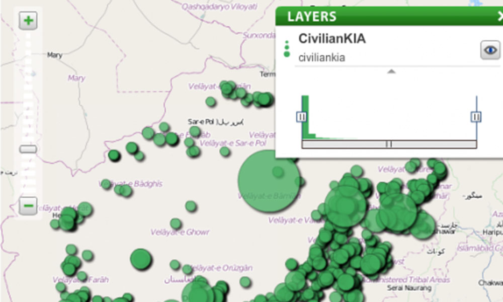
300 Key Incidents
I tried a few combinations using this data but nothing can really improve on the map interface the Guardian created for this data and, given this is just a manual selection of key events, any statistical or trend analysis will be flawed. I did a wordle word cloud analysis to see if there were any interesting trends on repeated terms but the data contains so much coded language and has references that distort such analysis.
Paul Bradshaw on the Online Journalism Blog reports that “French data journalism outfit Owni have put together an impressive app (also in English) that attempts to put a user-friendly interface on the intimidating volume of War Logs documents.”
The Atlantic website has joined in the task of visualising the data, presenting a range of map based analysis for the IED data.

Nathan at FlowingData has published a guest post by Alastair Dant, interactive lead at the Guardian, describing the efforts that went into designing the war logs map of incidents revealed by Wikileaks.
