
This post is the first in a series I am commencing called Visualisation Insights.
The purpose of this series is to provide readers with unique insights into the field of visualisation from the different perspectives of those in the roles of designer, practitioner, academic, blogger, journalist and all sorts of other visual thinkers. My aim is to bring together these interviews to create a greater understanding and appreciation of the challenges, approaches and solutions that exist in the worlds of this collection of people – the visualisation field’s ‘cast and crew’. I will be following each interview with a post reflecting on some of the key insights to emerge.
Visualisation Insights
#1 Visualisation Designer | Michael Deal
The World Cup is now but a distant memory to most of us, unless you happen to come from Spain of course, but one of the key aspects of the tournament from point of view was the array of innovative infographics and visualisation devices used by media organisations and websites to enhance their coverage (see my collections part 1, part 2 and part 3).
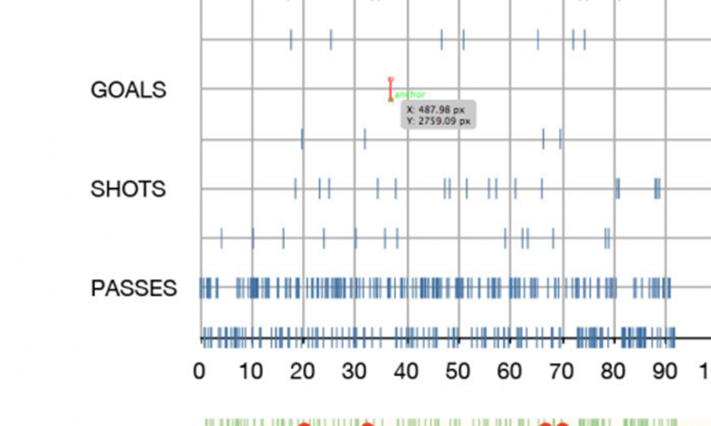
One of the most shared and discussed visualisation designs was conceived, designed and produced by New York designer Michael Deal on behalf of Umbro, the UK sportswear brand. Michael designed a novel, elegant and hugely insightful approach to visualising each of the 64 games based around three important statistics that help describe the ebb and flow of the game: completed passes, attempts on goal and goals scored. These designs were neatly compiled on to a single poster layout.

click image for large view

Hugely impressed by this design solution, which has strong themes of the layout and data density of Tufte’s sparklines and Few’s bullet graph, I invited Michael to impart his thoughts about the process he had gone through, the design decisions he had taken and the visualisation execution methods he had employed.
You can see more of Michael’s personal work at www.mikemake.com.
Background
Michael, can you give me a brief outline of your background as a designer? Also, if possible, how would you describe your particular focus or expertise as a design (in terms of the sort of project you typically undertake/enjoy)?
I’m 23 years old and I’ve been practicing graphic design in New York City for almost a year, working now at Pentagram. I’m still figuring out what my dream projects might be but recently I’ve been enjoying visualizing data in custom, “hand-crafted” designs.
How would you describe your interest in football?
I’ve been playing on teams since I was in elementary school. It’s a sport I love to play and deeply respect.
The Project
How did you get involved in the Umbro project?
Umbro had seen my work and approached me a few months ago with the idea of creating infographics for the World Cup.
What was the brief you were given? Was it fairly open (“we need some visualisations about the World Cup”) or more specific (“we need visualisations about each match showing passing, attempts and goals”)?
It was much more the former. I wish all clients could be as fantastic as Umbro has been, specifically my contact there, Aaron Lavery. The brief was very open and we had a lot of great dialogue. They showed full trust in me as the designer, allowing me to explore any option I thought might work.
How did you arrive at the decision to visualise the variables you chose (ie. passing, attempts and goals)?
One of the main challenges of this project was to design the entire graphic before having the actual data, so that when the matches were played, I could plug the data in and get the graphic out the door right away. This approach ruled out taking more editorial angles where one might assess the matches that had been played and use infographics to highlight interesting aspects unique to this tournament. So the practical direction was to create an infographic that could potentially receive data from any given World Cup, which offered the exciting possibility to experiment with a graphic language for visualizing any given football match.
I was interested in presenting possession, and I realized that mapping successful passes would be an easy solution for conveying the ebb and flow of possession purely with data points. The charting of shots on goal functions in a similar way, while suggesting more about where the ball was on the field.
The Data
You mention the data is supplied by Opta, was this an arrangement already presented for you or did you source the data yourself?
Umbro had worked with Opta before, so this was a conveniently established relationship for me.
Did you have the opportunity to explore other aspects of the vast data sets Opta hold?
There were XML files of data for every match, which could sometimes exceed 10,000 lines of code, tracking nearly every detail of the gameplay, including x/y field coordinates and a timestamp for each piece of action. This degree of granularity can really make you geek out, with rabbit holes left and right you have to make sure to step over.

Can you briefly talk me through your data preparation process? What software/techniques did you use to handle the data and produce the analysis behind the visualisation?
I’m still experimenting with more automated means of handling and visualizing data like this, so in the interest of time, it was important for me to just get it all into the more comfortable form of a spreadsheet for each game. There seemed to be a number of PC applications that converted XML feeds to Excel spreadsheets (I used Advanced XML Converter), but I found nothing for Mac, so if anybody knows of something, let me know!
I then spent a good bit of time preparing a multi-table template in iWork’s Numbers that would isolate and reorder just the data I needed upon pasting the Excel output for each match.
The Design
How did you arrive at the concept of the display? What sort of alternative solutions were you considering?
I was almost certain that mini-timelines for each game would be the way to go. I wanted compact match visualizations that would fit together in as small a space as a legible reading of the data would allow. At first it was tempting to arrange the timelines in more of a tournament bracket formation, but they needed to share a space within the same eye-span to allow for immediate ease of comparison. This was a much higher priority than it was to highlight the paths of each team as easily as a tournament bracket diagram does.
I was particularly interested in clearly presenting games with discrepancies between the frequencies of the three variables—For example, games where one team dominates possession but just can’t get a score on the board.
From a process point of view, do you tend to sketch ideas out on paper first or go straight to the data/technology and try out different compositions/iterations?
In all other types of design, I sketch a lot by hand before anything else; with data visualization, the framework of the design is usually fleshed out enough in my head to jump right in and get a proof of concept to make sure the imagined design works. In this case, that framework was generally a set of small, stackable timelines that contained different variables from a football match in the same shared space. I knew from the beginning that it would eventually work, but the number of Adobe Illustrator sketches I made to refine the final shapes for the visualization language is almost comical, with a file filled with dozens of iterations of these little timelines.
![]()
Can you explain some of the deliberate decisions you made around the visual properties in the design?
For the three event types charted in the timelines, a higher frequency of each generally indicates one team outplaying another for that respective variable, but there’s a hierarchy to the importance of each variable (the frequency ultimately being more crucial for goals than for shots than for passes). The shapes and colors representing these three variables needed to be appropriately weighted to maintain this hierarchical balance between the events.
The pass rectangles needed to fall back as the main texture of possession in the match, over which the more heavily weighted shot triangles were mapped in a darker color. The triangle was chosen for this variable because it conveys a sharp strike, the impact of a shot on goal. Successful goal circles were mapped at a higher position above the upward-pointing triangles to allow them to stand out, while conveying the upward progression in the importance of these gameplay events.
I chose a buoyant red circle for this variable to suggest (as far as one reasonably could in this case) the fiery triumph and ecstasy that comes packaged with any goal scored in the World Cup. The circle has its universal connotations of transcendental perfection and all that, and I gave it as saturated a red as possible.
I never would have guessed that such semi-philosophical abstractions would enter my design process for data visualizations, but I will welcome them anytime they feel like showing up again in the future. It was fun to think about Kandinsky’s Bauhaus ideal of the role of the circle, triangle, and square as part of a reductive universal visual script. It was also nice to get lost in the timelines as little landscapes painted with game data, with green trees, blue hills, and red suns. It definitely had me craving some Super Mario Bros action.
…and my answer to this question has officially become way too self-indulgent.
One of the key aspects of any creative process is knowing when to stop adding or subtracting from the design: how did you handle this delicate stage of the project?
It was tempting to include things like subtle time measures and tick marks throughout the piece, but I didn’t want the viewer getting hung up on that. It’s all meant to be more about comparing the general patterns within and between the games rather than being able to discern the exact minute that a goal was scored.
The shape of the timelines had enough order in their grid layout that I didn’t need any kind of framing lines or boxes, which was very liberating. If the timelines within each column don’t appear to align properly, it only appears this way because I left out all extra framing elements. It’s purely data points and country labels.
At some point in the process I was designing the timelines with data for fouls and penalties, and it was a tough decision at first to exclude it because it was definitely interesting stuff. However, as a gameplay event, it was in a separate category from the stepwise set of passes, shots, and goals, and it was steering the graphic in a different direction from what I was intending. Also, the immediate decipherability of a three-variable chart just isn’t as strong with a fourth element introduced.
What software did you use to create the designs? What features of this software did you use to create the intricate displays? For example, did you use scripting in Illustrator to automate the task of plotting the instance of passes?
I actually didn’t use any scripting in Illustrator. I copy/pasted scatterplots from Numbers into Illustrator, used the “convert to shape” effect a lot, and relied heavily on Illustrator’s Smart Guides. It was essentially built “by hand” with the spreadsheet-created charts as precise blueprints for locking the shapes in place. This is obviously a time-consuming approach, but it offered me absolute control over the entire graphic.

Reflections
Of course any design brief could be delivered in many different ways, but, on reflection, is there anything you would wish to change, add or remove to this design?
I’m actually pretty satisfied with the way this piece came out. If I hadn’t been working under such time constraints, however, it would have been very interesting to see how it would have looked with the height of the green passing bars representing the length of the pass. This might have revealed some insights about the varying playing and passing styles of different teams.
I’d also be curious to see an alternate version with “unfilled” outlines of the blue shot triangles to represent off-target shots, differentiating them from solid triangles for on-target shots. Again, it was a matter of time constraints and keeping it simple.
Like football, in the way every fan thinks he can do better than the manager (like me), design naturally has its own armchair experts (probably, again, like me!) – have you received any suggestions or comments that you thought represented good ideas?
Flaneuse from contexts.org wrote a very thorough and insightful review of my visualization, and had a great suggestion about including the win/loss point values accumulated by each team advancing past the Group Stage. It can be a confusing system to keep track of if your team is in a tight situation and you want to look ahead at what hypothetical tournament outcomes would be necessary for your team to advance. There would have been a way to make this work, it just didn’t make it into the final piece.
As a result of this work, do you have any “unfinished business”/burning ambition to pursue further football related visualisations?
I would love to continue to create visualizations for football, and other sports too. There’s so much to be done.
There are often limits to what you can deduce through numbers and charts, but with the rich datasets in sports, those borders are more distant. With the universal passion you see for sports, the continuing development of in-game data-tracking methods, and the broadening mainstream application of data visualization, it won’t be long before the presence of infographics will be ingrained in our conception of how sports footage and analysis is presented in the media—much more than they are right now. We’ll be seeing more infographics in-game and on SportsCenter.
How challenging did you find the task of creating a visualisation for football compared to some of the other design subjects/briefs you have been involved in?
Being so familiar with the subject, while brainstorming ideas I could imagine myself on the field and in the action, which is an advantage you don’t always have with projects where you’re learning a lot about the subject along the way. It’s a bit cheesy, but it definitely helped. Another advantage was that a lot of other World Cup visualizations were coming out as I was designing this, and it was easy to see what was and wasn’t working.
Many thanks to Michael for his detailed, candid and insightful thoughts and also for his time in participating in this post. I wish him all the success for the future.