July 2010

Visualisation Insights: #1 The visualisation designer

This post is the first in a series I am commencing called Visualisation Insights. The purpose of this series is to provide readers with unique insights into the field of visualisation from the different perspectives of those in the roles of designer, practitioner, academic, blogger, journalist and all sorts of other visual thinkers. My aim […]

Visualisation Insights: #1 The visualisation designer Read More »

Visualising the Wikileak’s war logs using Tableau Public

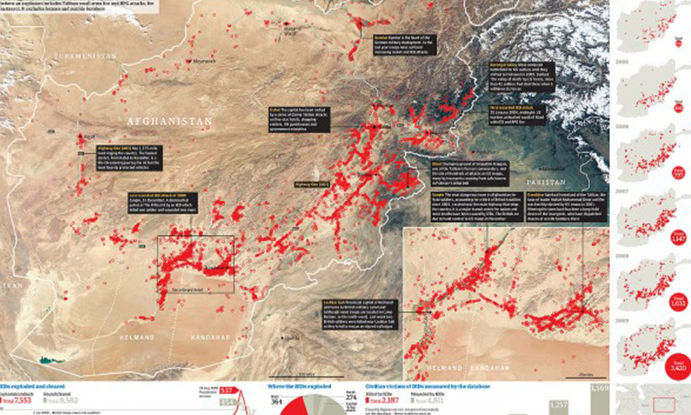
Further to yesterday’s post about the Wikileaks Afghanistan War Logs, the Guardian datablog has published a post today describing how their data journalism operation worked. This reveals some interesting insights into the way the investigation team went about handling, analysing and interpreting all this data in order to unearth and present the key stories. They

Visualising the Wikileak’s war logs using Tableau Public Read More »

Radial plot of FTSE 100

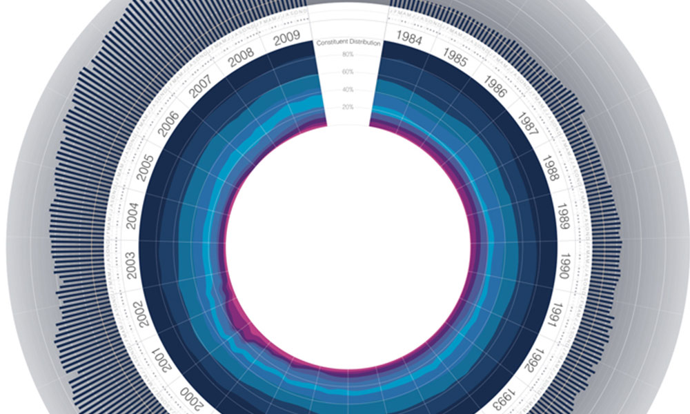
A series of charts by Jeremy Christopher depicting the history, worth and composition of the FTSE 100 share index have been doing the rounds over the past 24 hours (first seen via DataVisualization.ch). The image below is probably the most discussed and shared of this short series of 3 charts. It visualises the FTSE’s index

Radial plot of FTSE 100 Read More »