
The dreaded Threequel!
Following the popularity of my recent posts (part 1, part 2) about visualisations and information designs relating to the World Cup, here is a third instalment. I wasn’t intending to produce a third collection, because you can only get so much mileage from the same subject matter, however, I’ve been lucky to have received many additional suggestions. So, once again, many thanks to all who contacted me or posted comments with links to many of the items displayed below. I want to particularly acknowledge Tiago Veloso’s prolific Visual Loop website from which I came across several of the designs.
World Wide Visualisations
One of my key discoveries from researching these pieces has been strong evidence of the truly global growth in the use of visualisation and information graphics to enhance interaction and information exchange on news/media and sporting websites. In particular there is a real concentration of wonderful design talent emerging from Northern Europe, Spain, Portugal and South America.
As I mentioned in my previous post I would love to be able to plot further examples of visualisations coming from different countries to those already gathered especially, from a thematic point of view, at least one from every country participating in the World Cup. So, if you have some unique examples of information graphics (they don’t necessarily have to be good examples) from different parts of the world please send me a link. My site visitor statistics suggest there is a broad geographical spread of people reading my posts from almost every corner of the world so please put your country on the map!
CALENDAR/MATCH SCHEDULE
World Cup 2010 Calendar by La Tigre (via We Love Datavis)

Match fixture schedule by Renato Lopes

The 2010 World Cup Radial Bracket Poster will be produced (depending on backers) after the tournament showing the results and outcome


MATCH RESULTS AND ANALYSIS
Already mentioned Fabio Nada Flickr photostream chronicling Brazil’s progress but there’s so much good stuff it is worth repeating


iPad/iPhone App by ScoreGrid which presents a range of analysis about each game


TOURNAMENT ANALYSIS
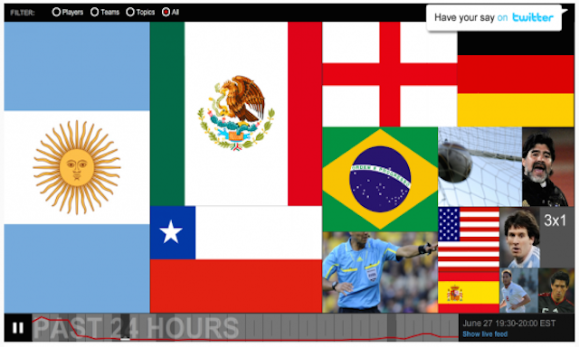
Tree-map of popular teams, players and topics presented by CNN Twitter Buzz (via Infosthetics)

Esquire offer an alternative view of the merits of Twitter content analysis

New York Times’ statistical analysis of the competing teams’ rankings

Using Opta stats, The Guardian offers an analysis of England’s early (and ultimate) flaws

PLAYER/TEAM ANALYSIS
Carlos Gámez Kindelán’s dMultimedia site has also published a collection of visualisations, here’s one (from Servicio Telegráfico) about the volume of various player’s endorsements

Assessing the market value of the respective teams (via Visual Loop)

Analysing 4 of the potential stars of the tournament (via Visual Loop)

WORLD CUP HISTORY
New York Times’ analysis revealing the particular dominance of a small concentration of countries

Interactive visualisation of each country’s World Cup appearances and each tournament’s finalists

OTHER MISCELLANY…
The Economics of the World Cup

A meticulous replaying of a famous 1982 match set in an urban environment, via infosthetics
