
Well I’ve managed to hold off for 53 posts but finally I’m compelled to discuss Minard’s 1869 graph depicting Napoleon’s 1812 march on Moscow, a graph famously described by Edward Tufte as possibly being “the best statistical graphic ever drawn“.

It has come up now because Andrew Arbela on The Extreme Presentation Method blog has published a post presenting excerpts from an essay written by Gene Zelazny, McKinsey Director of Visual Communications and author of Say It With Charts, amongst other titles. The purpose of this essay is to present an argument in favour of Microsoft PowerPoint in the face of common negativity that exists towards it (I’ve talked about this increasingly popular and hysterical attitude too).
Zelazny decides to frame his argument about the sophistication of PowerPoint by taking on Tufte (famously anti-PowerPoint) and his belief about the effectiveness of this graphic, in turn offering alternative designs. The basis of his disagreement with Tufte, on both fronts it seems, is a belief that the Minard graphic is difficult to read and is ineffective when displayed in a presentation:
I’ll grant that this is indeed a highly informational chart, especially considering that, when it’s published in a book, you can take as much time as you need to study it (with the help of a magnifying glass in this case)… however, it doesn’t work anywhere as effectively in a presentation… In this situation, the presenter must describe the chart one step at a time so everyone in the audience focuses on the same point at the same time. Clearly, the chart’s complexity makes this a challenge. Secondly,… the chart must be legible to each and every member of the audience. Clearly it’s not.
Unfortunately, I think Zelazny really misses the key argument lines in both his critique of the Minard graph and also in his defence of PowerPoint.
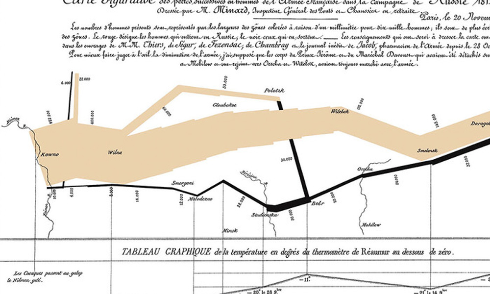
Whilst I don’t necessarily fall under its charm in the same way many do, you can’t help but marvel at the then sophistication of Minard’s solution to successfully display such a complex story into a single graphic containing a total of six variables. And the key word is ‘then’ because it was created in the 1860s with primitive tools, designed specifically for the viewer in printed format and at a time when using statistical graphics to present such information was an absolute rarity. To compare its effect on a PowerPoint slide is absurd. Its perhaps a rather tenuous (but topical) comparison but you wouldn’t challenge judgements about Pele by asking him to prove himself and turn out for the current Brazilian side at the age of 69, would you?
The problems with this essay continue as Zelazny attempts to reinforce his views by offering a series of “additional options to tell the same story [which] rely on the sophistication of PowerPoint as a production tool”.


Let me concede that I have never attempted a reworking of the Minard graphic nor have got an immediate solution, so I’m not speaking from a position of strength here. However, whilst I don’t mind the first attempt – perhaps removing the clipart type images would be advisable – the other two solutions are totally inferior. They completely fail to enhance the communication of the story’s complexity, they fail to create a more cohesive or elegant visual display than Minard achieved and these examples simply do not demonstrate the purpose, utility and value of PowerPoint.
I hate to criticise individuals but, given his prominent visual communications position in such an influential organisation like McKinsey’s, it is disheartening to see that Zelazny himself is credited with creating the second image. Compounding the failure, in my mind, of this essay in the context of its intent Zelazny leaves us with this rather unfortunate parting line:
Contrasting any of these with the original chart, I leave you to decide on the value of PowerPoint as a tool for visualizing the march.