
I’ve come across an infographic today (via cool infographics) that was originally published in February on Focus.com, a business expertise exchange and research service. I’ve shown the full length of the graphic below, a larger version can be accessed here.
In this post I wanted to discuss my reaction to this graphic and offer an assessment of its design. Unfortunately, I think it contains many flaws but I hope this item will present criticism alongside justification – after all, nobody sets out to produce bad visualisations. It can be a very tricky challenge trying to ensure criticism is fair, constructive and does not step into becoming insulting. It is simply about sharing suggestions for better practice.

Dimensions – my first comment relates to the dimensions of the artwork. Many infographics do tend to be large pieces which grow beyond the normal confines of A-graded paper sizes. It is nice to consume information like this in different shapes and sizes but my feeling is that this is a little bit unnecessarily long and thin when it could have been presented using a rectangular layout. It also makes it that bit harder to consume on a screen which is likely to be the logical, native platform for this piece.
Huge title & dots explanation– the first thing to grab you is the enormous title and explanation for what the dots represent. If it was to be printed and presented as a poster I could understand the need for the large-sized title font, but on the screen it just delays the process of getting to the actual information. The explanation key takes up so much space, should not be placed in such a prominent location and, fundamentally, is unnecessary because the dots are self-explanatory. At most this should be a footnote item.
Mixed font – throughout the infographic the font use is inconsistently employed in terms of size, colour and case. This makes it unnecessarily hard to automatically pick out the sections and topic changes as we read through the “story”.
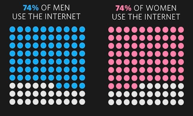
Colours – the design is significantly hindered by the use of a black background which restricts the potential colour palette that should be deployed to effectively visualise the information. For example, in the first image below showing % of women using the Internet, with a black background the white dots are equally as prominent to the eye as the pink dots when the emphasis should be on the value not the remainder. In the second image we see a statistic about the % of broadband access by income bracket and the value is represented by brown dots which are less prominent to the eye than the white remainder dots. As shown in the third image, with a white background the possibilities of presenting appropriate emphasis are greater by combining strong colours in contrast with a subtle colour scheme (such as softer greys or pastels). These choices help the visual system pick out the most important elements of design to more efficiently display the data.


Dots – the use of 100 symbols in a 10×10 grid, such as dots, to portray proportions are proving to be a popular design alternative to the more common pie chart or bar graph. I don’t necessarily dislike these designs in principle, however, there are two main visual problems with using them in certain ways. Firstly, as you can see from the dot diagrams above, the matrix of dots has a visually draining ‘noise’ effect created by the shaped gaps in between each dot. Secondly, they occupy a fairly sizable space given they only encode a single value. To overcome this I would normally prefer to see a simple horizontal bar which can then be presented in line with other values to aid comparison. However, if the 10×10 grid approach is to be used, ideally the shapes would be presented in a way that absolutely minimises the space in between each, preferably using squares that tessellate better than circles, as suggested in the compact fourth image above.
Data density – building on the comments about the space occupied by each dot diagram, their usage means the data density of the infographic is very low – a lot of space is taken up, a lot of graphical content is applied to present very few data items. The first 25% of space at the top of the graphic only presents two facts about the % of each gender who use the Internet.
Age groups using the Internet – there are some technical issues with this row of facts, such as the inconsistent label font sizes (they seem to imply something of significance – what, I don’t know) and the varied spacing between each graphic which is clumsy. However, the biggest fault here lies with the missing row of white dots (representing 91-100) for the 50-64 group.
How often do people use the Internet at home – these graphs are no better than pie charts and in fact are even less useful with the eye having to rapidly reference between the graph, the colour coding and the legend key labels (which incidentally presents the figure anyway). Furthermore, given that they are trying to present a comparison between ‘today’ and ‘June 2005’, it would have been far more useful to use a graph type that faciliates such comparison much clearer.
People with desktops/notebooks – after the ubiquitous use of dot diagrams, how come all of a sudden we revert back to pie charts?
Countries with most Internet penetration– this is doomed by the decision to use massive labels listing the top 5 countries whilst squeezing the world map the labels point towards into a reduced area. This means the destination of the arrows cannot be clearly seen especially with 4 out of the top 5 being northern European countries. Could we not have also seen some numbers to get a feel for the relative levels of each country?
Average broadband speeds – this bar graph would be fine if it was properly labelled and flipped onto its side so the columns were horizontal (facilitating clearer labelling). However, the labels that have been used are horrendous and simply hijack the potential merit of the graph.
How fast is mobile broadband– in isolation, this is the least interesting pieces of data on the graphic, comparing the speed of three anonymous providers. It would have been more useful to change the units to mbps (like the previous graph) and plot it against standard broadband speeds presented.
Lack of coherence– infographics are most powerful when the reader is engaged in a sequence of insights that build a logical and incremental story that helps to increase the understanding of a subject area. In this infographic we really only have a random collection of Internet user demographic facts. To my mind these are only snippets of information and offer a very narrow glimpse into the apparent purpose of the graphics message which is to present the state of the internet.
It is always far easier to pull apart and identify problems with other people’s work once it has been created. It is the classic “I don’t know what I want until I see what I don’t want“. Furthermore, it is never satisfactory to present criticisms without providing actual examples of alternatives – had I more time I would have made the effort to back up my observations with a re-worked example.
What I’ve tried to do here, at least, is to provide a fairly detailed justification of my criticisms about the infographic, rather than just offer an empty, unsubstantiated insult which can typically be found within comments posted about such examples.