
Best of the visualisation web… March 2010
Here are some of the most relevant, interesting and useful articles I’ve come across during March 2010
Best of the visualisation web… March 2010 Read More »

Here are some of the most relevant, interesting and useful articles I’ve come across during March 2010
Best of the visualisation web… March 2010 Read More »
Another interesting challenge presented by Nathan at FlowingData to improve the design and clarity of message of the graph presented below which displays the results of a study investigating obesity rates at different ages across people who were born in different cohorts of years.
Obesity prevalence graph makeover Read More »
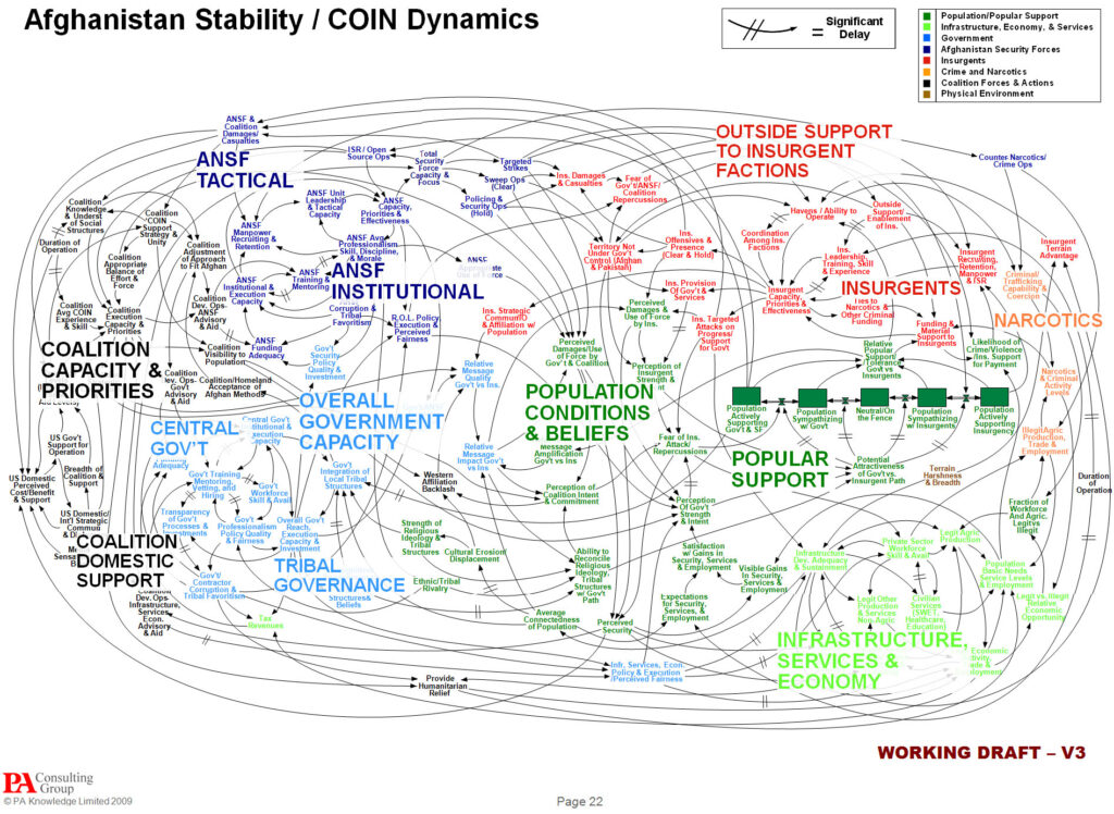
There has already been a great deal of coverage across visualisation-related blogs and news sites about the reaction of General McChrystal, the leader of American and NATO forces in Afghanistan, to a slide he was was presented portraying the complexity of American military strategy. I can’t avoid the temptation to add my own contribution to
PowerPoint hysteria Read More »

It is disappointing to hear about the escalation of the stand-off between Adobe and Apple with regards to Flash, the multimedia platform that enables designers to develop rich, interactive web content. The latest episode being the news that Adobe are no longer pursuing the development of a tool that will allow Flash developers to port software
Adobe cancel Flash development for iPhone/iPad Read More »
As I have mentioned several times before, my post strategy for this blog aims to minimise lazy repackaging and regurgitating of posts from other sites. It gets very boring when you end up reading about the same article several times across different sites and so I don’t want to add to this.
Best of the visualisation web… February 2010 Read More »

Bit of a tangent from normal posts but I was interested in this promotional campaign by IKEA for their kitchen design service. They have rendered three kitchen layouts and designs to represent the three main political party leaders. Aside from the comedy names and regardless of whether they necessarily accurately represent the leaders traits, I
IKEA special ‘election kitchen’ Read More »
With the UK election process very much reaching its peak in terms of anticipation, discussion, debate and spin I thought I’d follow up my earlier post, which introduced some of the quantitative analysis and interactive scenario tools, to present some examples of qualitative analysis. This area of visualisation is rapidly growing in prominence as media
Election sentiment visualisations Read More »
Throughout the financial crisis broadcasters, politicians, journalists, authors, academics and other communicators have tried various techniques to try help make their message come of this complex subject as accessible and as digestable as possible. One of the key attributes of effective communication, as suggested by Dan and Chip Heath, is to make the message concrete. That
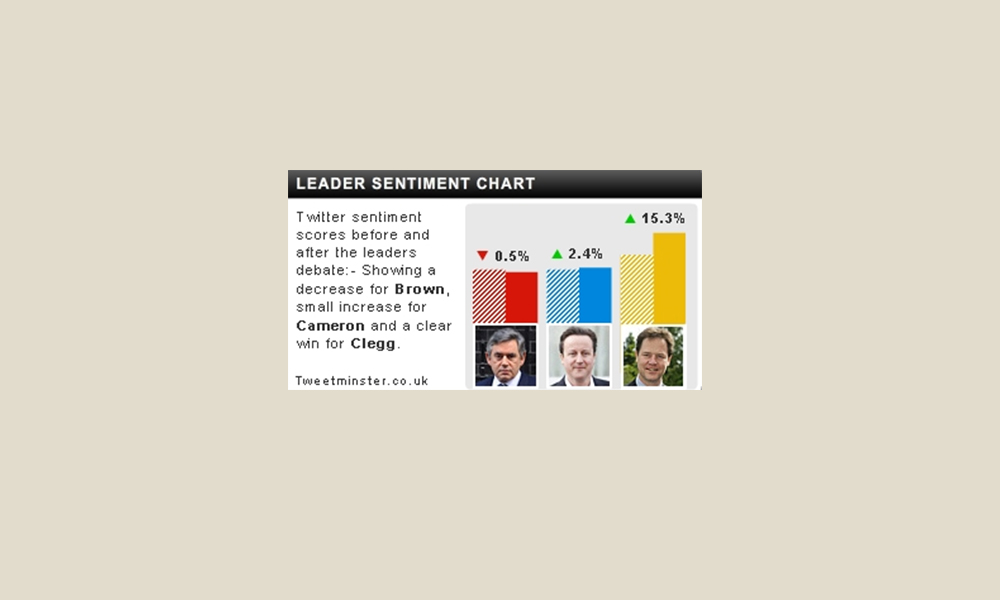
In today’s Guardian are details about some of the interactive tools that will be available for viewers who watch Thursday evening’s first prime-ministerial debate at www.itv.com/electiondebate. It describes a range of “sentiment” tools that will be deployed to measure live responses to the discussion between leaders of the three main parties: Gordon Brown, David Cameron and
Election debate live reactions Read More »
Having immersed myself in the world of data visualisation through research and practice over the past 3 to 4 years, it’s emergence and continued growth is very clear for me to witness.
Advocating vs. benefiting Read More »