
Intersting to see in the Telegraph newspaper a report about the Top 50 University spin-out companies and, in particular, the use of sparklines. The graphs themselves are embedded from a service called younoodle scores which claims to have ‘the largest-ever dynamic directory of active startups, compiled from proprietary tracking technology, a rapidly-growing community, and several leading startup data partners‘.
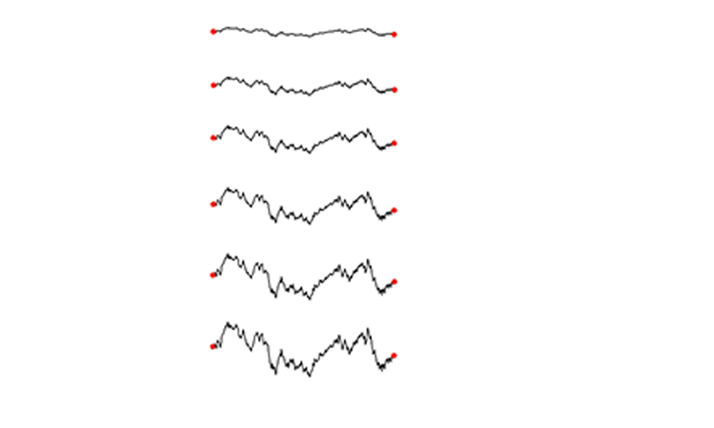
Sparklines convey trend information in a single line graph and are ideally applied in small multiples when you are faced with limited space like that of the tabular layout above. They are not designed to facilitate point-reading, they simply enable the viewer to gauge a sense of the different journeys an array of values have gone through over a specified time span.